|
<< Click to Display Table of Contents >> Component Attributes Configuration |
  
|
|
<< Click to Display Table of Contents >> Component Attributes Configuration |
  
|
❖Settings of number of options in editable color of legends
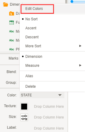
If you add statement "discrete.guide.max.item=x" in bi.properties, the user can edit the color options up to X.
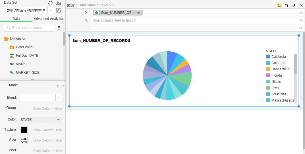
➢For example:there is a diagram as shown below.

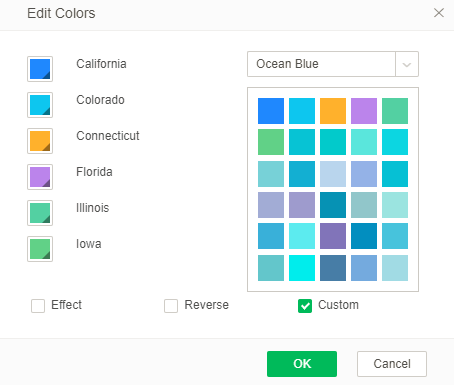
Assuming that add statement discrete.guide.max.item=6 in bi.properties, the number of legends that can be edited in the legend can be up to 6, as shown in the following figure:


❖Settings of the maximum number of chart axis
Add the following statement in bi.properties to configure.
chart.axis.maxsize=50
The maximum number of axis of the chart is 50.
❖The maximum row limit of exporting csv
Add the following statement in bi.properties to configure.
csv.max.rows=5000000
When exporting csv data on floating buttons of display components such as table, pivot, chart and freestyle, the default number of exported rows is a maximum of 5,000,000 rows.
➢For example:csv.max.rows=10 refers that the maximum rows of exporting data is 10 rows, including the header.
❖Whether the exported Excel file displays the component sheet
Add the following statement in bi.properties to configure.
excel.export.datasheet=true。
When the attribute is true, the component sheet is displayed for the exported Excel file when the output of table, pivot, freestyle, form and chart component are visible; while the attribute is false, the component sheet is not displayed for the exported Excel file when the output of table, pivot, freestyle, form and chart component are visible. If this attribute is not configured, the default value is true.
❖Settings of displaying component title
Add the following statement in bi.properties to configure.
db.element.showname=true
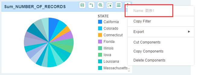
The default value is false. When the value is true, the name of component is displayed on the top of "more" menu in Create Dashboard and View Dashboard; while the name of component is not displayed if the value is false, as shown in the figure below:

❖The improvement of Brush function
Add the following statement in bi.properties to configure.
disable.chart.brush.effect=true
The default value is false. When the value is false, the target chart is displayed according to overlay data after the brush is applied; when the value is true, the target chart is only displayed the linked data after the brush is applied.
As shown in the figure below:


brush.source.background=
brush.source.foreground=
It control the background color of table and pivot brush source and foreground color of highlighted font respectively. If brush.source.background=-1, there is no background color.
The picture below are the effect picture of brush by setting brush.source.background=-1 and brush.source.foreground=0x0365C1:

❖The drop-down action settings in cellphone layout of list component Description: Yonghong Desktop does not support Moblie Layout.
Add the following statement in bi.properties to configure.
phonelayout.ignore.dropdown=true
The default value is false. If the list component of PC is in drop-down mode, the component in cellphone layout is displayed consistently with PC, namely the drop-down mode; while the value is true, the list component of PC is in drop-down mode, the component in cellphone layout will be automatically converted to list mode for display.
❖Settings of component paging of table
Add the following statement in bi.properties to configure.
table.pagination.type=true
If the default value is false, paging is not made; while the value is true, paging is made.
table.pagination.row.number=25
The default value is 25, which stands for the displayed rows of data are 25; after the value is revised, the displayed rows of data are subjected to the revised value for every page.
❖Configuration of default value as "not self-adaptation of width" of table
Add the following statement in bi.properties to configure.
table.properties.fitWidth=false
The default value is false, which means that self-adaptation of width is not selected; while the value is true, the self-adaptation of width is selected.
❖The maximum fill area ratio setting for axis labels
Add the following statement in bi.properties to configure.
chart.leftTop.part.max.ratio=0.6
The default value is 0.6, and "..." is displayed after the axis label is longer than the maximum percentage.
❖Gestures zoom in and out of the chart for mobile
Add the following statement in bi.properties to configure.
chart.scale=false
The default value is false, which means that the mobile does not support gesture zooming in and out of the chart. When the value is true, the mobile supports gesture zooming in and out of the chart.