|
<< Click to Display Table of Contents >> Cell Render Script |
  
|
|
<< Click to Display Table of Contents >> Cell Render Script |
|
The Cell Render can display data changes by drawing different graphics. It is a more intuitive and convenient way of data representation. This feature is supported in table components and pivots components and freestyle table components.
This chapter explains how to use scripts to render data in a grid.
❖Open method
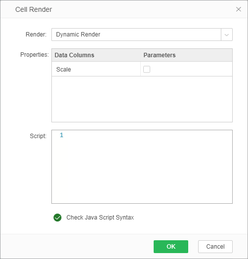
The user can select the table and pivot and freestyle table, and then click on the table rendering in the right panel settings. In the open table rendering dialog, select the dynamic rendering, the script is active, the user can enter the script.
❖Detailed introduction
Rendering a table by creating a chart mainly includes three parts. The first part is to define the format of the chart. The second part is to set the data source of the chart. The third part is to call the getImage function to generate the chart.
•Define chart format
function createBMark(stack){
var mark = new RangeBMark();
mark.addDim("market");
mark.addMeasure("sum_Sales");
mark.setOpt(new StackMarkOpt());
mark.setStack(stack);
return mark;
}
function getBChart(){
var axisType = CConstants.AXIS_BOTTOM_LEFT;// AXIS_UPPER_RIGHT
var xscala = new DiscreteScala(new Array("market"));
var aopt = new AxisOpt();
aopt.setPType(axisType);
var lbopt = new AxisLabelOpt();
lbopt.setPType(CConstants.LABEL_OUTER);
aopt.setLabelOpt(lbopt);
xscala.setOpt(aopt);
var yscala = new ContinuousScala(new Array("sum_Sales"));
aopt = yscala.getOpt();
aopt.setPType(axisType);
var coord = new RectCoord(xscala, yscala);
var mark = createBMark(false);
var bchart = new BChart(coord, mark);
return bchart;
}
var bc = getBChart();
•Set the data source for the chart
The data source of the drawn graph, the user can use the SQL statement to make the data source according to the requirements in the query.
1)The data must be grouped data, use group by to group the data
2)In the query conditions of the data, you can add parameters and then pass values to the parameters in the cell render script to make the query more flexible and easy to use.
param['product'] = cols['Product'];
var data = execute(this,SQL,"Query_cellRender2");
•Call the getImage function to generate a chart
Table width: cell.width
Table height: cell.height
getImage(bc,data,cell.width,cell.height);
❖Application examples
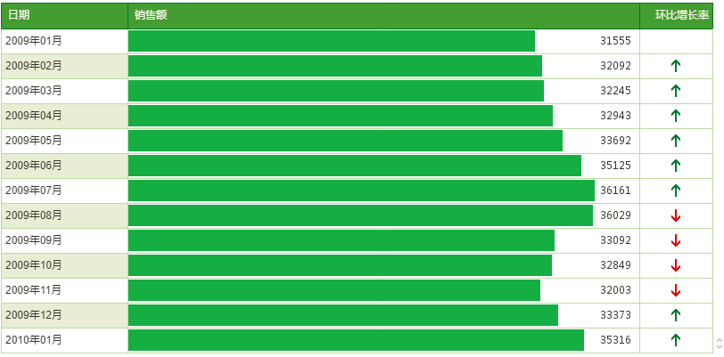
For example, create a new table as follows:
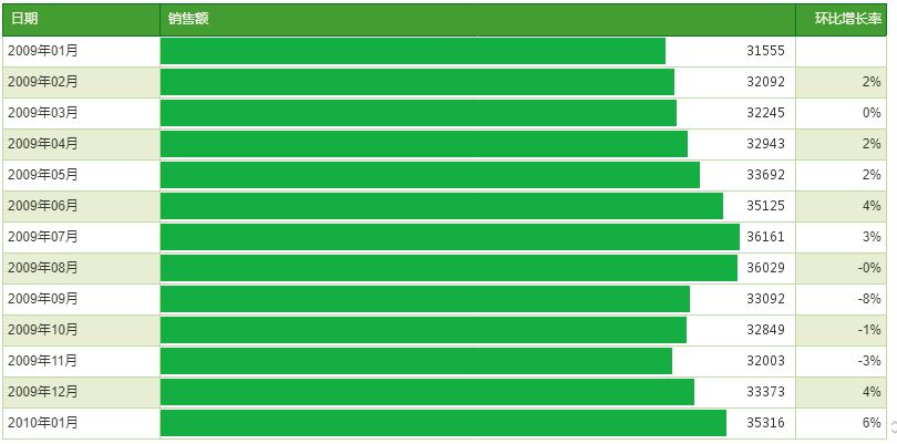
the user needs to display the "环比增长率" greater than 0 as the upward green arrow and the ring growth ratio of less than 0 is displayed as the downward red arrow, it can be achieved by dynamic rendering. The specific operation is: first select the cells in the "环比增长率" column, select the Cell Render in the right panel, select the dynamic rendering in the table rendering dialog box, enter the script as follows:
var data = cols.环比增长趋势 ;
if(data<=0){
url="file:///C:/warning/direction/arrow/arrow_bottom.png"; //Local picture
}
else if(data>0){
url="file:///C:/warning/direction/arrow/arrow_top.png";
}
After the setting is completed, the effect is as shown in the figure: