|
<< Click to Display Table of Contents >> Special Effects |
  
|
|
<< Click to Display Table of Contents >> Special Effects |
  
|
Dashboard features are highlighted through some special beautification.
•Use gauges properly.
•Dynamic dashboard.
•Tooltip effects.
•Text description.
❖Use Gauges Properly
Placing a gauge in place on the dashboard not only adds aesthetics but also provides a overview of the aggregated data.

❖Dynamic Dashboard
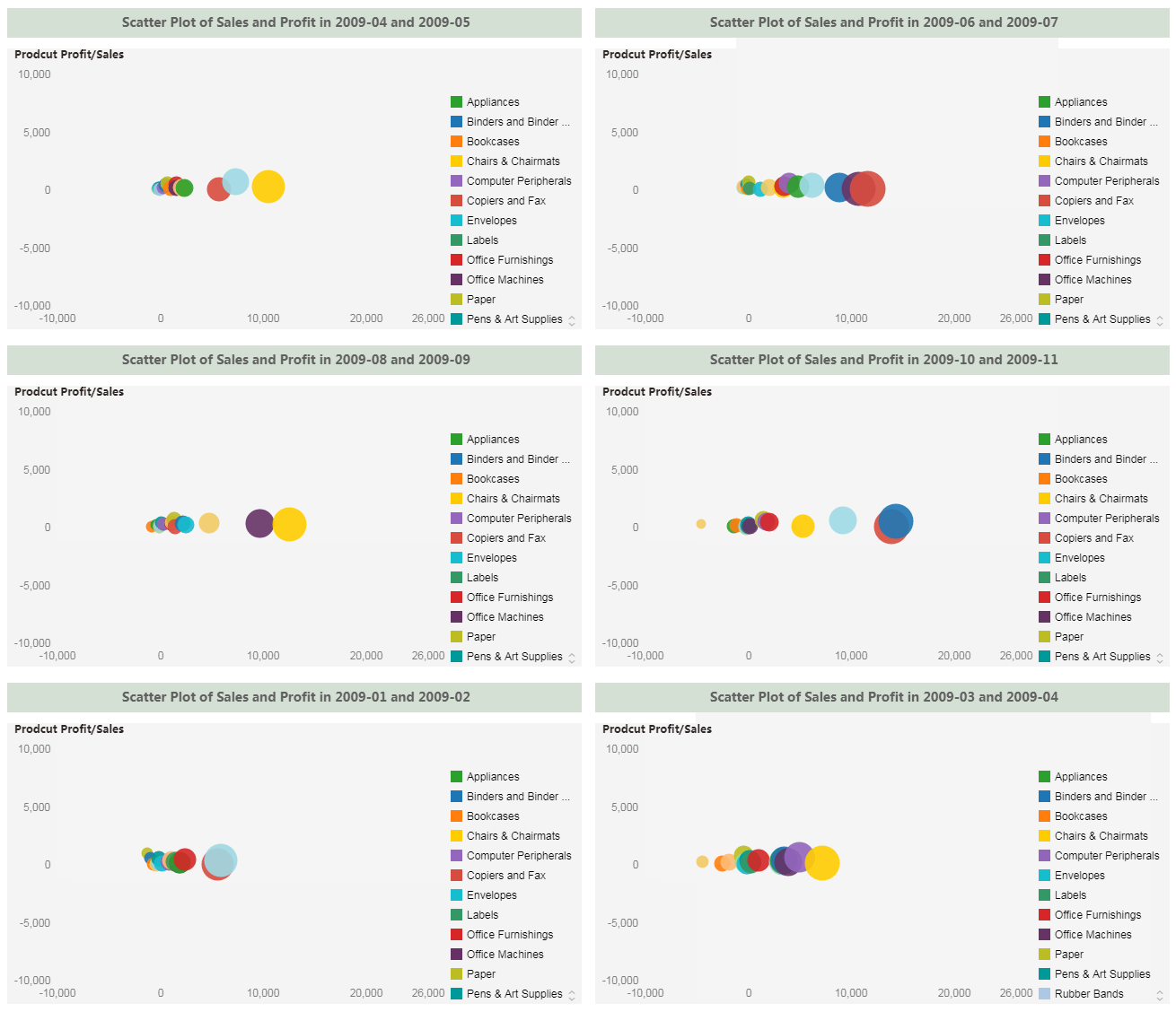
The script can be used to create some dynamic display effects. The following chart will dynamically display the product sales and product profits for different months of the company year.

❖Tooltip Effect
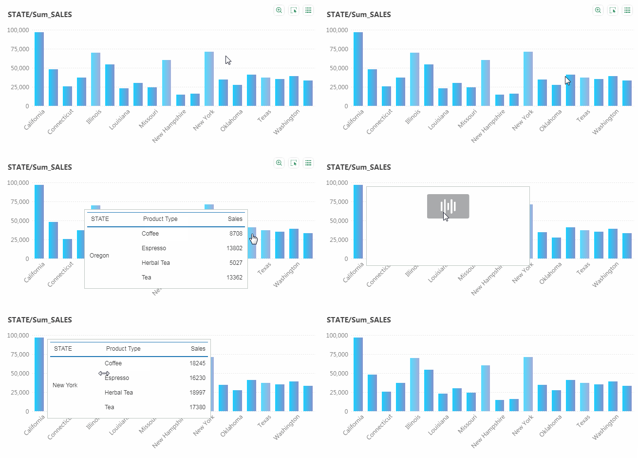
To save space, we often need to show more detailed information related to it through Tooltip.

❖Text Description
By properly describing the information, the text can increase the readability of the dashboard, and can also improve the overall beautification of the dashboard.

Thank you for reading this document! If you do not understand, please contact us, we will provide online services. I believe that through our joint efforts, we will surely create more beautiful dashboards.
More Demo, please visit Yonghong BI official website: http://www.yonghongtech.com/zc/guankanyanshi/