|
<< Click to Display Table of Contents >> Create Carousel |
  
|
|
<< Click to Display Table of Contents >> Create Carousel |
  
|
❖Create a Carousel
In the right panel component, drag and select the rotation component to the dashboard editing area.
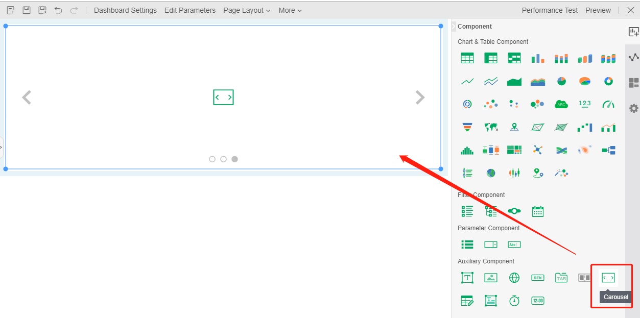
•add component
There are three ways to add components to a rotation component:
Drag the component you want to add to the container area of the rotating component to add. The effect is shown as follows:
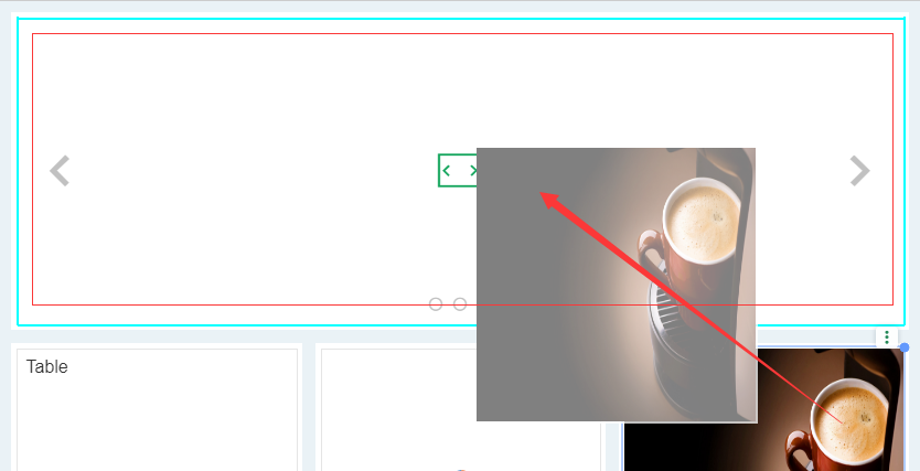
After successfully adding components, the following figure is shown:

Build the components to be added in advance in the dashboard. In the right toolbar "Settings", click "Configuration Components" and then have options in the dialog box. At this time, you can select the optional components and then click "Add", so that you can successfully add the components to the rotation component. See the following figure:
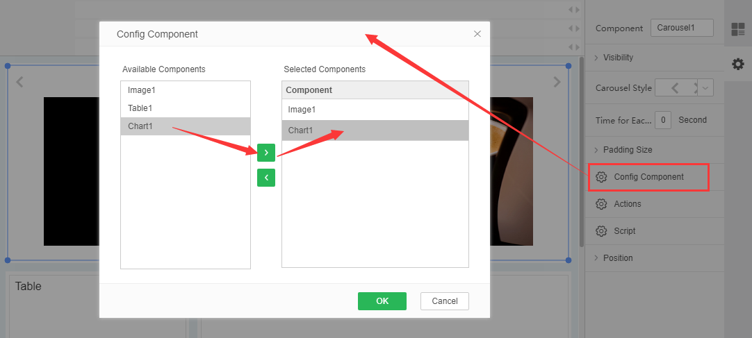
Drag the component you want to add from the drop-down box of the toolbar to the header area of the rotation component to add the component directly to the rotation component. As shown in the figure:

•Remove components
There are two ways to remove components from a rotating component:
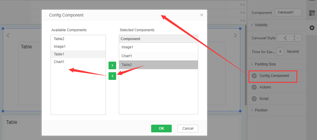
Select the rotation component, click "General" in the right toolbar, and click "Confign Options" to remove the selected component from the pop-up dialog box, so that the component can be successfully removed from the rotation component, as shown in the following figure:
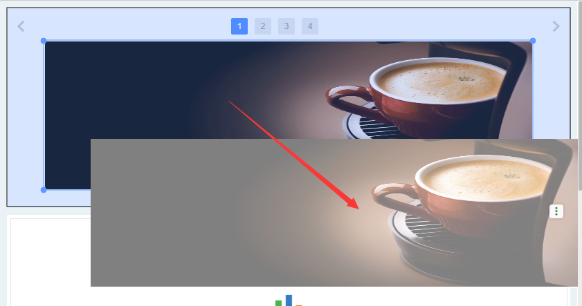
Select the component in the rotate component to drag and drop to the area outside the rotate component to remove it.
As shown in Figure 1, drag image 1 to an area other than the rotation component to display the effect map:
•Replacement component
There are two ways of replacing subcomponents with a rotation component:
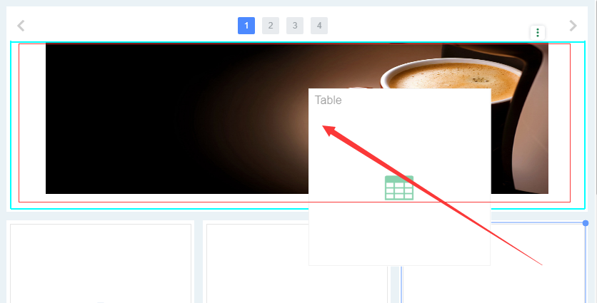
Drag the new component onto the original component to be replaced for substitution of the subcomponent, as shown in the following figure:
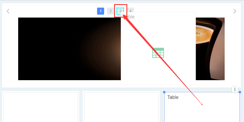
Drag the new component onto the page number icon of the original component to be replaced for substitution of the subcomponent, as shown in the following figure:
Be careful:
(1) The size of "tables, crosstabs, free forms, filling parameters, charts, pictures, web pages, echart components and combination components" in the rotation component varies with the size of the rotation component, and can be adapted to the size.
(2) Filtration components, parameter components, text components, buttons, instrumentation components do not adapt to size
(3) Components of container class (tab component, rotation component, filter container) are not supported in rotation component.