|
<< Click to Display Table of Contents >> Right Side Pane |
  
|
|
<< Click to Display Table of Contents >> Right Side Pane |
  
|
The right side toolbar generally includes components, routines, and setting modules (graphics components also have axes, drawing modules). Different content is displayed according to the selected content. The following example uses the list filtering component as an example to describe the right toolbar area. Content:
1. Components
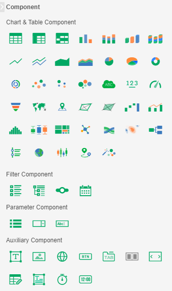
Component area includes all component types that the product can add.
2. Data
❖Bound physical table
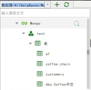
When binding data, you can use the physical table (Table) or view (View) in the data source to bind. For NoSQL data sources, such as Mongo, you can also directly select tables for binding.

Bind the table in the Mongo data source as shown in the following figure:
❖Bound data set
You can also select data sets for binding.
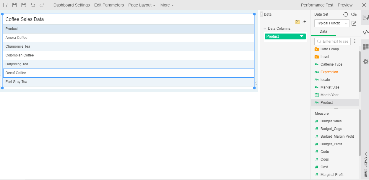
[Add Data Set] Click the Add Data set icon to open the dashboard query. You can create a new combined query and save it in the Dashboard folder. You will not see it when you create the data set.
[Refresh] Columns could be added, deleted, and changed in the data set. After the refresh, the change can be synchronized.
[Edit Data Set] Click the edit data set icon to open the bound data set directly in the “Create Data Set” module or “Create Dashboard” module.
For data sets, dashboards, and data segments, you can use the search function to quickly find the resources you need.
Searchable locations of data set: data set list on data connection interface, drop-down list of data set in dashboard, added data set, list of specified data set, list of replaced data set, list of data set in edit parameter dialog box, the data source and data set list in the form parameter settings dialog, and the resource list of the export resource interface.
Dashboard searchable locations: resource tree on make dashboard page, dashboard list in hyperlink dialog box, resource tree on view dashboard page, dashboard list of system monitoring interface, the resource list of export resource interface, the dashboard resource tree of the portal interface.
Searchable locations of data fields: Data set resource tree in make dashboard interface, data set resource tree in advanced sequencing, and data set resource tree in the bindings dialog box for freestyle table.
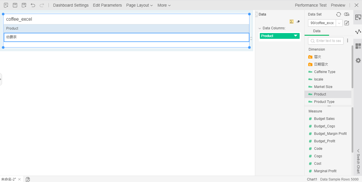
As shown in the figure below, the user drags the data field that needs to be statistically analyzed into the binding area. At the same time, the number of sample rows of the bound data set is displayed at the bottom right corner of the window in gray. The number of sample lines means: the maximum number of lines that can be edited in dashboard. If the setting for the number of sample rows is greater than the actual data in the data set, the number of editable rows is the total number of rows in the data set. The modification of the number of sample rows needs to be modified in Create Data Set - metadata area - number of sample lines.
3. General
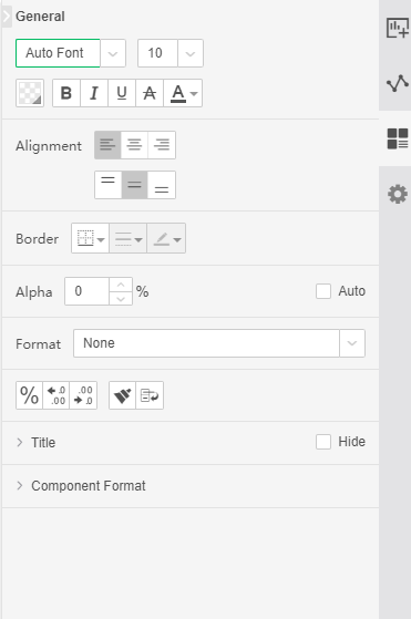
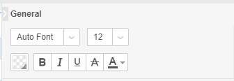
[Font Format]Select a part of component (such as a cell in a table) and you can set its font format, as shown below:
[Alignment] Adjust font alignment, including vertical and horizontal alignment
[Border] Adjust the border style, line style, and line color of the selected area
[Alpha] Set the transparency of the selected area
[Format] Set the format type of the selected area text
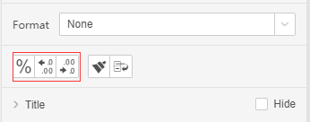
[Data Format] Change the data to the percentage type
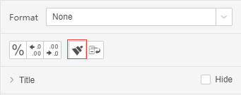
[Format Brush] Format brush, you can brush the area format to the selected other area
[Automatic Wrap] Text automatically wraps
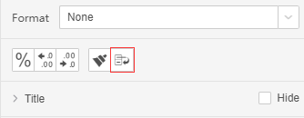
[Title] Set the title of the selected component, which is shown by default
[Component Format] The content of the component format is basically the same as the local format and is not described in detail.
4. Settings
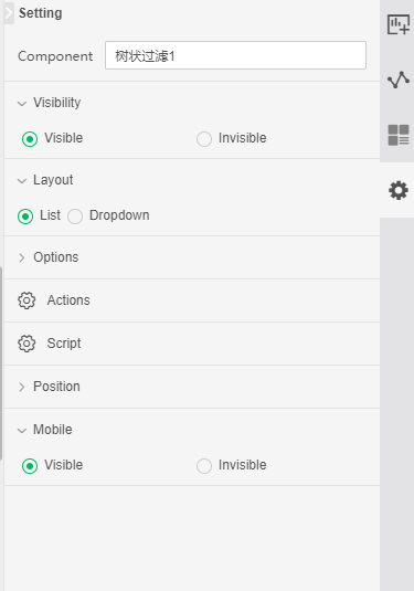
[Component Name] the name of the selected component, the default is the component type + number.
[Visibility] You can set the component whether is visible on PC terminal and mobile app, the default is visible both on PC and mobile.
[Layout] You can set the layout mode of the selected component. The list filter has a drop-down mode and a list mode.
[Script] You can bind scripts to components to control the entire dashboard.
[Options] Advanced property settings for each component, such as mandatory, submit when changed, etc.
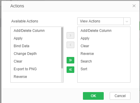
[Operation] Set the component to view the operation items in the DB. You can set the operation contents in the view, analysis, and edit modes, as shown below:
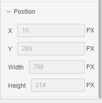
[Position] Set the position of the component, which can be edited in the free layout, including the XY coordinates and width and height of the component, as shown below:
[Mobile] Set whether the component is visible or invisible on the mobile.