|
<< Click to Display Table of Contents >> Pareto Chart |
  
|
|
<< Click to Display Table of Contents >> Pareto Chart |
  
|
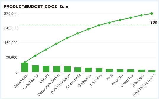
Pareto charts are histograms plotted in order of their frequency of occurrence, indicating how much of the result is due to the type or category of the confirmation. It is a chart used to rank quality problems and quality improvement items in order of importance. It can be used to analyze quality problems and determine the main factors that cause quality problems. The two-eight analysis line can more intuitively express under what conditions the effect has an 80% impact on the results.
When the user needs to adjust the size, color, or the like of the Pareto chart line, it needs to be set by the conventional or drawing in the right panel of the line.
