|
<< Click to Display Table of Contents >> National Sales Report |
  
|
|
<< Click to Display Table of Contents >> National Sales Report |
  
|
Let's take a look at the sales statistics dashboard before beautification.
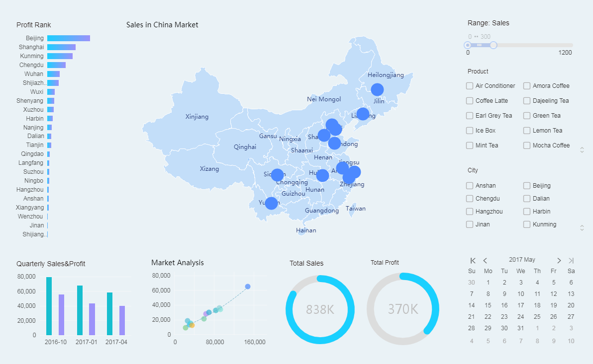
Dashboard that hasn't been beautified look rather empty and cluttered. Let's take a few simple steps to beautify the current dashboard.
Detailed steps:
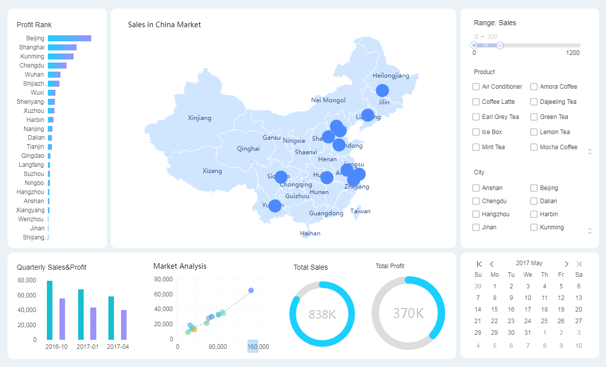
1. Beautify the component background.
With the image component, add a white rounded rectangle that is placed below the chart component to form the rounded background of the chart component. Different contents will be displayed in different areas.
2. Beautify the spot map.
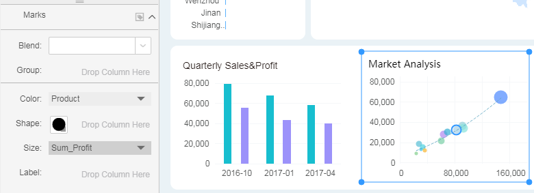
Drag the "Profit" field to the Size area in Marks. The more profitable the product, the bigger the spot.
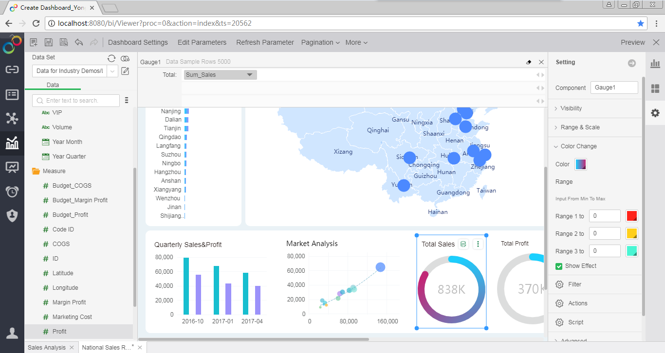
3. Beautify the gauge.
Modify the color of the gauge component. Through the color change, the monotony of the component is reduced.
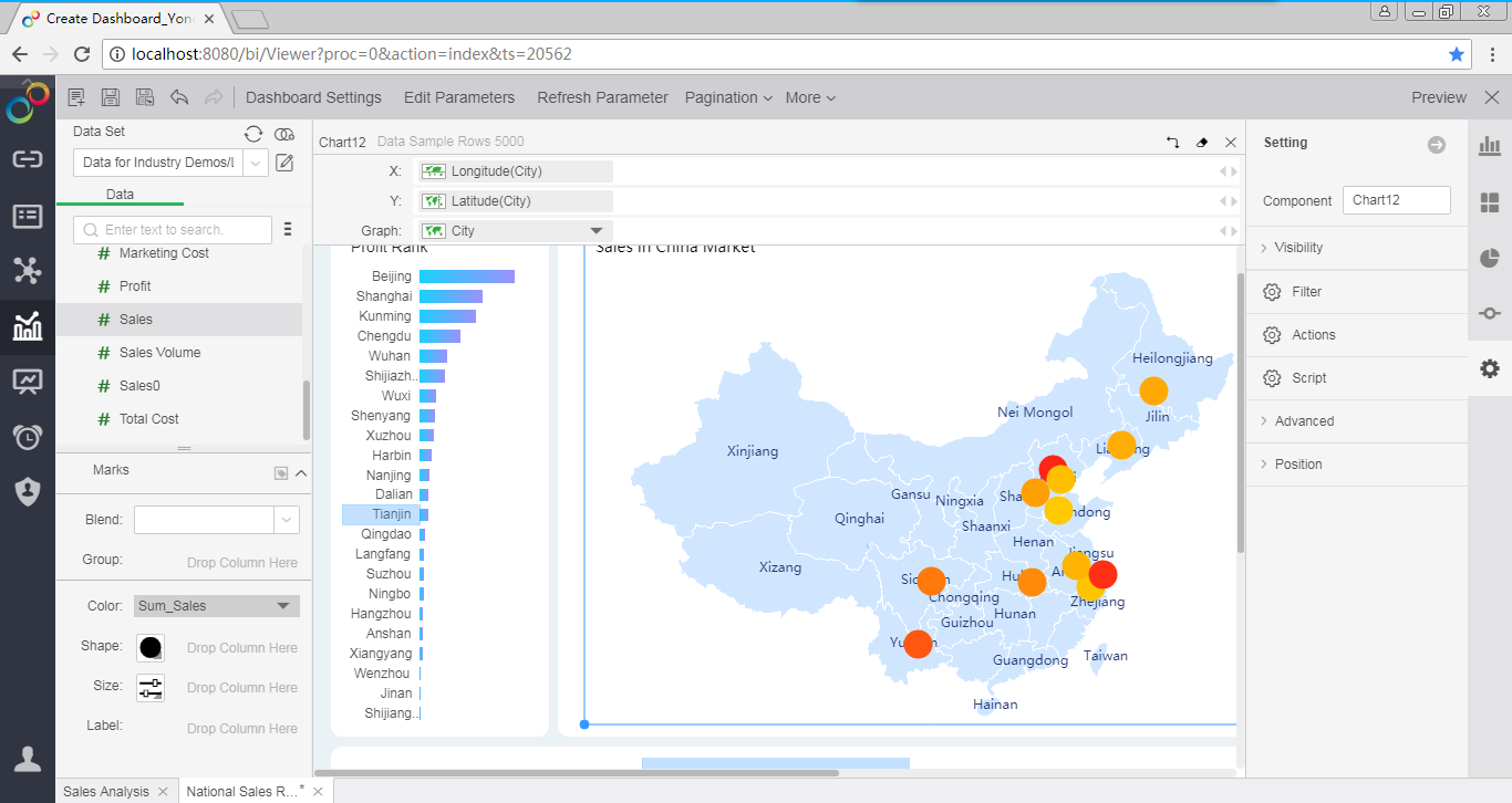
4. Beautify the map.
Drag "Sales" to the Color area of Marks. The color of the mark changes with sales.
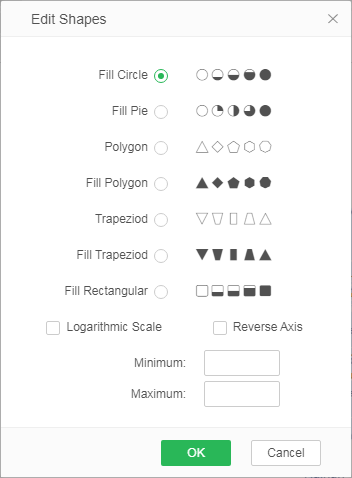
Drag "Profit" to the Shape area of the Marks. Select Fill Circle. The larger the profit value, the more part of dot are filled.
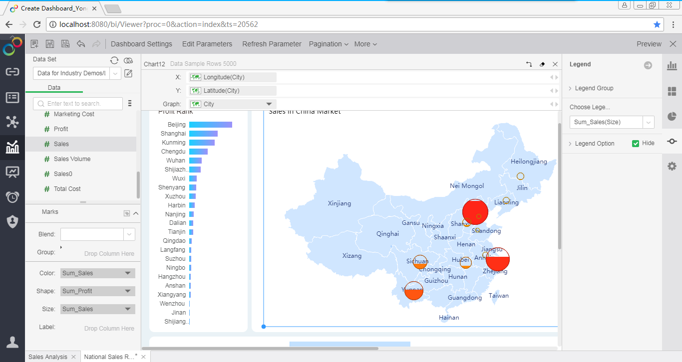
Drag "Sales" to the size area of the Marks. The more sales you have, the bigger the mark.
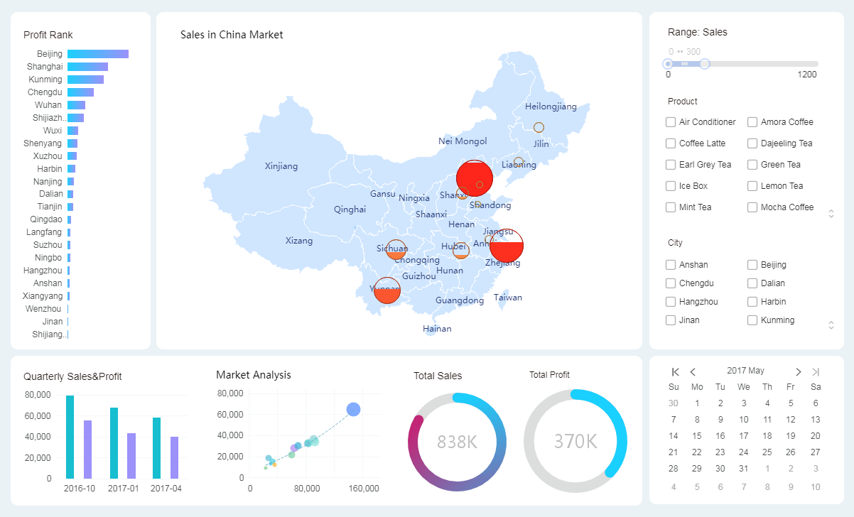
After a few simple steps, a beautiful and well-organized dashboard is born. It's really simple!
