|
<< Click to Display Table of Contents >> Sales Statistics |
  
|
|
<< Click to Display Table of Contents >> Sales Statistics |
  
|
Let's take a look at the national sales report before beautification.
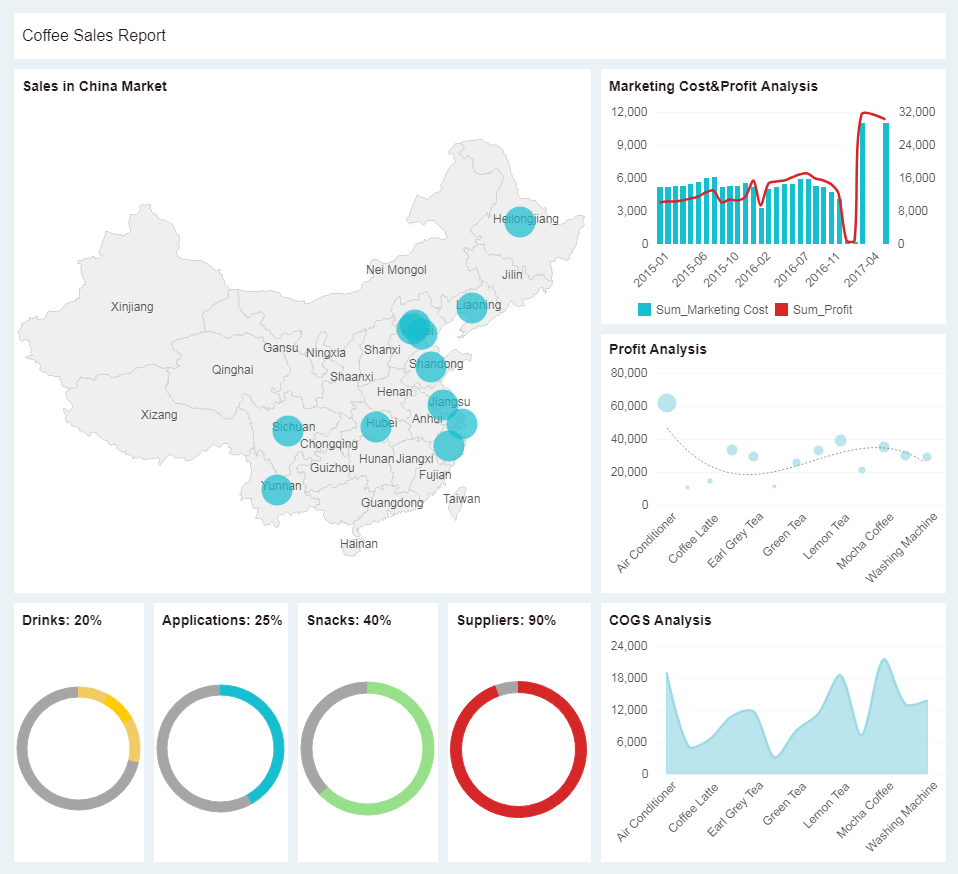
Dashboard that hasn't been beautified look cluttered and heavy. Here we will beautify the current dashboard in a few simple steps.
Detailed steps:
1. Add a background image. Via the menu bar -> More -> Dashboard Style, set the background of the dashboard to a prepared coffee photo.
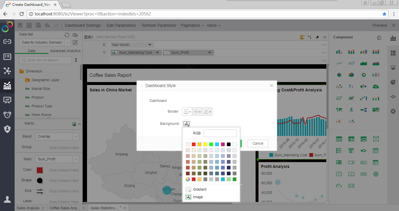
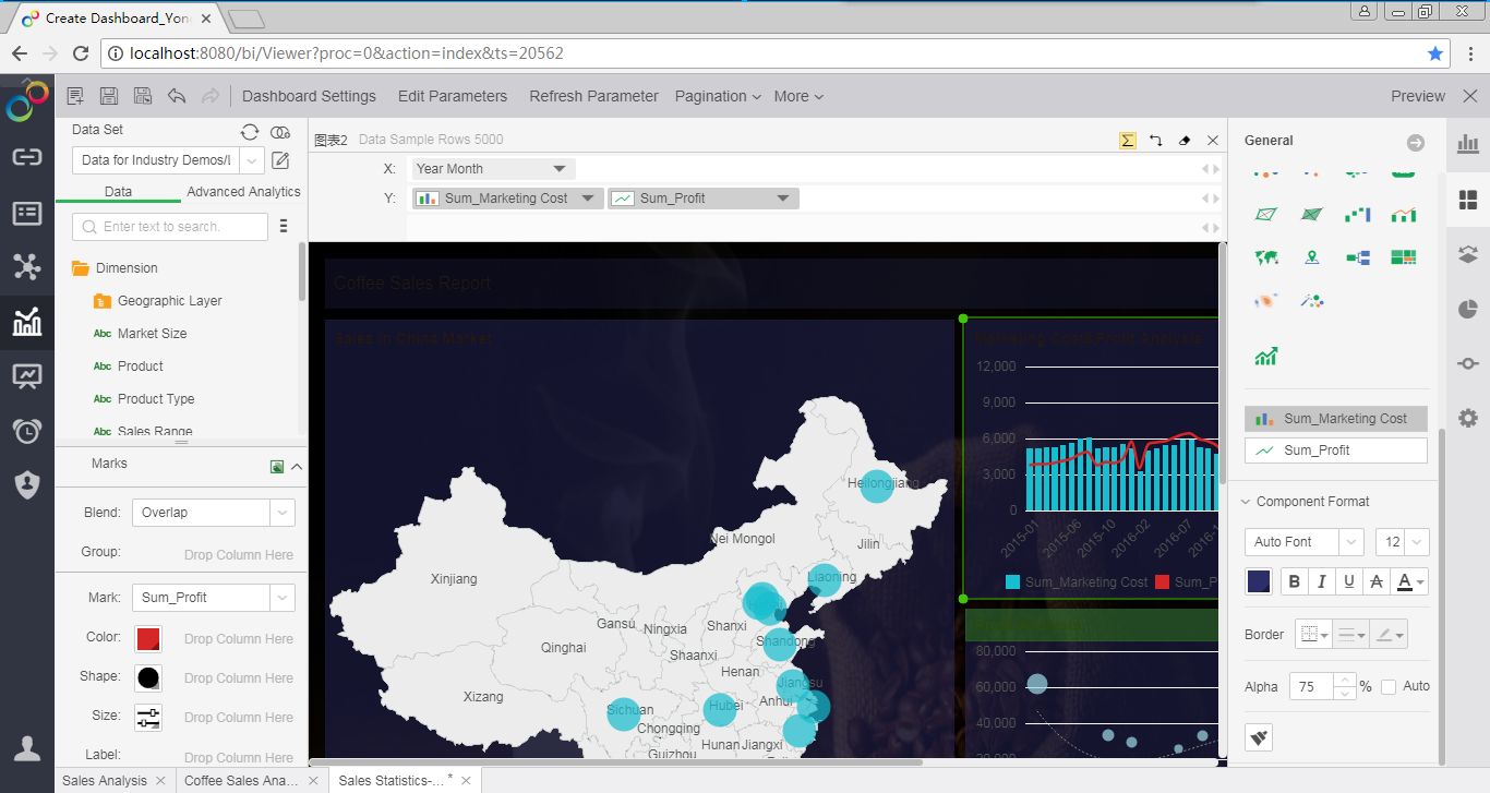
2. Adjust the component's fill background.
Select the component. In the component format in General Tab, select the dark blue background color and set the transparency to 75%.
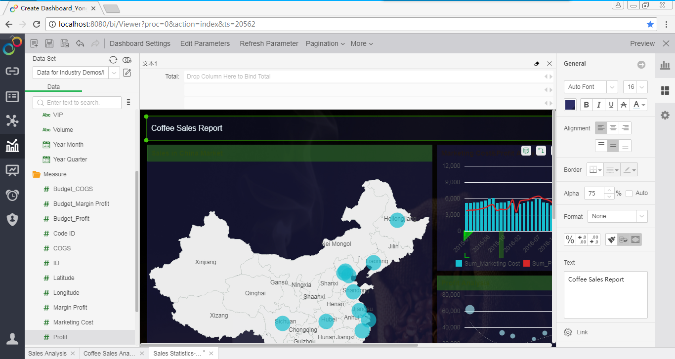
3. Beautify the dashboard title. Set the size and color of the title font.
4. Beautify the map.
Set the fill color of the map, the edge color, the transparency of the map, and hides the map area name.
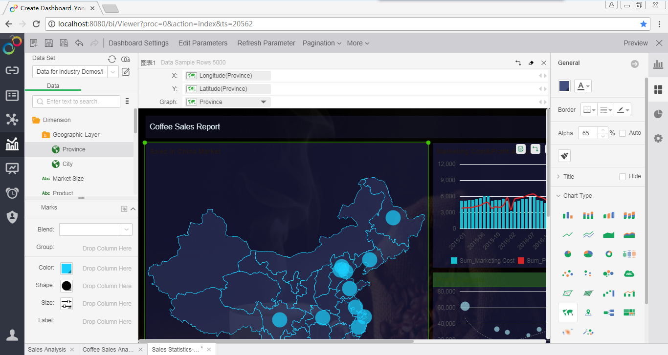
Set the shape of the map marker and change the dot to a dynamic dot.
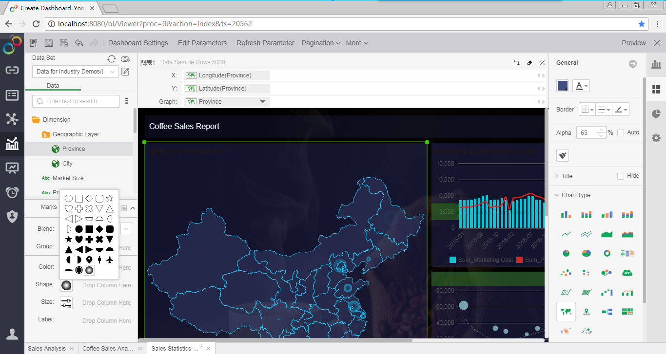
5. Beautify the combination chart.
Left and right Y axes share the scale, and hide the right axis.
Modify the color of the bar and line markers.
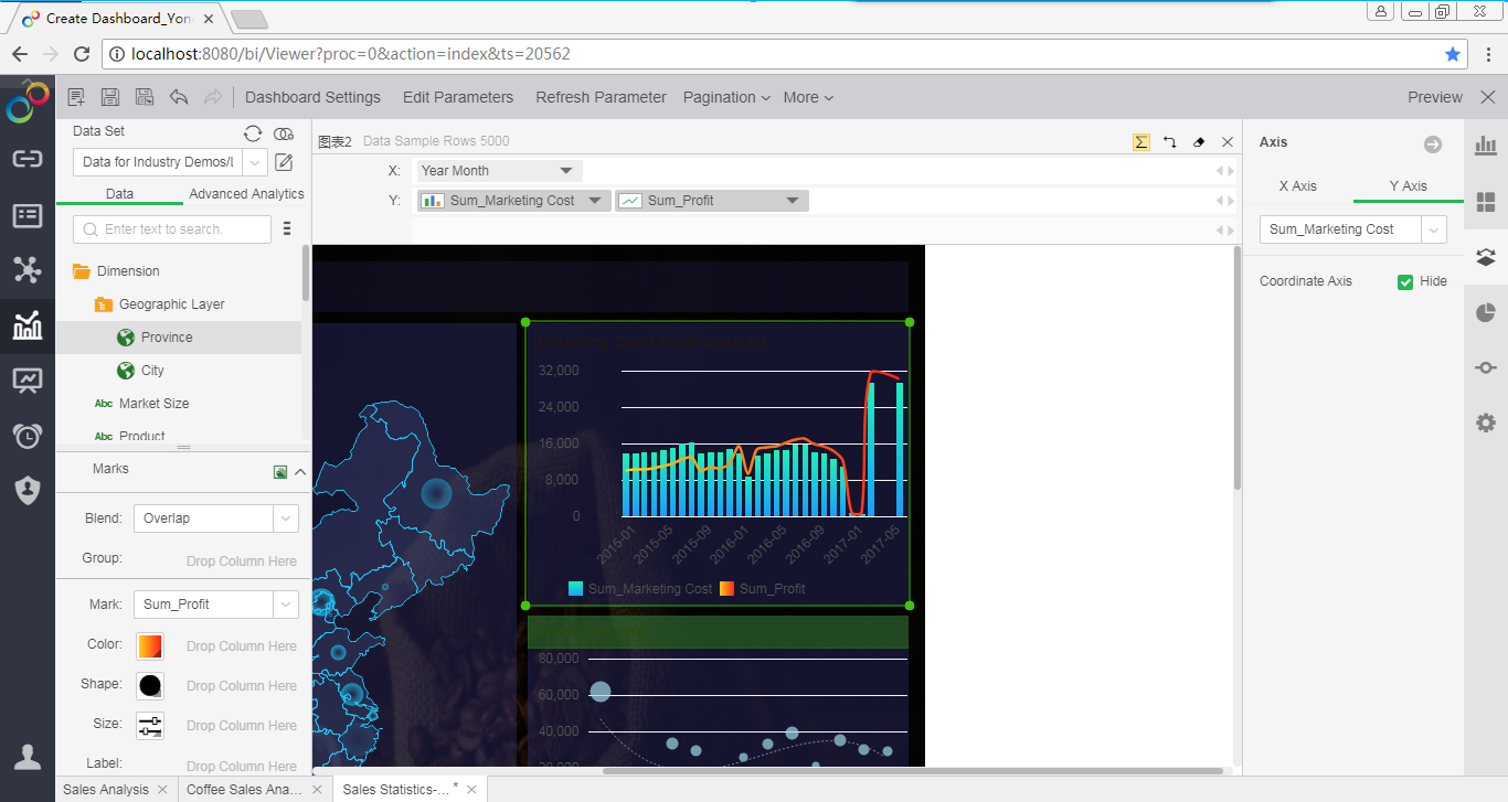
6. Beautify coordinate axes and grid lines.
Beautify the label color of the axis.
Beautify the style of the grid line, change the solid line to a dotted line, and set the dotted line color.
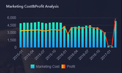
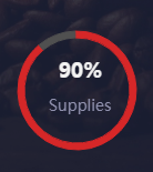
7. Beautify the donut title.
With a text component, add a title to the donut and place the title in the center of the donut.
8. Beautify the component title.
In front of the component title, add a text component and set its fill color and size to make the dashboard look richer.
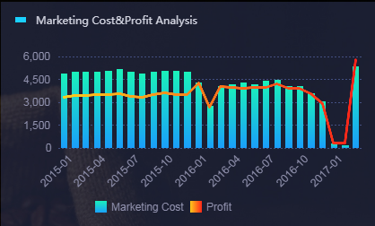
After a few simple steps, a beautiful and well-organized dashboard is born. It's really simple!
