|
<< Click to Display Table of Contents >> Add Components |
  
|
|
<< Click to Display Table of Contents >> Add Components |
  
|
Under the smart layout, adding components to the dashboard, the product will trigger different response areas based on the mouse position, placing new components in different locations. Response areas are: overall response, partial response, internal response.
❖Overall response
The components in the smart layout are arranged in a grid with a fixed spacing of 12px. Hovering over the grid triggers the entire insertion of the response area, as shown in the following figure.

When the green dotted line in the above figure appears, insert the component and the effect is as shown below.
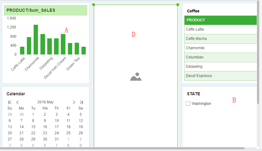
When the overall response, the proportion of components rules are as follows:
The height of the insertion component = the height of the component A + the height of the component C + 12px (12px means: the spacing between two adjacent grids under the smart layout);
The width of the insertion component: Assume that the width of the dashboard is 1 and the inserted component is D. Before inserting component D, the ratio of the width of the component is A:B=3:2. After inserting component D, the ratio of the width of the component is A:D:B=(2/3)*(3/5):1/3:(2/3)*(2/5).
❖Partial response
The following two situations trigger a partial response:
When the width/height of the component is less than 36px, the mouse hovering within the 6px inwards of the grid frame;
When the width and height of the component are greater than or equal to 36px, the mouse hovering within 12px of the grid frame inward.
The partial response trigger effect is shown in the figure below.

When the green dotted line shown above appears, insert the component and the effect is as shown in the figure below.

When the partial response, the proportion rule of the component is as follows:
Insert component height = height of component A;
The width of the insertion component is the same as when the overall response area is inserted.
❖Internal response
The internal response is divided into left and right responses and up and down responses.
•Left and right response
When the mouse hovers over the left and right 1/3 area of the component, that is, the blue area in the figure below, the left and right response areas of the component are triggered.

The internal left-right response trigger effect is shown in the figure below. The figure shows the right side response as an example.
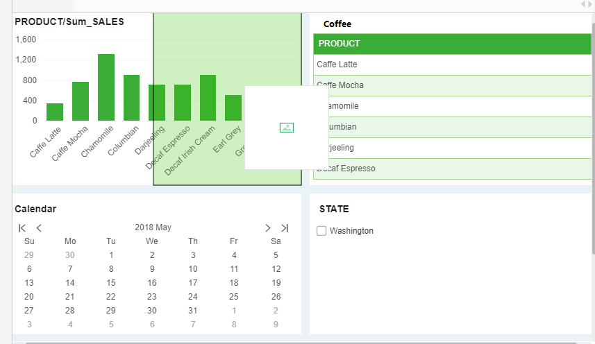
When the green area shown in the figure above appears, insert the component as shown below.
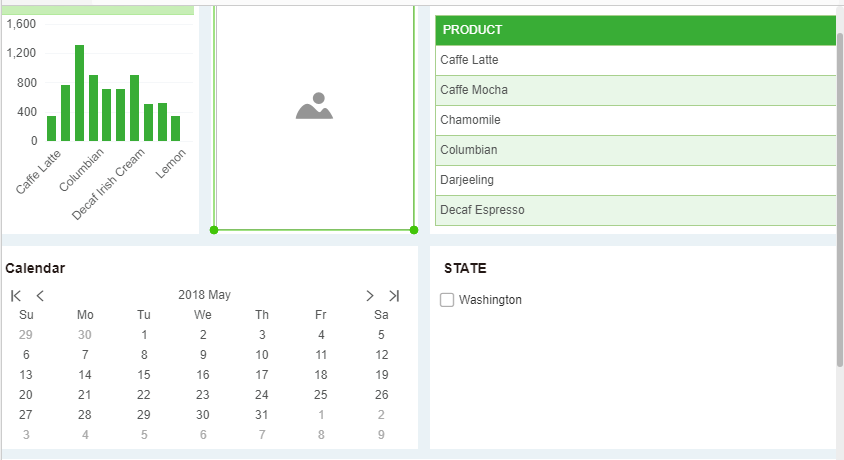
When the internal response is left or right, the component ratio rules are as follows:
Insert component height = height of component A;
Width of insert component = (width of component A -12px)/2
oUp and down response
When the mouse is hovering in the middle 1/3 area of the component, the component up and down response area is triggered.
The trigger effect of the internal up-down response is shown in the figure below. This figure uses the above response as an example.
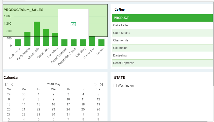
当触发上图所示的绿色区域时,插入组件,效果如下所示。
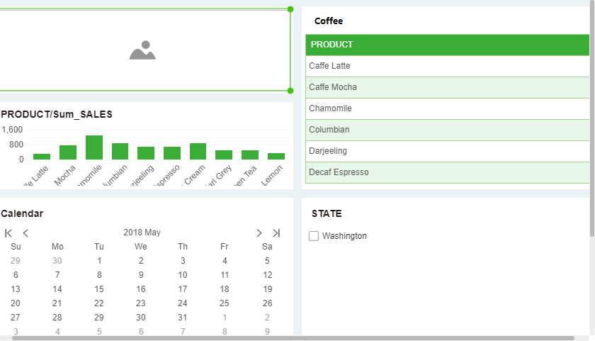
When the internal response is up and down, the component ratio rules are as follows:
The height of the insert component = (the height of component A -12px)/2;
The width of the insert component = the width of the component A.
➢Tips:The tab component does not trigger the insertion of a response area inside the component. When other components move inside the tab component, they are inserted inside the tab by default.