|
<< Click to Display Table of Contents >> Histogram |
  
|
|
<< Click to Display Table of Contents >> Histogram |
  
|
A histogram, also known as a mass distribution map, is a statistical report graph showing the distribution of data by a series of longitudinal stripes or line segments of varying heights.
❖Create a histogram
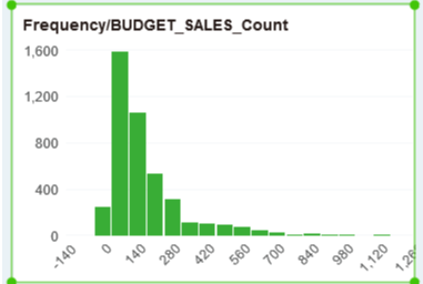
To create a histogram, drag the histogram component to the report editing area in the component on the right pane, bind the measure field to the Row axis, and then bind the dimension field to the group or tag group, as shown in the following image.

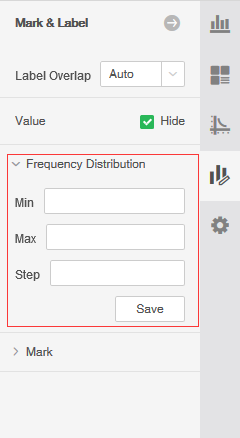
The X-axis is the distribution interval calculated by the system based on the maximum and minimum values of the metric data. This interval can be set on the right pane. You can set the maximum value and the step value. After setting, you need to click Save.
