|
<< Click to Display Table of Contents >> View and Analyze Dashboard |
  
|
|
<< Click to Display Table of Contents >> View and Analyze Dashboard |
  
|
You have completed a product profit analysis report and have generated some questions. Through the dashboard export function, you can save your analysis results to your local computer for follow-up discussion with colleagues. You can also share this report directly with managers and team members via email to facilitate their viewing and exploration. Yonghong Z-suite also provides a subscription function that allows you and others to receive the latest reports at regular intervals.
In this section, you will learn about data co-movement, dashboard export, and dashboard subscription.
❖Data Co-movement
•Data Co-movement Triggered by Filter
When you notice the abnormal profit data of the Mocha coffee in the eastern market, you can filter the product and only check the total profit, profit of each area, and profit details of the product, and the trend of its profit within two years.
On the filter, only mocha coffee is checked and other products remain unchecked. At this point, all the components on the dashboard only show the relevant data of Mocha coffee, as shown below.

From the chart, you can see that although Mocha coffee's profit in the national market have generally risen, its profit have been negative in the eastern market. And from the profit map, it is precisely the Mocha’s negative profits in Anhui and Shandong caused the loss of the product in the eastern market.
•Data Co-movement Triggered by Zoom
So, is Mocha coffee not popular in the eastern market? Or are the profits of most products in the market less than other markets? The zoom tool can filter out useless information and help you focus on the profitability of the two markets in Shandong and Anhui.
1. In the profit map, hold down the Ctrl key and mouse over the two provinces of Anhui and Shandong. Click the zoom button ![]() in the chart area.
in the chart area.
2. In the dashboard, all components only show data of the two provinces, and the rest data is no longer displayed.
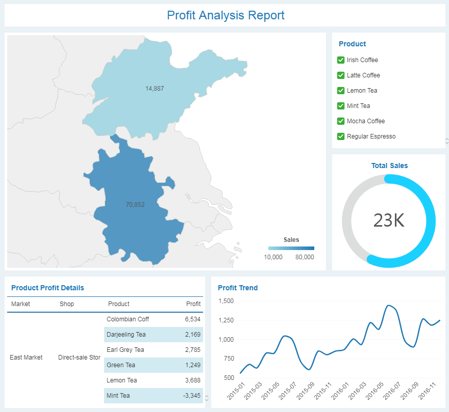
When only the data of the two provinces are displayed, you can see that, similar to the profit trend of mocha, the total profit of the remaining products has generally risen in the past two years. However, when looking at the profit details of other products in the two provinces, it was found that mint tea has suffered losses. So is the mint tea similar to Mocha coffee's profitability?
•Data Co-movement Triggered by Brush
In order to study the profitability of mint tea in the eastern market, you need to use brush tool based on data zooming. The brush will highlight the mint tea's data to help you find the answer.
1. Select the cell “Mint Tea” and click the brush button ![]() in the chart area.
in the chart area.
2. In the trend chart and map, the data related to "Mint Tea" is highlighted. In the gauge and details table, only the data related to "Mint Tea" is presented, and the data of rest products are no longer displayed.
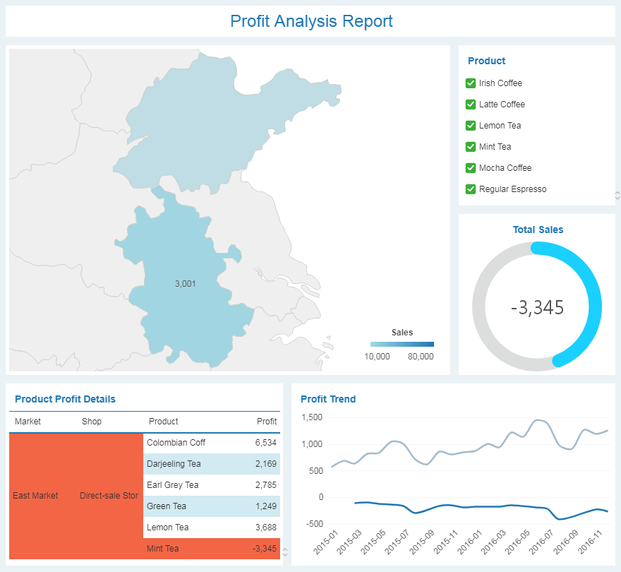
When the profit of mint tea is highlighted, you can find that only Anhui sells the product and the profit is negative, and Shandong does not sell mint tea. Moreover, unlike the steady increase in profits of other products, mint tea is a loss-making product since appearing on the market, and the loss has been increasing for two years.
Note: Yonghong Y-Reporting does not support zooming, brushing.
❖Export Dashboard
After previewing the dashboard, you may need to export the dashboard in PDF, PNG, etc. format in order to save and review. Take PNG export as an example:
1. After logging in the main interface, click [View Dashboard] to enter the View Dashboard interface.
2. Open one dashboard, and click the menu bar -> [Export] -> [PNG] to output the dashboard in PNG format.
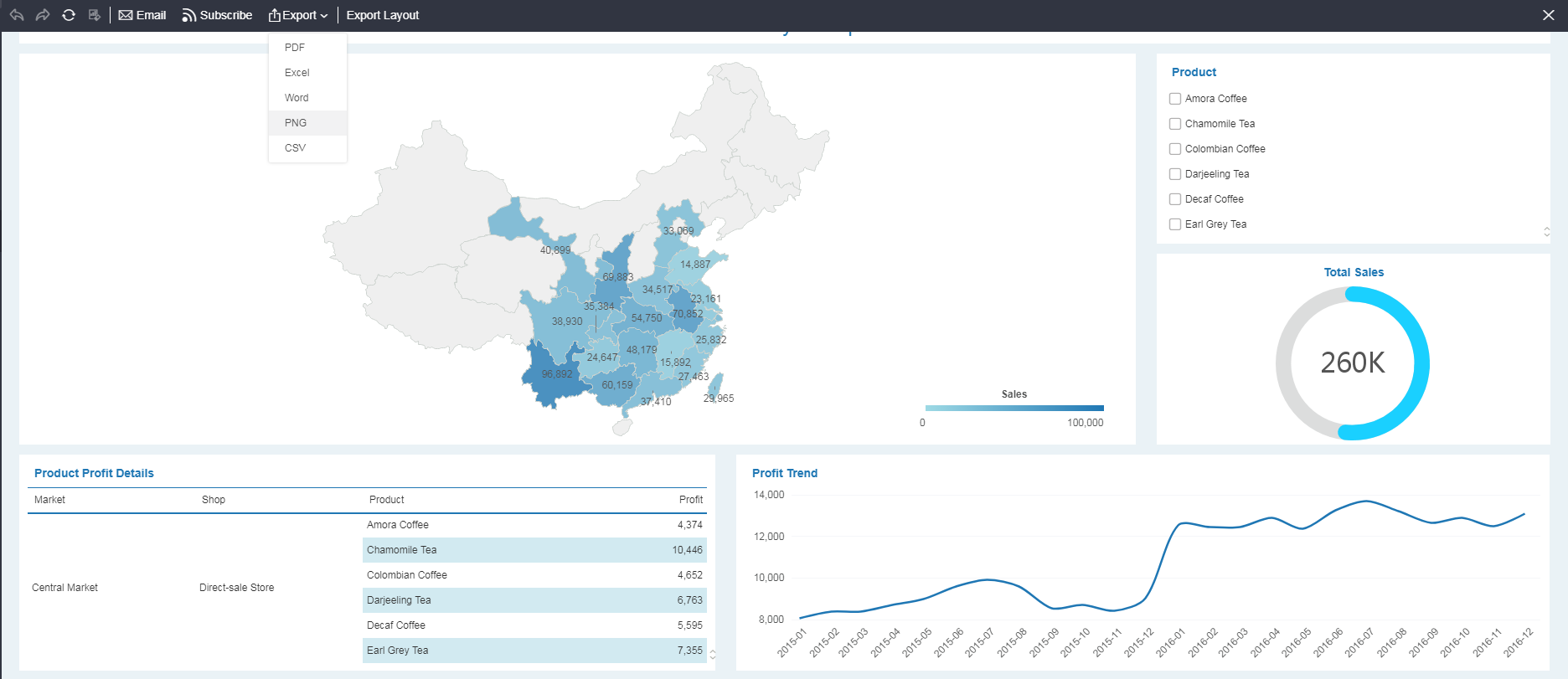
3. The browser pops up a download dialog. You can set the file name and download path. Click [Download] and the dashboard will be exported to your computer in PNG format.
❖Subscribe to Dashboard
To make it easier for you or others to regularly review the changes in the dashboard, Yonghong Z-Suite provides a subscription function for the dashboard. You can set a fixed time and the system will send the dashboard at your customized time.
1. Click on [View Dashboard] to enter the View Dashboard interface.
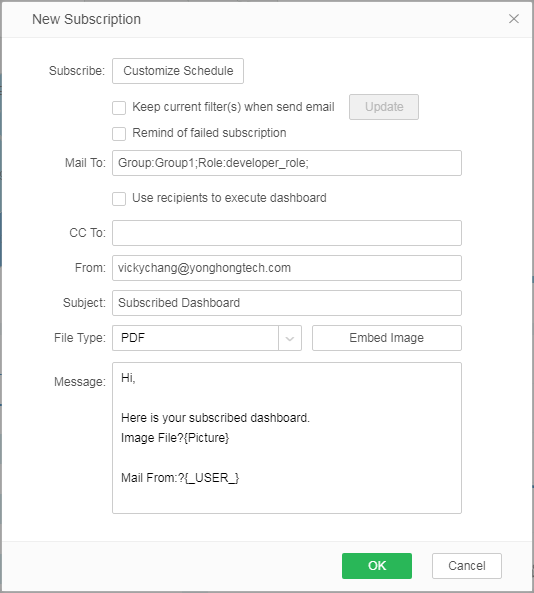
2. Open one dashboard, and click the menu bar -> [Subscribe] -> [New Subscription] to open the new subscription dialog.
➢Note: If you have not yet configured a mailbox, the system will remind you: “Please configure the mailbox server in Preference page first.” The specific configuration steps of the email are as follows:
a. In the navigation bar, click on your username -> Preference.
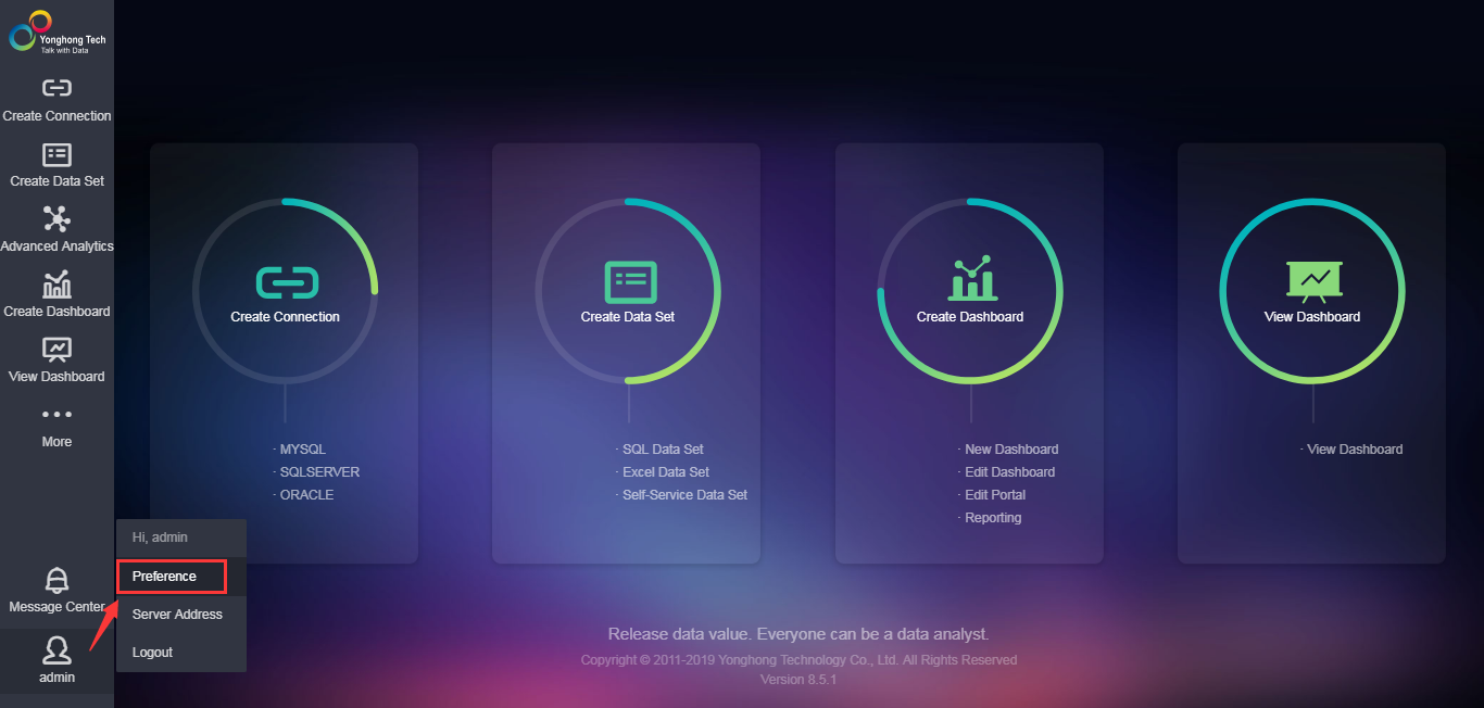
b. In the Email Sever Setting area of Preference window, enter the mailbox configuration information and click [Save]. Mailbox configuration is complete. You can continue to subscribe to the dashboard.
3. Click [Customize Schedule] to set the sending time and click [OK].
4. In the recipient text box, click the plus sign ![]() to enter the Select Address dialog.
to enter the Select Address dialog.
5. Select the user or group that needs to receive the subscription and click ![]() ; the user or group will be added to the corresponding recipient area as shown in the following figure.
; the user or group will be added to the corresponding recipient area as shown in the following figure.
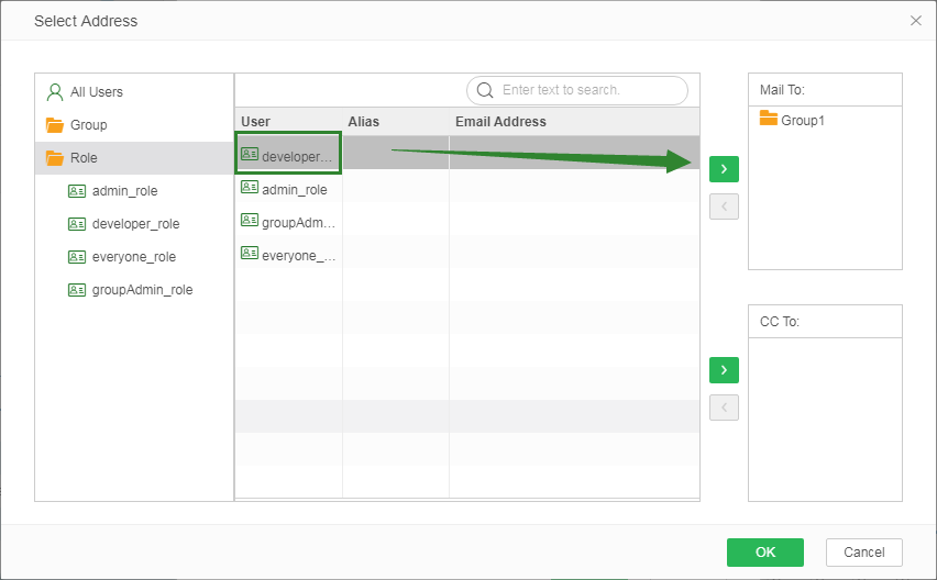
6. Return to the New Subscription dialog box. Click [Embed Image]. A line of characters "Image File?{Picture}" appears in the message area. The position of these characters represents the position of the picture in the body of the message.
7. Enter the email subject and message body, click [OK] to complete the subscription.
