|
<< Click to Display Table of Contents >> Create Dashboard |
  
|
|
<< Click to Display Table of Contents >> Create Dashboard |
  
|
❖Make Dashboard Template
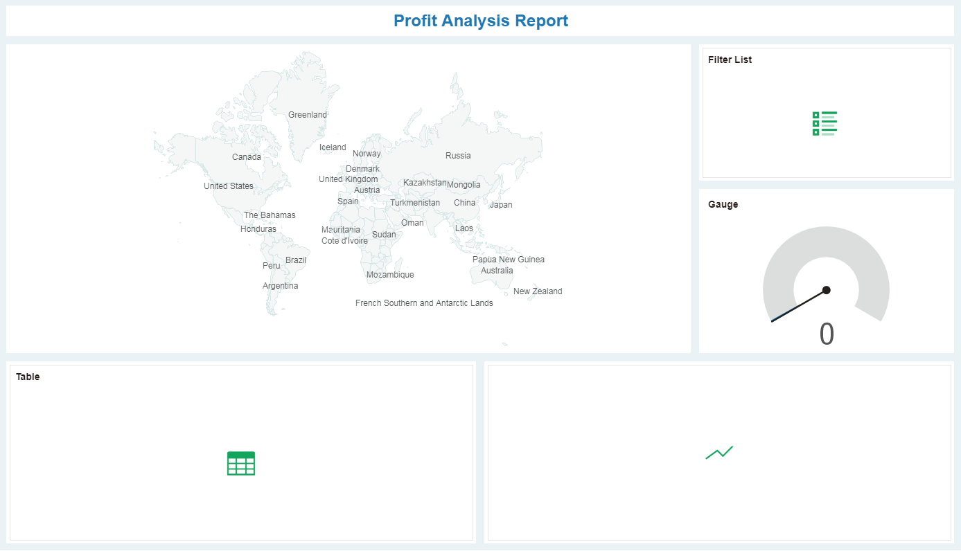
To produce the "Profit Analysis Report" in the example, you need a map, gauge, one-dimensional table, line chart, and list filter. Under the grid layout, you can drag and drop these components into the editing area to form a template.
1.Choose Theme
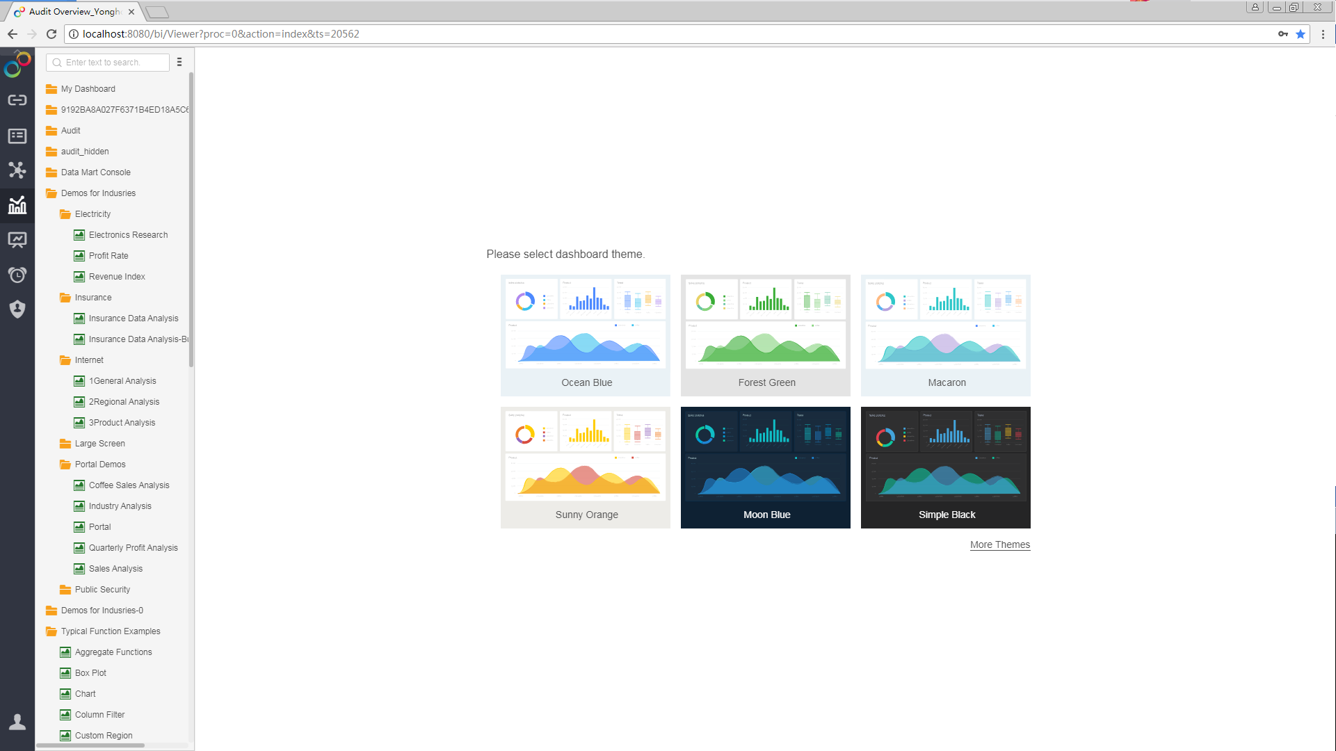
In Create Dashboard, select the Dashboard Theme -> [Ocean Blue].
2.Add a Title
1) From the component pane, drag and drop the "Text" component ![]() into the editing area to generate the text 1.
into the editing area to generate the text 1.
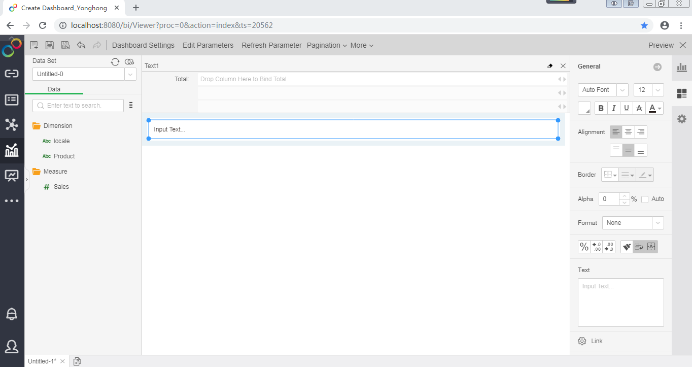
2) Double click to activate the text box and enter the dashboard title "Profit Analysis Report".
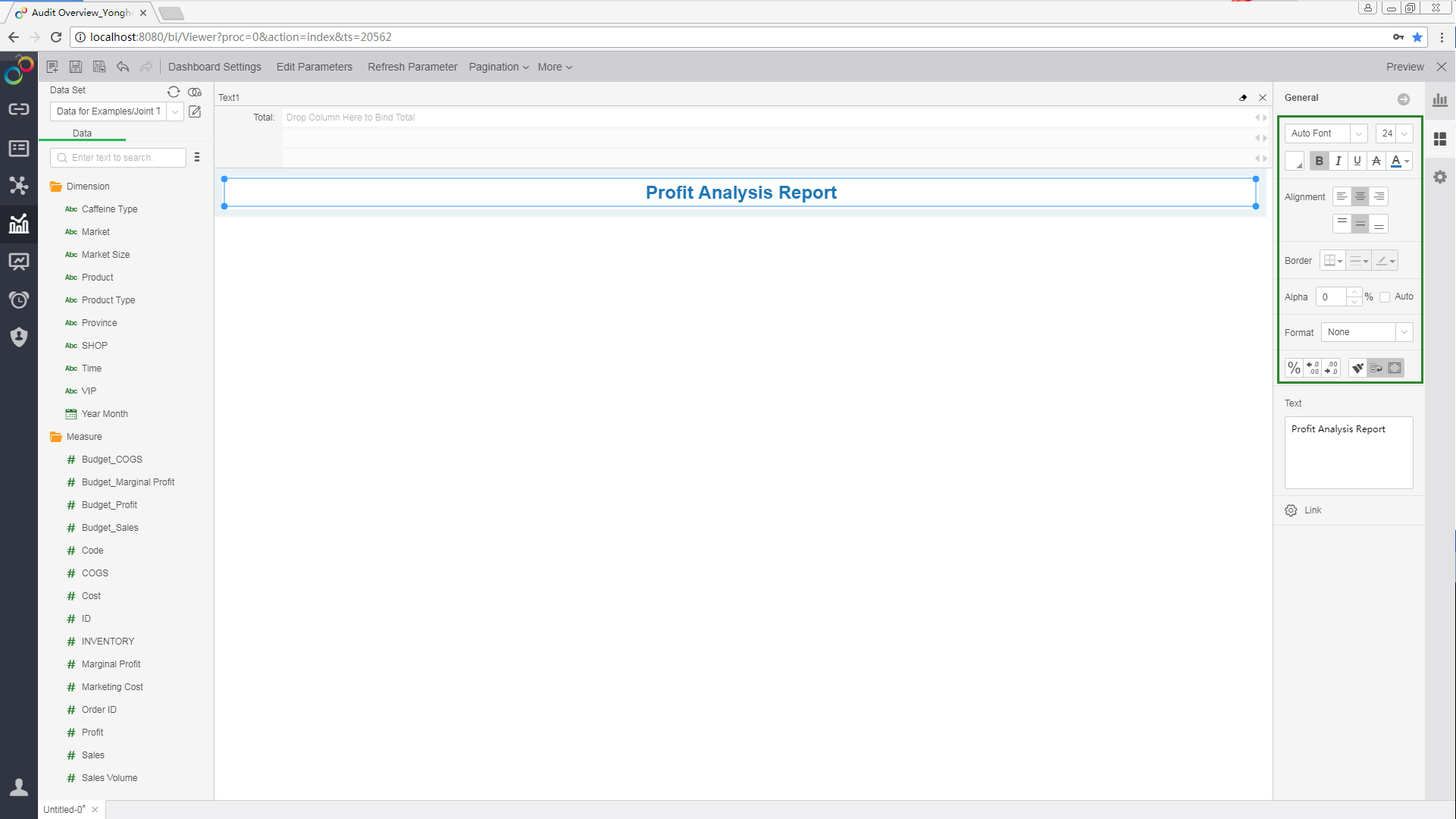
3) Select the title text, and set the format of the text in the General pane on the right: horizontally centered, centered on the top and bottom, no border line, font size as 24, bold style, and blue font color.
3.Add Map
From the Component pane on the right, drag and drop the "Map" chart![]() into the editing area to generate a chart 1 for subsequent generation of the map.
into the editing area to generate a chart 1 for subsequent generation of the map.
4.Add Gauge
From the Component pane on the right, drag the "Gauge" component ![]() to the right side of Chart 1 in the editing area to generate Gauge 1 for the subsequent generation of Profit gauge.
to the right side of Chart 1 in the editing area to generate Gauge 1 for the subsequent generation of Profit gauge.
5.Add Table
From the Component pane on the right, drag and drop the "Table" component ![]() below the chart 1 in the editing area to generate Table 1 for the subsequent generation of the schedule.
below the chart 1 in the editing area to generate Table 1 for the subsequent generation of the schedule.
6.Add Line
From the Component pane on the right, drag and drop the "Line" chart ![]() to the right of Table 1 in the editing area to generate Chart 2 for the subsequent generation of trend graph.
to the right of Table 1 in the editing area to generate Chart 2 for the subsequent generation of trend graph.
7.Add Filter
From the Component pane on the right, drag the "Filter List" component ![]() to above the Gauge 1 in the editing area to generate a list filter.
to above the Gauge 1 in the editing area to generate a list filter.
8.Edit Component Size
Mouse over the border of the component area, and drag and drop to change the size of the area.
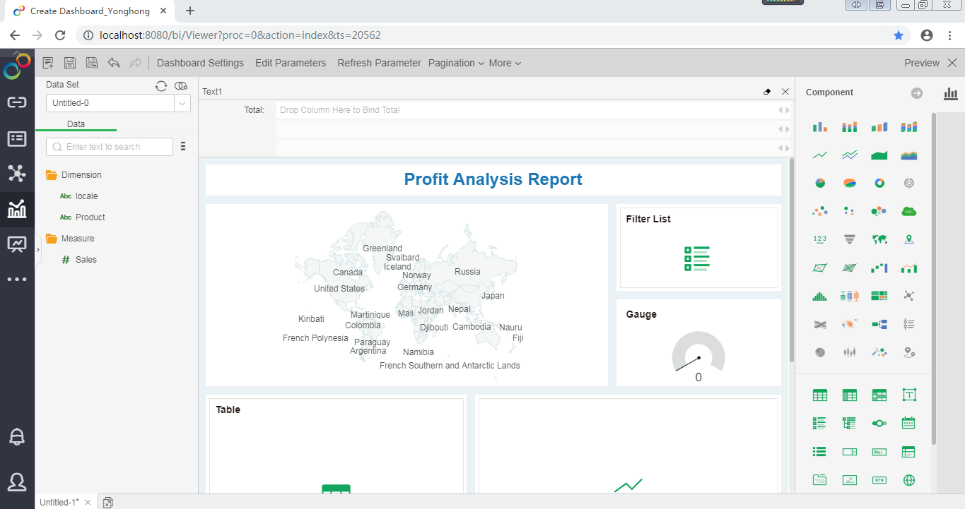
The dashboard template is generated as shown below.
❖Make Profit Map
When you count the profits of each region, it is very suitable for using maps. From the map, you can visually see which areas have outstanding profitability. At present, maps can display your regional data by "continent," "country," "province," "city," and "county."
This section continues to introduce you to the steps of creating a profit map using the saved data set “Joint Table of Chinese Coffee Data” on the basis of the profit analysis report template.
1.Generate A Map
1)With the chart 1 selected, in the "More" menu of the "Province" dimension in the data list, select [Convert to Map Column] -> [Yes].
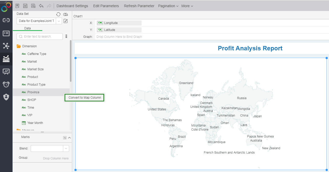
2)In the map column window, select the country "China" that you want to match, and select "Province" to display the data. Click "The data have not been matched" to match the province names in the data set with the built-in provinces in the software.
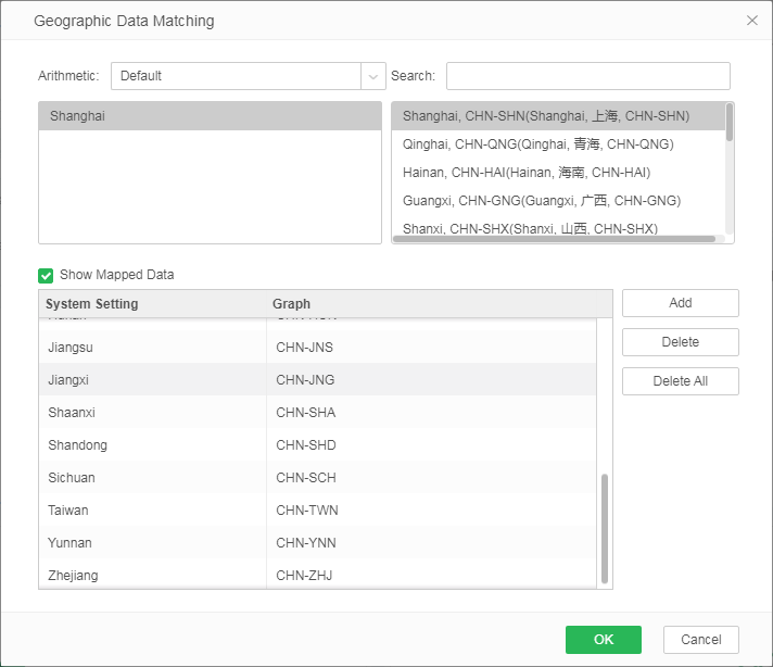
3)From the data list, drag and drop the dimension "Province" to the Chart 1 to generate a map.
2.Set Marks
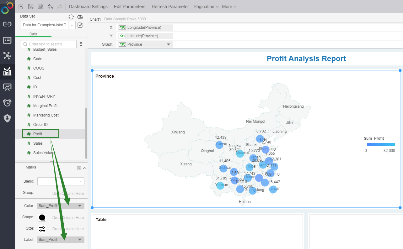
1)From the data list, drag the measure "Profit" to the Marks -> Color. Different profit amounts are displayed in different colors.
2)From the data list, drag and drop the measure "Profit" to the Marks -> Label and display the profit value of each mark on the map.
3.Map Rendering
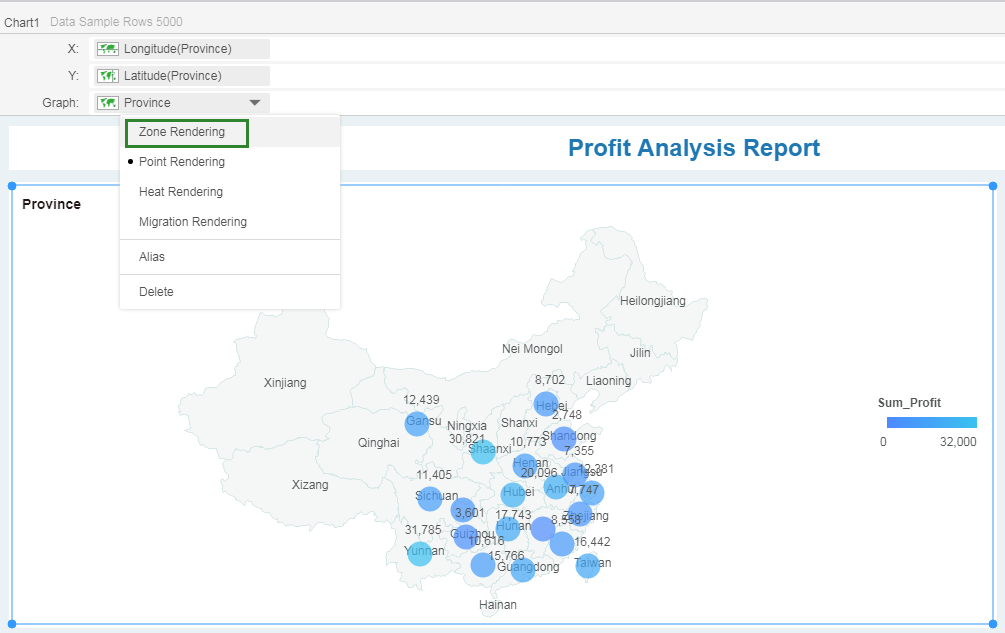
In drop down menu of the Graph field in the binding area, select [Zone Rendering].
4.Set Legend
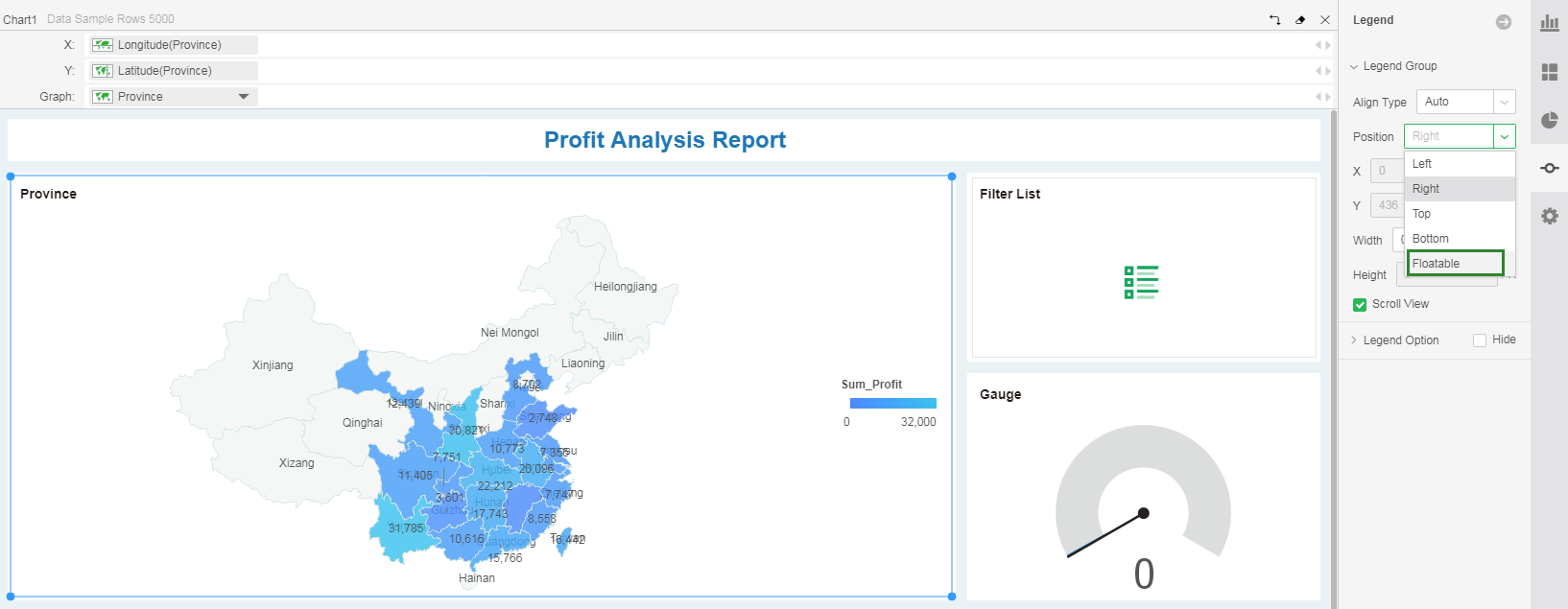
1)In the Legend pane, set the position of the legend to "Floatable" and set the position, width, and height of the legend.
2)In the right Legend pane, set Legend Title.
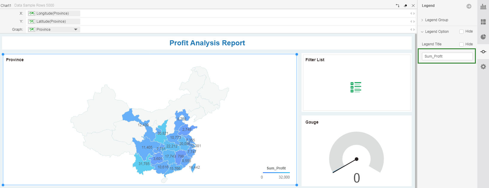
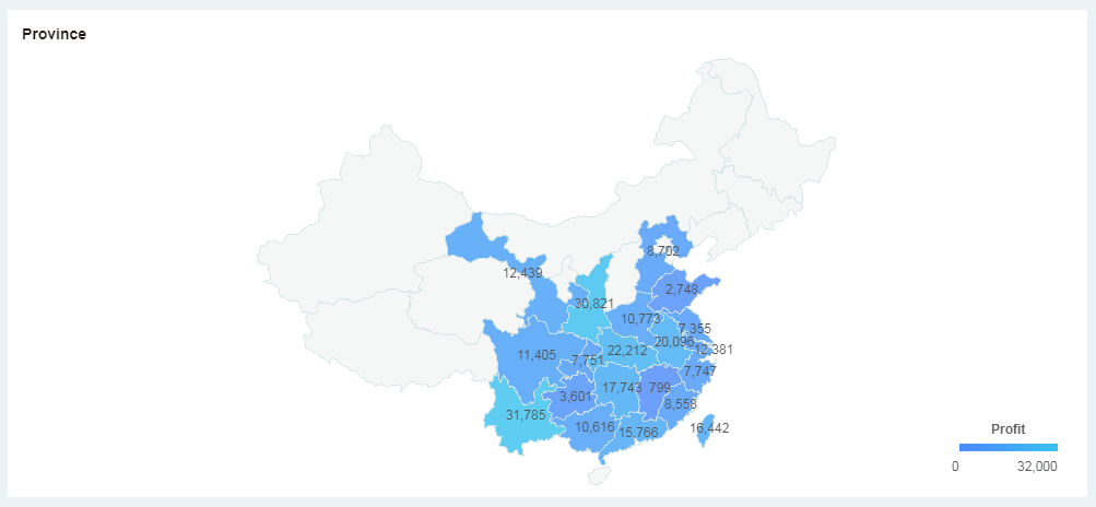
In the end you will get the following profit map:
❖Make Profit Gauge
Through the analysis of profit map, you understand the profitability of products in each region. However, how much profit did the products bring to the company in the recent two years? The gauge can help you to calculate the total profit in the past two years.
1.Generate A Gauge
From the data list, drag the measure "Profit" to the gauge area. At this point, the gauge shows the sum of all product profits.
2.Edit Gauge Title
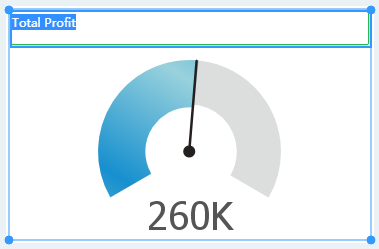
Double-click on the title area of the gauge component and enter the desired title, for example "Total Profit".
3.Set Title Format
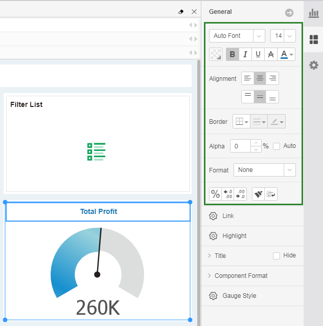
Select the title of the gauge. In the General pane on the right, set the local format: horizontally centered, centered on top and bottom, bold on 14th, blue font, no borderline, no background color.
4.Set Gauge Color
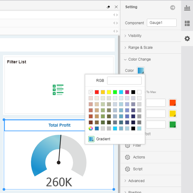
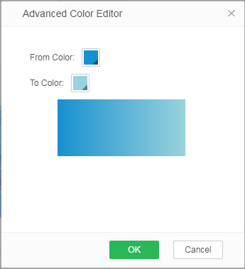
In the Setting pane, expand the Color Change and set the gauge's fill color. In this case, set the gradient color.
5.Set Gauge Style
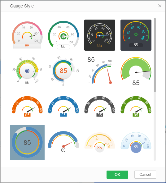
In the General pane, click Gauge Style to open a dialog to select your desired gauge style.
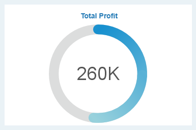
Finally, you will get the following total profit gauge. With this gauge, you can see the summary of the profit amount.
❖Make Profit Trend
The map shows the profitability of each region, and the gauge shows the total profit, but neither of these two charts can reflect the profit changes. If you want to understand whether a product's profit increases steadily or if there are major fluctuations within a certain period of time, and you can further excavate the cause, you need to make a trend chart. Trend charts can not only show data changes in past time, but also help you predict the future direction of profits. The more time your data covers, the more accurate the trend will be.
This section uses the product profit within two years as an example to show you the process of building a profit trend chart.
1.Generate A Trend
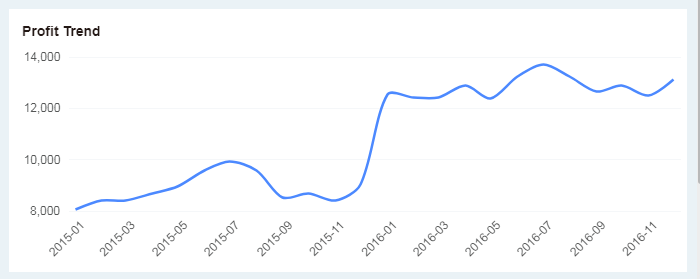
From the data list, drag the time dimension "Year Month" and the measure "Profit" respectively to the X-axis and Y-axis of the chart 2 to achieve data binding.

2.Set Trend Title
Double-click on the title area and type in the title as "Profit Trend."
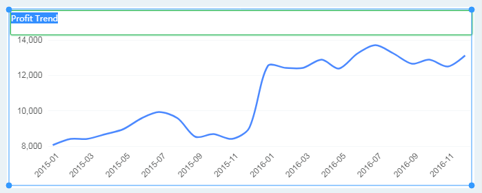
In the end, you will get the following line graph. It shows the changing trend of product profit within two years.
❖Make Profit Details
When the regions have higher profits and the profits increase steadily within two years, it seems that the profitability of the products is relatively optimistic. But are all products profitable? Are some products performing poorly in various markets? Profit schedules help you quickly find weaker products.
1.Generate A Details Table
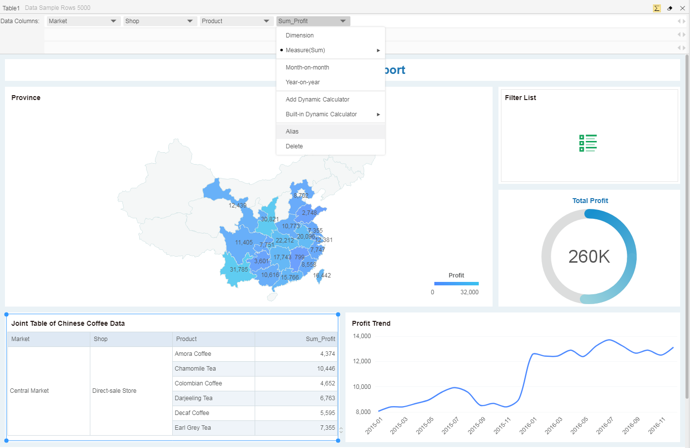
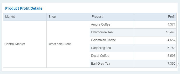
From the data list, drag and drop the dimensions "Market", "Shop", "Product" and the measure "Profit" to the table to achieve data binding.

2. Set Alias
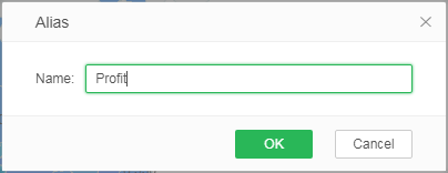
In the drop-down menu of the "Sum_Profit" field in the binding area, select the alias and set the alias to "Total Profit".
3. Set Table Title
Double-click on the title area, the title will be editable as shown in the figure below, and enter the new title “Product Profit Details”.
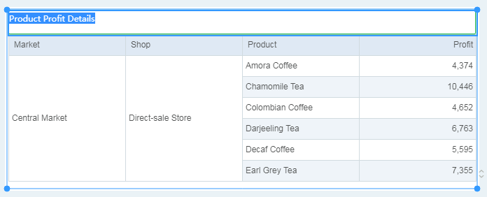
At this point, a profit details table was completed. With this details table, you can focus on specific products in a given market and check their profitability.
❖Add Filter
In your analysis of the data, you may have found that some products are profitable, and some products have poor revenue. Is this related to the market area? Are some products popular only in some specific markets? Are some products with higher upfront profits, but recent profits have fallen too fast? Through data filtering, you can filter out the required data information in one step, eliminate interference, and get answers.
Filtering components include filter list, filter tree, calendar, and range. This section explains how to add a filter list component to your dashboard to globally filter out the information you want.
1. Generate A Filter
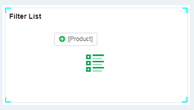
Drag and drop the dimension "Product" to the filter list area, as shown in the figure below, to achieve data binding and generate a product filter.
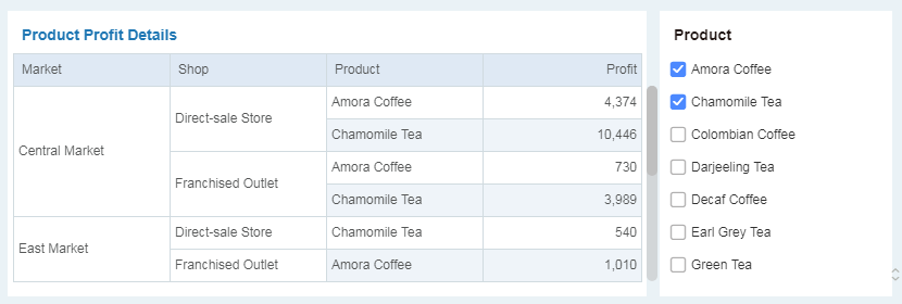
In the end, you will get the filter list as shown below. When you select one or more products, each chart on the dashboard filters and presents data for that product.
❖Save Dashboard
After the dashboard is completed, you need to save it. The saved dashboard can be analyzed and used in the View Dashboard module.
1. Click on the menu bar -> Save.
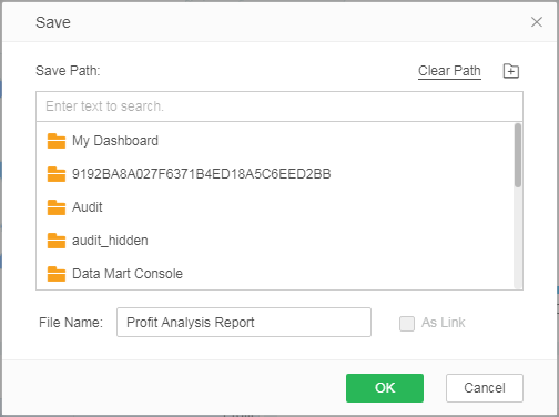
2. Select the save path and enter the dashboard name. After confirmation, the dashboard is saved successfully.
