|
<< Click to Display Table of Contents >> How to Do Concentration Analysis |
  
|
|
<< Click to Display Table of Contents >> How to Do Concentration Analysis |
  
|
Concentration analysis can usually use three forms: bubble, word cloud, and tree diagram. Bubble charts use the color, size, and number of bubbles to visually reflect the quantitative relationship of data in the dashboard. The word cloud diagram is similar to the bubble chart, and it is important for the keyword to be visually prominent, forming a “keyword cloud layer” or “keyword rendering”, thereby filtering out relatively insignificant information in large quantities and helping the viewer to find its key information. The rectangular tree diagram is an effective chart structure for the visualization of hierarchical structures. Take the statistics of product inventory as an example to show you how to use bubble to do concentration analysis.
1.Add Component
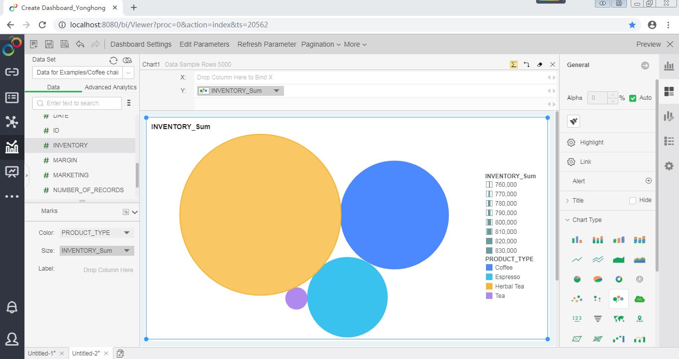
From the right Component pane, drag the bubble chart ![]() to the editing area.
to the editing area.
2.Bind Data
From the left data list, drag the measure "Inventory" to the Row axis and to Size in Marks area, and drag the dimension "Product Type" to Color in Marks area.

3.Hide Legend
From the Legend pane, choose the legend Sum_INVENTORY, and hide it.

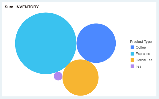
Finally, the following bubble diagram is obtained. Each color represents a product type, and the larger the bubbles, the more inventory of such products.
