|
<< Click to Display Table of Contents >> How to Make a Map |
  
|
|
<< Click to Display Table of Contents >> How to Make a Map |
  
|
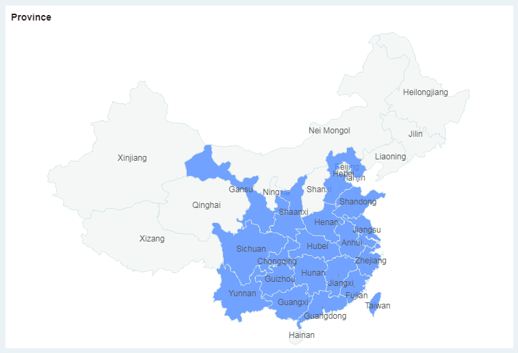
Maps visually display data from different regions. Users can use the map to count sales and other indicators in different regions. This section uses Joint Table of Chinese Coffee Data as an example to show you how to make a coffee sales map.
1.Add Component
From the right Component pane, drag the map chart to the editing area.
2.Convert to Map Column
In the left data list, select the dimension "Province" and in the "More" menu, select "Convert to Map Column".
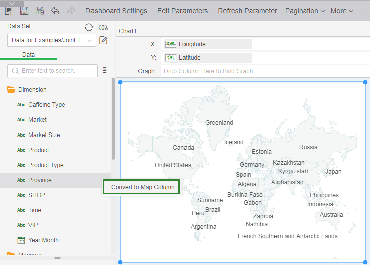
3.Match Geographic Information
1)In the Map Column dialog box, select "China" for geographic information and "Province" to display data.
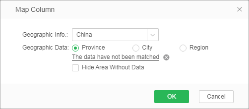
2)Click "The data have not been matched" to match the geographic information in the data with the geographic information in the product.
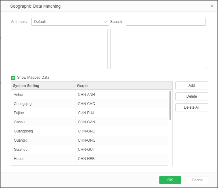
4.Bind Data
From the left data list, drag the map column "Province" to the map to generate map.
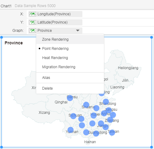
5.Set Map Rendering
In the binding area, open the operation menu of the "Province" field and select [Zone Rendering] to change the rendering mode of the map.
6.Set Label
From the list of data on the left, drag the measure "Sales" to Label in Marks area. The map will present sales data for each region.
