|
<< Click to Display Table of Contents >> Bubble Chart |
  
|
|
<< Click to Display Table of Contents >> Bubble Chart |
  
|
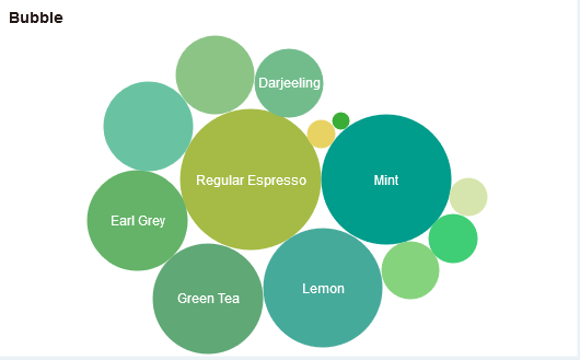
The bubble chart can reflect the quantitative relationship of the data in the dashboard with the color, size, and number of bubbles.
Bind the appropriate values to the color, size, and label fields of the mark group to generate bubble charts. Or bind the field to the Column or Row axis and click the icon in front of the field or through the right panel => General => Chart Type to convert to a bubble chart.
