|
<< Click to Display Table of Contents >> Grid Component |
  
|
|
<< Click to Display Table of Contents >> Grid Component |
|
❖Create a Grid Component
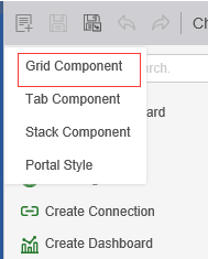
This product supports two methods to create a Grid Component.
1. Click the grid combination icon for the production portal.
2. Select the grid combination in the drop-down options for the New button.
❖Add content to a Grid Component
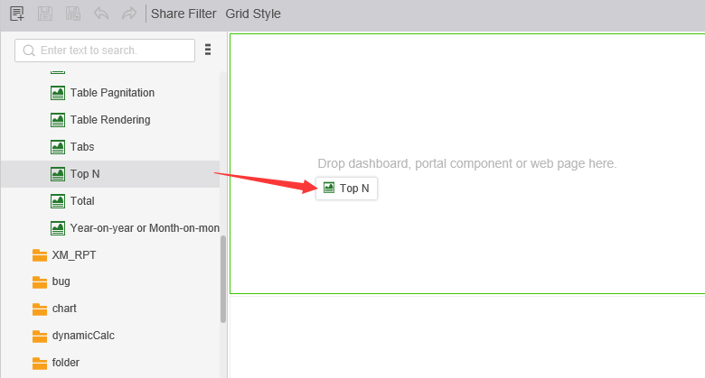
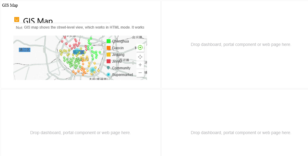
You can drag and drop dashboards, portlets, and web pages into the grid of grid components. Drag the TopN into the Grid Component from the Report / Typical Features Demo on the left as shown:
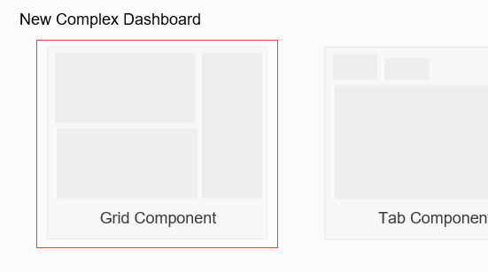
The Grid Component cell defaults to 2 rows and 2 columns, and the Grid Component is displayed as shown:
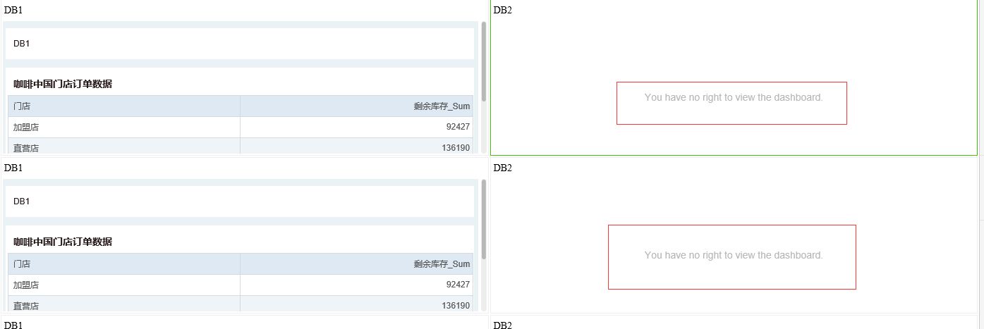
Permissions:
If the dashboard added in the Grid Component does not have permission to view the current user, the corresponding prompt will be displayed, as shown in the figure:
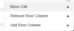
❖Right click menu
Edit the Grid Component by right-click menu operation. The right-click menu is as shown:
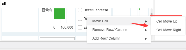
1.Moving cell
Used to adjust the position of the cell. Move the cell that binds the dashboard sales down as shown:
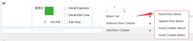
2. Add row/column, delete row/column
Used to add or remove cells within a Grid Component. Right-click on the selected cell to select the row/column of the add/delete cell. Add a row below the cell that binds the dashboard as shown:
❖Right Pane
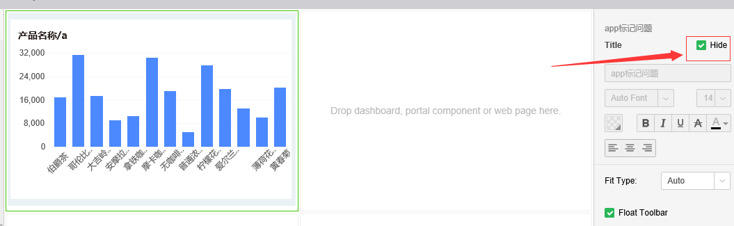
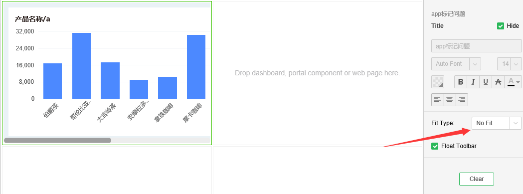
1. Hide title
Hide the title of the dashboard or Portal Component, or the URL of the page, with the title defaulting to the name of the dashboard. Hide the title of the dashboard as shown:
2. Float toolbar
The Float toolbar property is only displayed when the dashboard is bound within the Portal Component, and is suspended by default. Unsuspend the effect of the toolbar as shown:
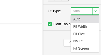
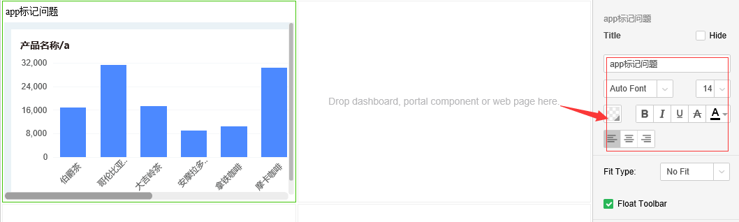
3. Fit type
This property is only displayed when the dashboard is bound within the Portal Component. This property controls the type of adaptation of the dashboard within the component cell. The default display is automatic, and the adaptive type is as shown:
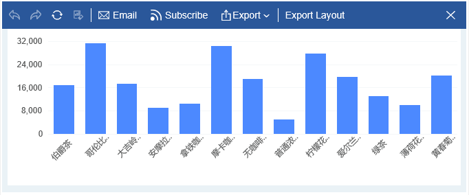
Select the adaptive type as No Fit and the dashboard will look like this:
4. Title style
In the title setting area of the Pane on the right side, you can set the title background color and font attributes, and the setting page is as shown:
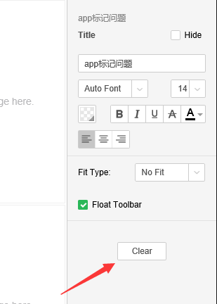
5. Clear
Empty the data bound in the cell. Select the cell that binds the data and click Clear as shown:
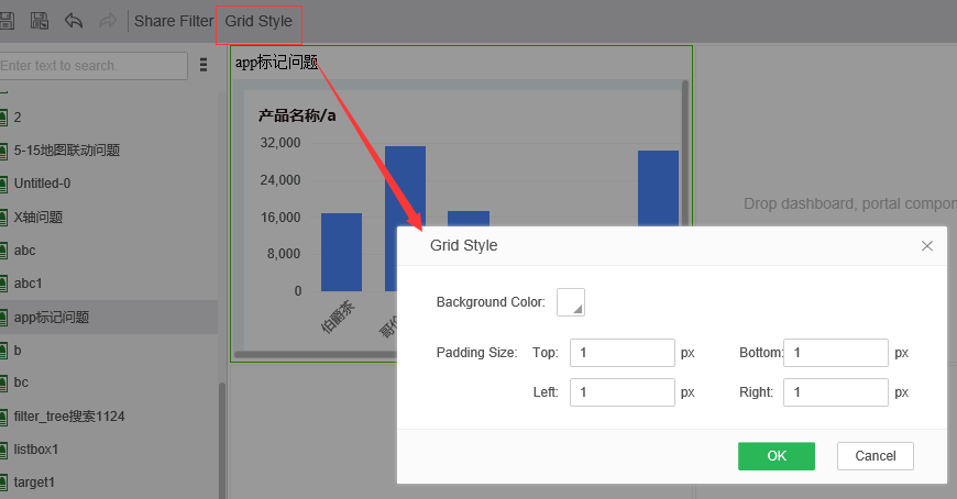
❖Grid Style
Click the grid style button on the toolbar above to set the background color and font properties of the grid. The settings page is as shown: