|
<< Click to Display Table of Contents >> Set Table |
  
|
|
<< Click to Display Table of Contents >> Set Table |
  
|
The table's settings panel allows you to set the table's component name, visibility, number of header rows, sorting strategy, sorting area, options, filters, actions, scripts, locations, and more.
Open Method: Select the table component and click the Setting in the right panel.
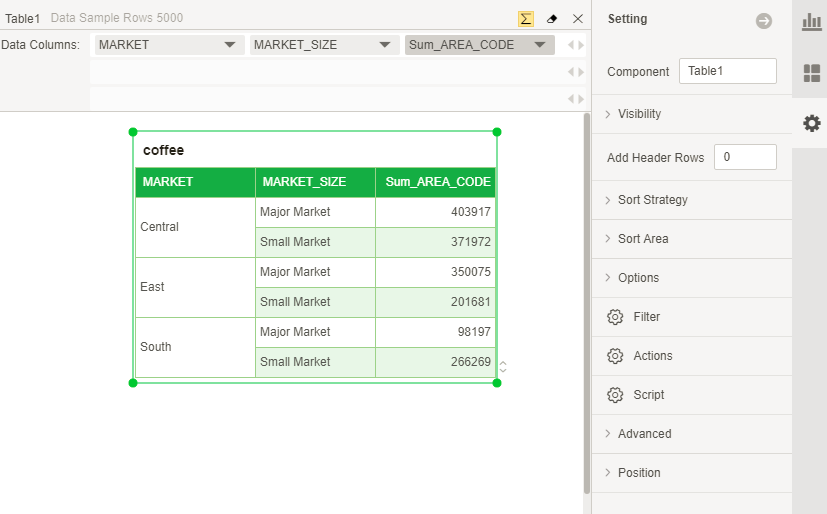
[Component Name] The name of the table component. The name is the identity of each component, so different components cannot have the same name.
[Visibility] When the user is set to be invisible, the table component is displayed in a semi-transparent state in the dashboard editing area, all operations of the table component are not affected, this table component is not visible in the preview and user portal, and Components are not displayed in the export file. When the user is set to be visible, this table component is visible in the dashboard edit area, preview, and user portal and is displayed in the export file.
[New header rows] The number of rows in the header. If you enter 3, the number of header rows is as follows:
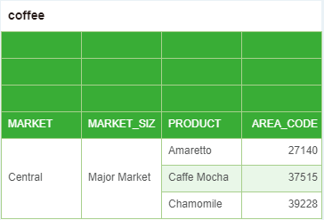
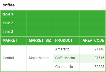
Double-click on the newly added header row number to enter the corresponding information, which can be used to help explain the information of the table bound field, see the following figure:
[Sort strategy] includes Sort By Multiple Columns, Sort By One Column, and Exclusive Measure Sort.
Sort By Multiple Columns:Sorting between fields does not affect each other.
Sort By One Column:The ordering of all fields is mutually exclusive, that is, only one field can be sorted.
Exclusive Measure Sort:Only sorting between metric fields is mutually exclusive, and has nothing to do with the sorting of dimension fields.
【Sort Area】includes Auto, Sort as Plain, and Sort as Group。
Auto:If the bound field is a hierarchical or grouped field, it is automatically sorted within the group; if the bound field is a discrete or non-grouped field, it is automatically sorted out of the group.
Sort as Plain:Sort as Plain means sorting outside the group.
Sort as Group:Sort as Group refers to sorting within the group, and there is no relationship between the fields of the group and the group.
For a detailed description of each sort type, see Table Sorting.
[Options] include Show Line Number, Fit Width, and Pagination.
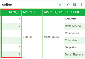
Show Line Number:Checking the Show line number option will display the line number of the form in the first column of the table component. As shown below:
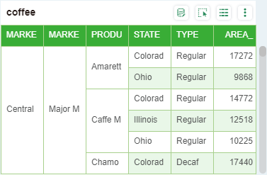
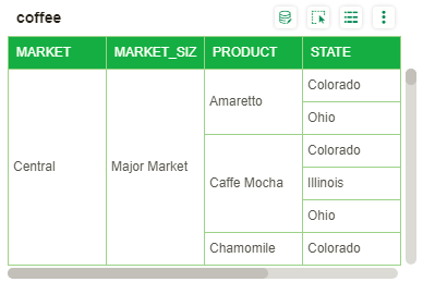
Fit Width:Check Fit Width: all the columns bound by the table will be displayed in the fixed range of the table component according to the average column width, and the content that is not enough to display will be hidden;Do not check Fit Width:If the average column width is >= 90px, the table will be displayed as it was. If the average column width is <90px, the table will be displayed at 90px per column width and a horizontal scroll bar will be displayed. The default is not checked.In the bi.properties configuration property to modify the default value, "table.properties.fitWidth = false" default value is false, which does not check Fit Width; when it is true, it means to select Fit Width.
➢For example, when the table is bound to 6 columns, check Fit Width. The effect is as follows:
Do not check Fit Width, the effect is as follows:
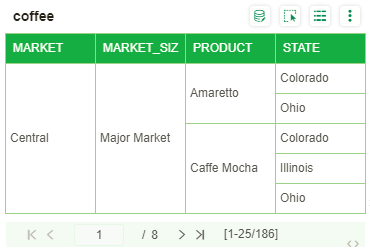
Pagination: After selecting the Pagination and selecting the Row(s) per page, the corresponding paging area will appear below the table component to display the current page data. The user can enter the page number to display the data of the current page, or click the previous page, the next page, the first page and the last page to perform the page turning operation, as shown in the following figure:
[Filter] Filtering of component data by setting filter conditions.
[Actions] View the operation supported by the report component through the Actions.
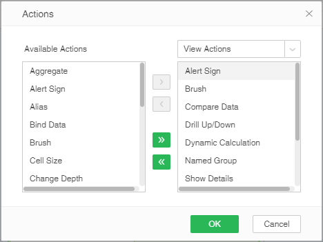
Available Actions: All operations that can be performed on the table component.
Analytic Actions: The configurable operation when the user enters the user portal module in the analysis mode.
View Actions: Configurable operation when the user enters the user portal module in preview mode.
Edit View Actions: The configurable operation when the user enters the user portal module in edit mode.
[Script] You can set scripts for components.
[Advanced] Including Refresh intervals, Not involved in data association, and Export detail data when export to Excel or CSV.
Refresh intervals: The user sets how often the table is refreshed. Assume that the refresh interval is 2 seconds. If the user changes the data in the data segment bound to the table in the query, the corresponding table will be refreshed once every 2 seconds in the preview mode or in the user portal. Update the data in the table.
Not involved in data association: When this option is checked, the current component is no longer affected by the linkage of other components, including: filtering effects of filtering components and the linkage effects of brush & scaling.
Export detail data when export to Excel or CSV: When check Export detail data when export to Excel or CSV, the output data details are displayed. The component is displayed in the export file and the component sheet is displayed in the exported Excel file. If this option is not checked, the component is not displayed in the export file, and the export is in Excel. The component sheet is not displayed in the file.
[Position] Modify the location and size of the components.
[Mobile] Including three options: "visible", "invisible" and "selectable". "visible" and "invisible" are mutually exclusive Settings. When "visible" is selected, the table will be displayed normally on the mobile, and when "invisible" is selected, the table will be hidden on the mobile.If "selectable" is checked ,the table which is not full screen state can click to be selected and then you can slide the table on the mobile