|
<< Click to Display Table of Contents >> Cell Render |
  
|
|
<< Click to Display Table of Contents >> Cell Render |
|
The Cell render can only be performed on numeric-type data. This property applies only to tables, pivots, and freestyle tables. The Cell render uses a histogram, number of charts, etc. to more visually describe the size of the data.
There are three types of The Cell render: Dynamic Render, User Defined , and Pre Defined. The Pre Defined includes Bar, positive and negative Bar, Shape, positive and negative Shape, Image, Slash, Traffic Light, and Ups and Downs.
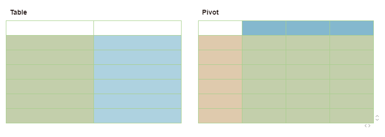
The Cell render area in the table is the column (excluding the column header). The role of the the Cell render in the pivot is the row header, the list header and the data area.The Cell Render in the freestyle table is set in the cell that can be the table and can also be the pivot.
❖Instructions
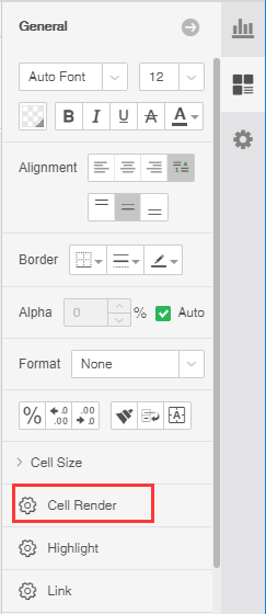
1. Set up the Cell Render
Select the area of the Cell Render on the table, pivot, or freestyle table, and click General - Cell Render on the right panel.
2. Exit the Cell Render
In the right pane, select the Cell Render. In the Cell Render dialog, select No Render. The corresponding area in the grid exits the Cell Render mode. As shown below:

❖Functional introduction
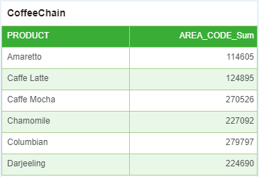
Assume that the data in a data source is as follows:
The Dynamic Render means that the user achieves the purpose of rendering a table by writing a script. When the user selects Dynamic Render, the script in the table dialog is active, and the user can edit the script here.
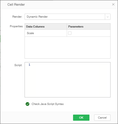
The user can return the picture through the script. There are two ways to return the picture. One is that the user constructs a chart, and the other is to refer to an existing picture through a URL.
For a detailed description of the construction of the chart, see the “Table Render Script” chapter in Yonghong Scripting Manual.
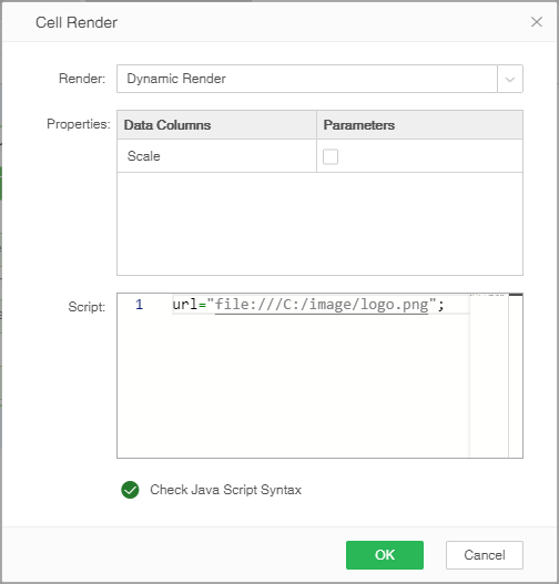
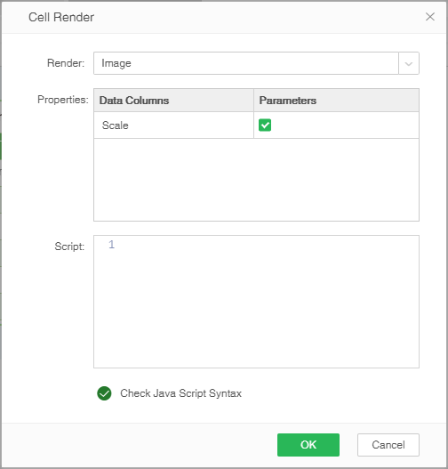
When referring to an image via a URL, the user can refer to a local picture or refer to a picture on the network. As shown in the figure below, refer to the local image. Note that you need to add "file:///" before the path.
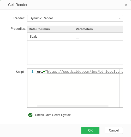
Refer to the pictures on the network as shown below.
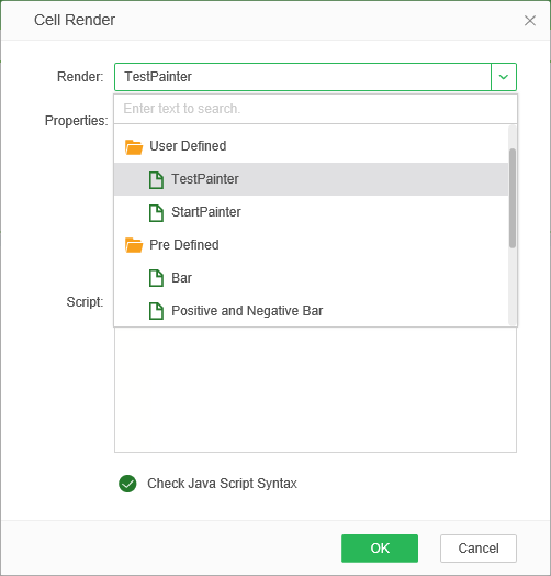
Users write java files and create renders.xml files in bihome, then display User Defined under custom folders in the Cell Render dialog.
•Pre Defined
The Pre Defined supports the following rendering methods:Bar, positive and negative Bar, Shape, positive and negative Shape, Image, Slash, Traffic Light, and Ups and Downs.
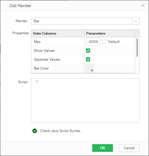
Select Bar in the Cell Render dialog to set the maximum value (Check the Maximum value for all the data in the render column when you check Automatically, enter the maximum value manually when not checked), Display the value and separate tags, Script Is gray, script input is not supported.
Support for displaying values in Bar, positive and negative Bar, Shape, positive and negative Shape. The value display function can be configured in properties by "render.value.calc.rows", if not configured. The length of the character is calculated, up to a maximum of 1000, which is half of the square.
After the above operations are performed on the data source, the effect is as shown in the following figure:
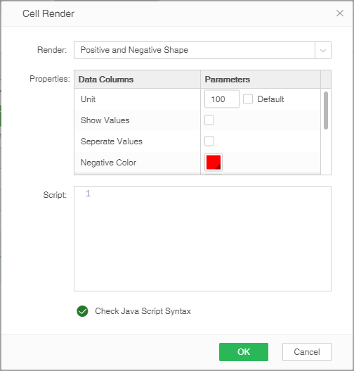
In the Cell Render dialog, select Positive and Negative Bar. You can set the property to include the max (checking the max for default is to set the maximum value of all data in the render column, manually input the max when not checked), show values, Separate values, negative color, target value, target line style, target line color. The script is grayed out, script input is not supported, and Positive and Negative Bar supports adding target lines.
The max is the maximum value of the data in the table. For example, the max is 100. If the positive data in the table is greater than 100, this data is treated as 100. When the negative data in the table is less than -100, the data is Treat it as -100; the target value is the value of the position of the target line on the axis; the target line style and the target line color are the settings of the target line style and color, respectively; the negative color is the negative value of the table Pillar color drawn.

After performing the above operations on the data source, the effect is as shown in the figure below: The size of the positive data is described by the length of the light gray column bar, and the length of the red bar is used to describe the size of the negative data. The yellow thin line is Set the target value, the effect is as follows:

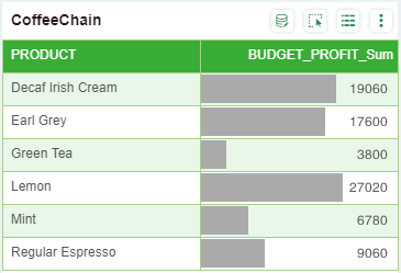
Shape supports only positive numbers, and the number of shapes is determined based on the number. If there are decimals in the data, the pentagrams are displayed proportionally. If 2.5, two and a half stars are displayed. Only five-pointed stars are supported as shapes. The user can change the color of the five-pointed star by setting the background color in the partial format, and control the number of five-pointed stars by calculating the unit. If the current data is 2000 and the unit of calculation is 200, the number of pentagrams displayed is the data obtained by dividing the current data by the unit of calculation and should display 10 pentagrams.
After the above operations are performed on the data source, the effect is as shown in the following figure:

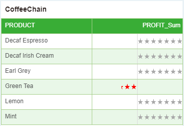
Positive and negative shape supports positive and negative numbers, and the number of shapes is determined based on the numerical value. If there are decimals in the data, the pentagrams are displayed proportionally. If 2.5, two and a half stars are displayed. Only five-pointed stars are supported as shapes. Set the background color in the local format to change the color of the pentagram, set the negative color to set the color of the negative pentagram, and calculate the unit. If the current data is 2000 and the unit of calculation is 200, the number of pentagrams displayed is the data obtained by dividing the current data by the unit of calculation and should display 10 pentagrams.
After the above operations are performed on the data source, the effect is as shown in the following figure:
If the data in the query is the address of the picture, after the data is bound in the dashboard and the picture rendering is selected, the picture will be displayed in the current table. The data in the query is the address of each picture, as shown in the following figure:
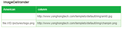
Use image rendering in the American column and column column respectively, as shown below. When the user selects the zoom option, the chart is displayed according to the scale of the grid. When the zoom is not checked, the image is displayed according to the original proportion.
After the picture is rendered, it looks like this:

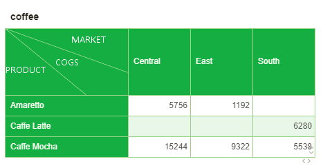
The rendering method is more meaningful in the header of the pivot. The user selects the junction area in the first row of the first column of the crosstab, right-clicks the selected table to render, and the selected rendering format is slash , as shown in the following figure:
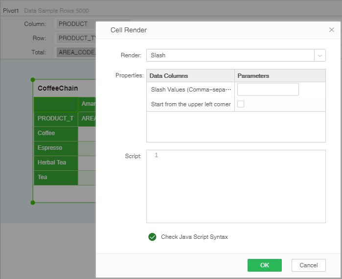
[Slash Values (Comma-separated]The content of the header is divided by the "," in English format.
[Start from the upper left point] When checked, the starting point of the slash is the upper left point of the form, and when not checked, the lower right point.
Note that when the content contains Chinese, the user needs to set the font type in the table, which is generally set to Song.
After clicking the OK button, the effect is as follows.
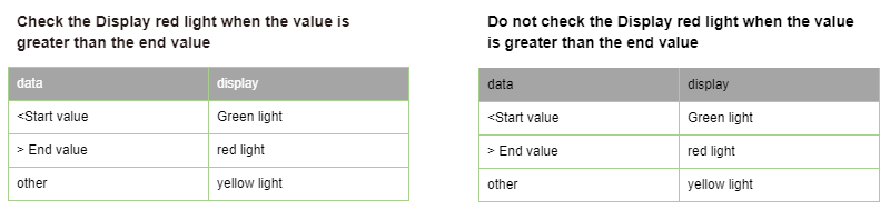
In the Cell Render dialog, select traffic light to support the show values, start value, and end value. If the value is greater than the end value, the red light is checked, and the custom settings for the red, yellow, and green lights are supported. The script is grayed out and script input is not supported.
Checking the show values means to set the value of the data to be displayed at the same time after rendering. Otherwise, only the rendering will be displayed, and the value will not be displayed. The starting point value and the end point value will divide the data into three segments. First, the data is smaller than the starting point value, and the second is greater than or equal to the starting point. The value is less than or equal to the end value of the data, and the third is greater than the value of the end value.
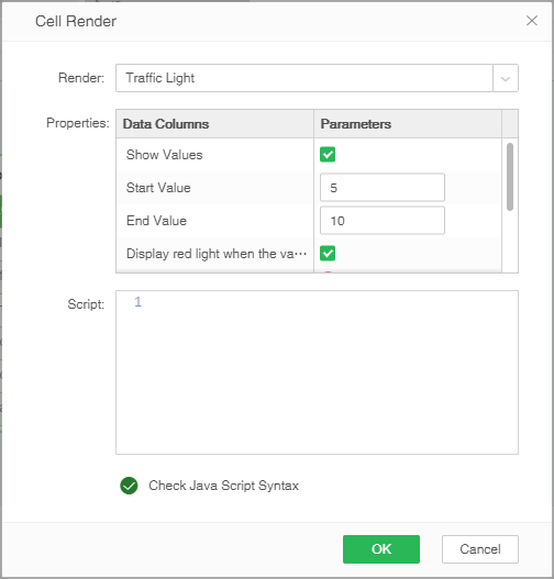
For example, the data with the ID of 1 to 15 has a start value of 5 and an end value of 10, and the options for the Display red light when the value is greater than the end value are checked. The configuration is as shown in the following figure:
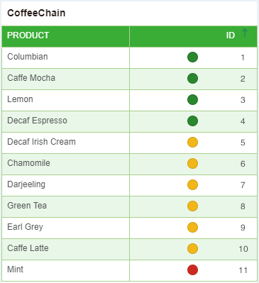
After the above operations are performed on the data source, the effect is as shown in the following figure:
Users can also set traffic light-rendered pictures as needed. The operation is as follows:
In the Cell Render dialog, under the traffic light rendering, select the red, yellow or green light picture, click the pop-up pattern editor, as shown below:
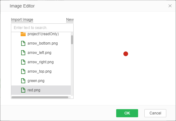
On the picture list, the user can select the picture as needed. You can also click the import image to import the image and set it as a traffic light-rendered image.
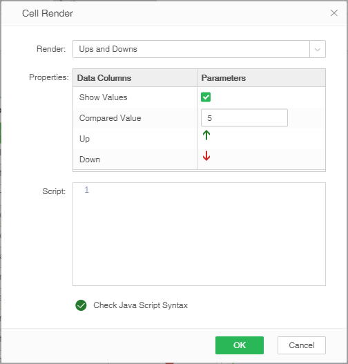
In the Cell Render dialog, select Ups and Downs to support the show values, the Compared value, and the Up and Down. The script is grayed out and script input is not supported.
Checking the show values means that the value of the data after rendering will be displayed at the same time. If it is not checked, only the rendering will be displayed, and the value will not be displayed. The Compared value represents the rising and falling reference standard. Data that is less than the comparison value is shown as falling, and data that is greater than or equal to the comparison value is shown as rising.
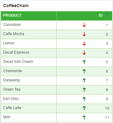
➢For example, if the ID is from 1 to 15, set the comparison value to 5 and check the Show Values option. The configuration is as shown in the following figure:
After the above operations are performed on the data source, the effect is as shown in the figure below: That is, values less than 5 are displayed as falling, and values greater than or equal to 5 are displayed as rising.
Users can also set Ups and Downs's image as needed. Operation with traffic light rendering.
❖New features in version 9.0
Table rendering support parameters
In the table rendering dialog, parameters or parameter components are supported where specific values are set, as shown in the following figure: the maximum value and target value of columnar rendering can be selected from the drop-down box:
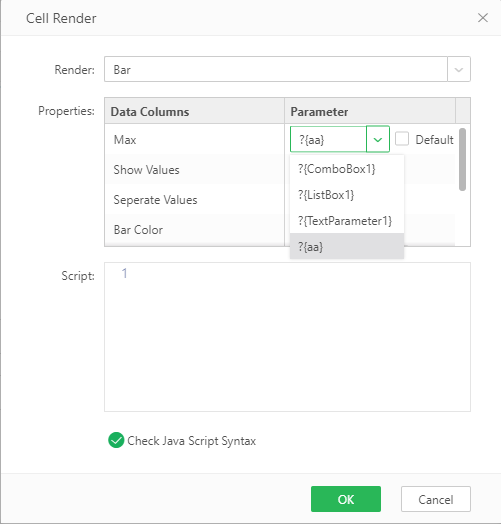
When a parameter or parameter component is used in table rendering, the latest parameter value will be used to refresh the rendering effect after the parameter value is changed or the parameter component value is switched.
Note: the data type of the parameters used in the table rendering dialog must be numerical.