|
<< Click to Display Table of Contents >> Specify Trained Model |
  
|
|
<< Click to Display Table of Contents >> Specify Trained Model |
  
|
In create dashboard, the user can apply the advanced analytics model generate new fields, and apply these fields for visual analysis. This section uses the K-Means clustering model as an example,The application of other training models can be found in the advanced algorithm =>Advanced Analysis Experiments and Applications chapter and its subsections.
➢For Example
In the advanced analysis, the K-Means clustering node is selected and saved as a training model. It is determined that the saved model can be applied to the data set bound to the component in the dashboard that create dashboard.
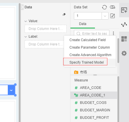
1. In the dashboard, in the dataset where the component is bound, click the More button and select Specify Trained Model :
2. Opens the Specify Trained Model dialog, where only the models that can be applied to this bound data set are displayed.
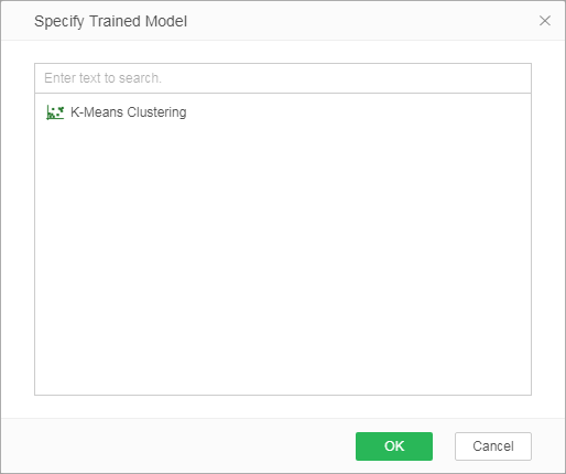
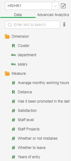
3. Select the saved training model "K-MeansCluster1" and click OK to generate 2 columns, Clusters and Distance. Cluster: The result of cluster classification, located in the dimension; Distance: The distance between this point and the centroid is in the measure.
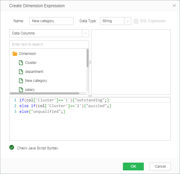
4. Based on the results of the application model, create a new dimension expression and rename the three categories as follows:
5. As shown below, the data is bound to the chart component and the chart type selects the line chart.
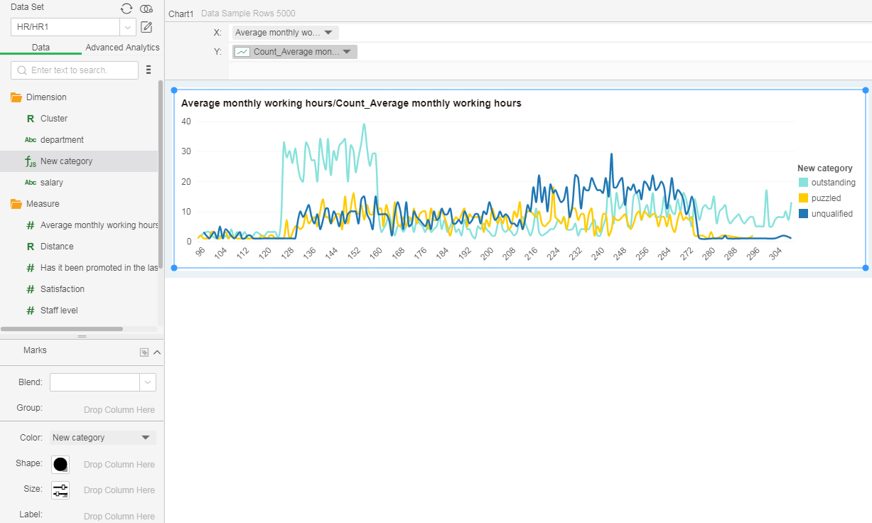
6. Set the dynamic calculator on the y-axis field: percent of total; remove the points on the marker, and modify the size to get the following result graph; as you can see from the figure above, the unqualified person's working duration is concentrated on the left (lower) , The puzzled person has the longest working hours, and the outstanding is the next.
