|
<< Click to Display Table of Contents >> How to Do Trend Analysis |
  
|
|
<< Click to Display Table of Contents >> How to Do Trend Analysis |
  
|
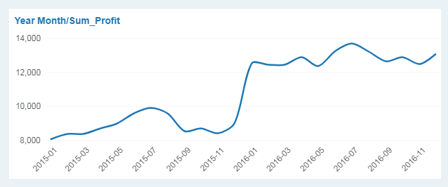
Trend analysis usually uses line chart. Line chart can display continuous data that change over time and are therefore ideal for displaying trend in data at equal intervals. In the line chart, the dimension is evenly distributed along the horizontal axis, and the measure is evenly distributed along the vertical axis. Take the change in product profit within two years as an example to introduce you how to make the trend analysis.
1.Add component
From the right Component pane, drag the line chart ![]() to the editing area.
to the editing area.
2.Bind Data
From the left data list, drag the dimension "Year Month" to the Column axis, and the measure "Profit" to the Row axis to get the trend graph.

3.Set Chart Title
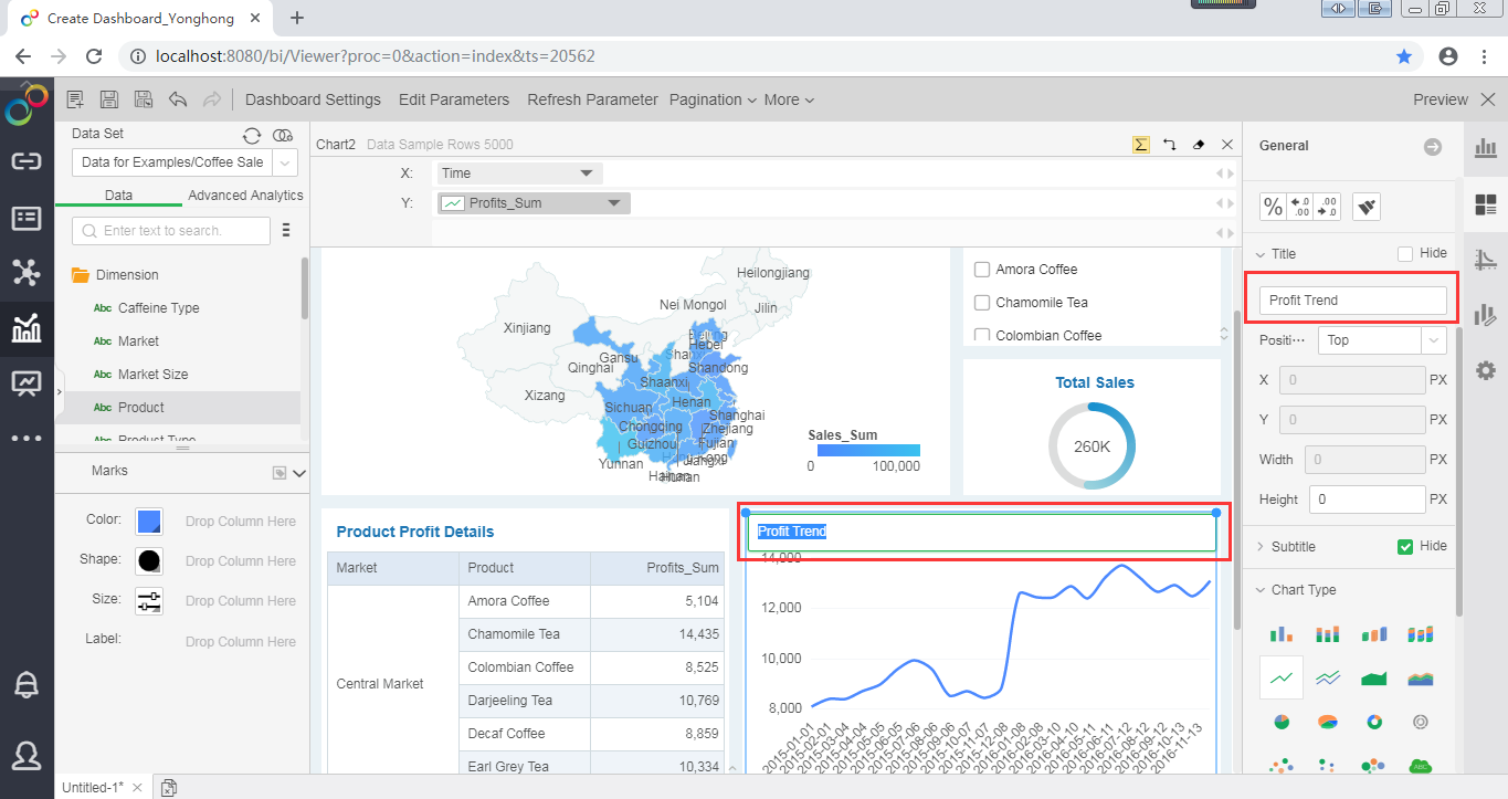
Select the component and click on the General pane on the right. In the title area, enter the new title "Profit Trend." You can also double-click the title area to change the title.

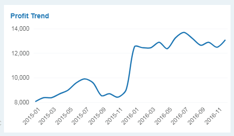
Finally get the following trend chart:
