|
<< Click to Display Table of Contents >> Heat Map |
  
|
|
<< Click to Display Table of Contents >> Heat Map |
  
|
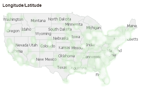
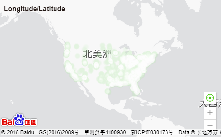
Heat map, support for custom base map display (Point Chart), heat rendered map (autonomous maps and GIS maps). The heat map use a progressive color band to display, and can simply aggregate a large amount of data. The final effect is generally better than the discrete points‘ direct display , which can intuitively show the degree of density or frequency of spatial data.
❖Create HeatMap
•Custom base map
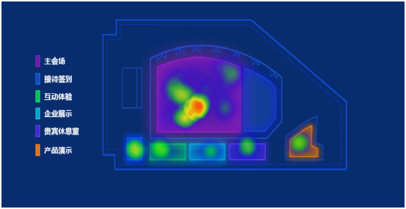
Bind the appropriate field on the X-axis Y-axis; or bind the data, click on the icon in front of the binding field, or the chart type in the field drop-down menu to convert it into a heat map to create a heat map. When using a heat map, a background image is usually added to the component to illustrate the analyzed scene.
•Heat Rendering
oPositioning by map column
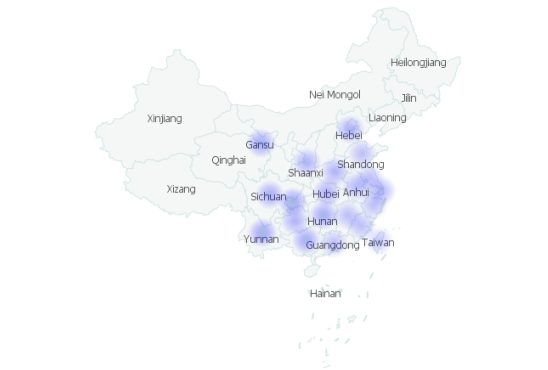
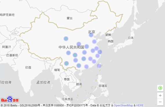
After binding the map column, open the drop-down list of the bound field and convert it to heat rendering.
oLatitude and longitude positioning
After latitude and longitude are bound, the drop-down list of bound fields is opened and converted to heat rendering.
❖Heat Effect
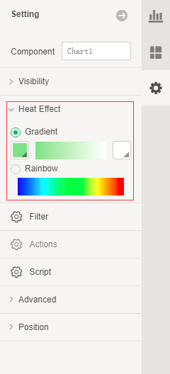
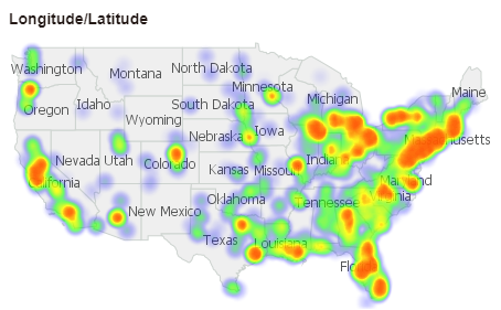
Here are two forms of heat effects display: Rainbow heat display, custom gradient heat display. Select the heat map and click the heat effect in the right-click menu to open the heat effect dialog box. Users can set the desired heat display effect according to their own needs.
Rainbow Heat Show:
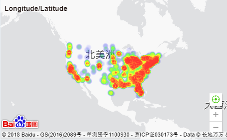
Custom gradient heat display (set the color gradient from green to blue):
