|
<< Click to Display Table of Contents >> Stack Component |
  
|
|
<< Click to Display Table of Contents >> Stack Component |
|
❖Create a stack component
This product supports two methods to create a stack component.
1. Click the stack component icon on the portal home page.

2. Select the stack component in the drop-down options for the New button.

❖Add content to the Stack Component
You can drag and drop dashboards, portlets, web pages into Stack Components. Drag the web icon from the left toolbar to the Stack Component as shown:

Pop up the web page dialog box and enter the URL "www.yonghongtech.com" in the input box.

The display of the URL on the Stack Component is as shown:

Permissions:
If the content added to the stack has no permissions for the current user, the corresponding prompt is displayed:

❖Right Pane and right click menu
The Stack Component is edited by the right Pane and right-click menu operations.
The right-click menu allows you to edit the URL of the web component as shown:

Pane on the right
1. Hide title
Hide the title of the dashboard or portlet as shown:

2. Clear
Clear the bound data. as the picture shows:

❖Tag attribute
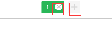
1. Add / delete options
You can add options by clicking the "+" icon after the option. The “X” icon suspended on the label removes the current option. as the picture shows:
Up to 15 options are supported on the Stack Component interface. When there are more options, the stack styles "<", ">" are used for selection. as the picture shows:

2. Option sort
The mouse drag option can sort the options, the content of the options will switch to the drag position, but the name of the option will not change, for example: drag and drop option 3 to option 2, then the content in the original option 3 moves In option 2, the contents of option 2 are moved back.
3. Stack style
You can set the stack style by clicking the stack style button on the toolbar above.
After clicking the stack style, the stack style dialog pops up, and you can select the style of the stack icon. as the picture shows:
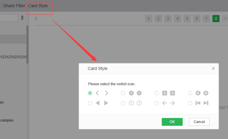
Select the second style and it looks like this:

❖Stack Component display
In order to make the portal home look more beautiful and more convenient to use, the stack is combined in the display of the portlet and portal styles. as the picture shows:

The stack style is shown in the middle, and the dot of the option is shown below. You can toggle the options by clicking on the stack style and the dots below.