|
<< Click to Display Table of Contents >> Custom Theme |
  
|
|
<< Click to Display Table of Contents >> Custom Theme |
  
|
The system provides powerful customization. Users can customize the dashboard theme style.
❖New/edit theme
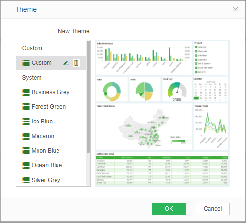
1.In the theme dialog, select a theme and click on the "New Theme" or "Edit" button to enter the custom theme page. The editing function is only available when selecting a custom theme. The editing button is invisible when the system theme is selected.
2.At the top left of the page, set the name of the new theme.
3.Select the element to be set in the list of theme elements on the left, that is set the style of the element and preview the style effect.
Theme elements are divided into global formats, chart formats, and other formats. We will explain the setting items for each element in detail later.
4.After setting, select "Save" to save all the current format changes made in the theme edit page. If the theme is a new theme, save it as a new custom theme with the name in the name column as the name. You can also select "Save As" to enter a new name in the pop-up Save As dialog box and save it as a new topic.
❖Set custom theme elements
•Global formats
The global formats tab can configure the overall format of the dashboard. Specific configurable options are described in detail next.
ofont setting
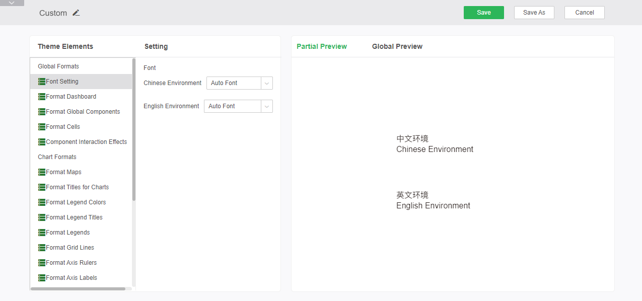
Here you can set the font for the dashboard in both Chinese and English. You can click on the drop-down list to select the font. You can preview the effect and the global effect in the preview area on the right.
oFormat Dashboard
Set the overall format of the dashboard, including the border and background.
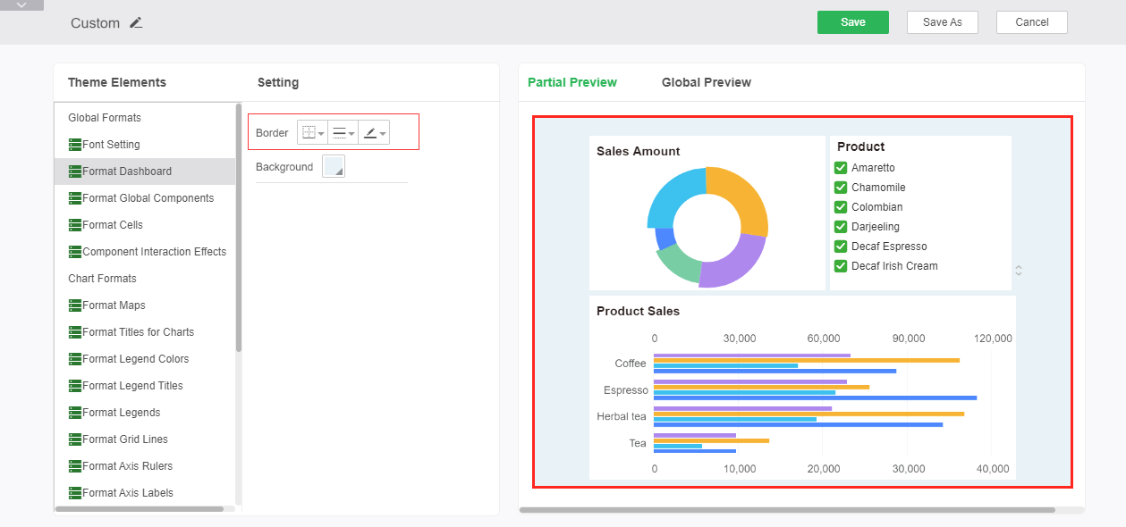
Border: Sets the position of the dashboard's border line, the style and color of the line.
➢For example: Add a bold red full border to see the display effect in the preview area, as shown in the figure:
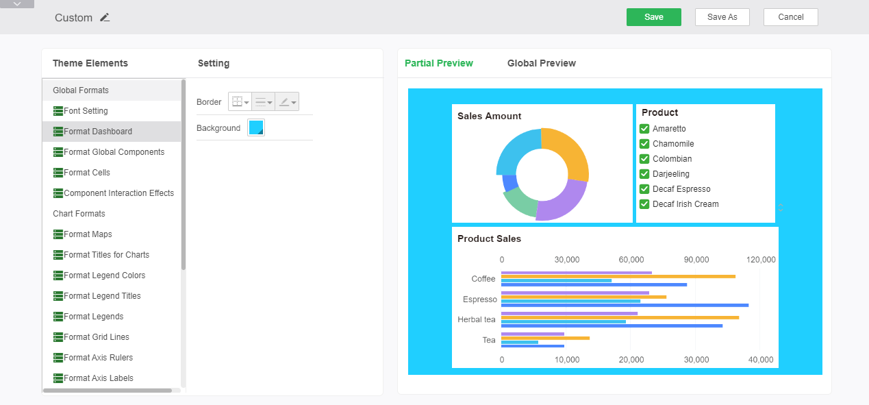
Background: Setting the background color of the dashboard, including single-color, two-color, gradient, and picture of the color, can all be changed through the drop-down box, and the color change can be viewed in the color preview area in real time.
➢For example: to add a blue background, you can see the display effect in the preview area, as shown in the figure:
oFormat Global Components
Set the format of tables, charts, and other components, including borders, backgrounds, and alpha.
Border: Sets the position of the component's border line, the style and color of the line. Invalid for tables and gauge components.
➢For example: Add a red dotted border, the display effect as shown:
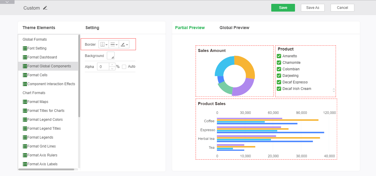
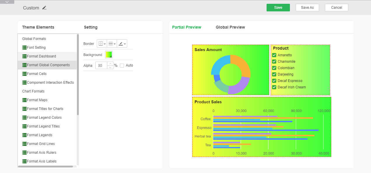
Background: Setting the background color of all components, including single-color, two-color, gradient methods, and pictures, can be changed through the drop-down box, and the color change can be viewed in real-time in the color preview area.
Alpha: Sets the transparency of the component's background color.
➢For example: Add a two-color background and 30% transparency, show the results as shown:
oFormat Cells
Set the style of the dashboard when the dashboard property is selected as smart layout. Includes borders, backgrounds and alpha.
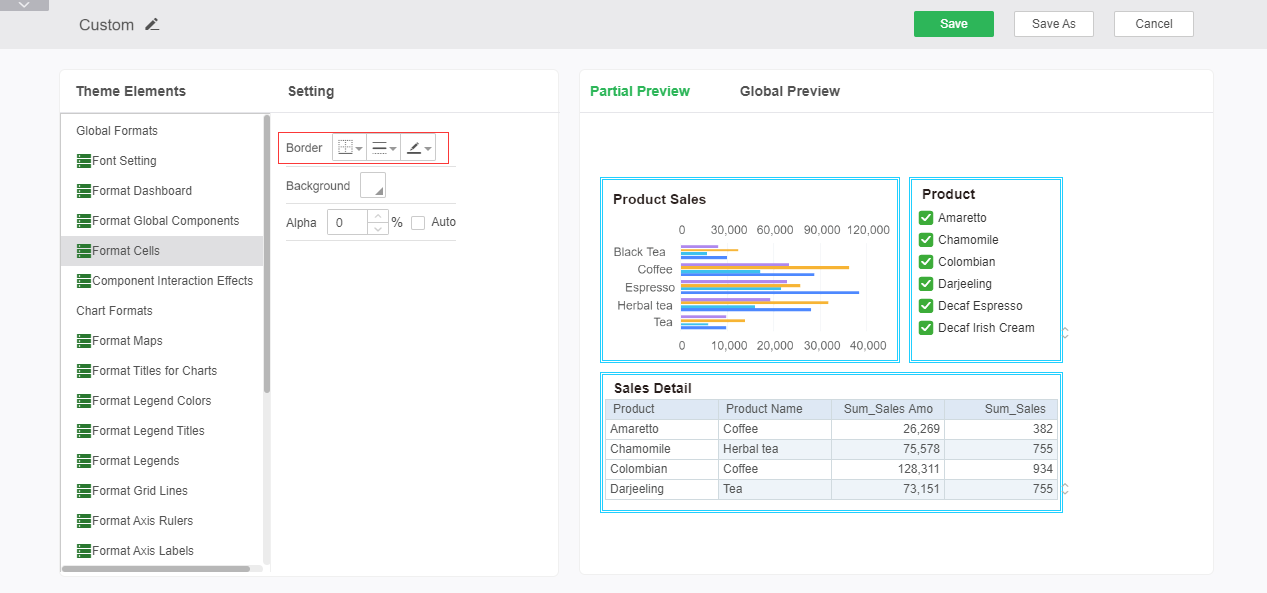
Border: Sets the position of the border line, the style and color of the line.
➢For example: Set the grid border to a blue solid double line, as shown below:
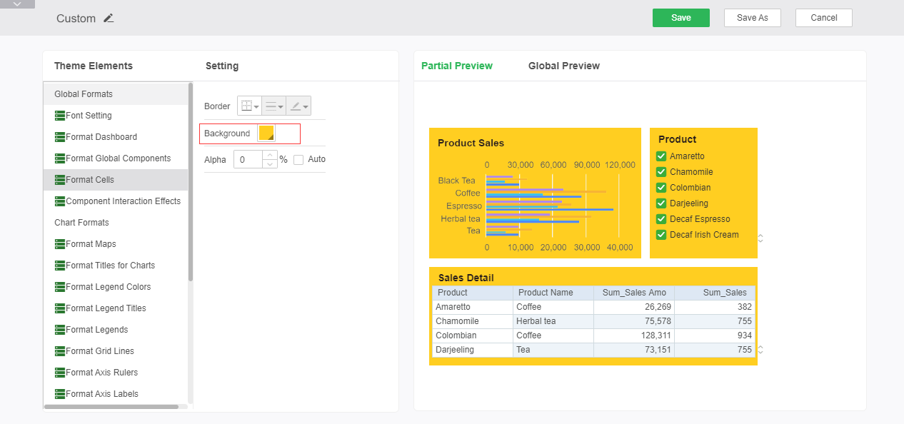
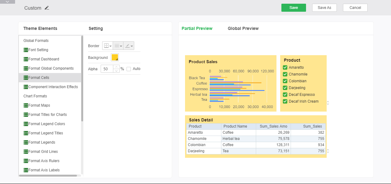
Background: Sets the cell background color of each component when the dashboard is intelligently laid out.
➢For example: Set the cell background color to yellow, as shown in the following figure:
Alpha: Set the cell background color alpha.
➢For example: keep the configuration of the background color unchanged, set the alpha to 50%, the effect is as shown below, compared with the above figure, the color becomes lighter.
oComponent Interaction Effects
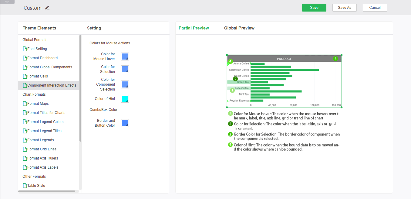
Set the color of the behavior when the mouse interacts with the dashboard, as shown in the figure below. The right preview area here does not change in real time with the changes, details of each color appear in the preview area.The border and button color are effective for the comboBox.
•Chart Formats
The Chart Formats tab allows you to configure the format of the dashboard chart. Specific configurable options are described in detail next.
oFormat Maps
Here you can set the border line style and border line color of the map, the background color and alpha of the map. After the setting is completed, you can perform global preview and partial preview in the right preview area.
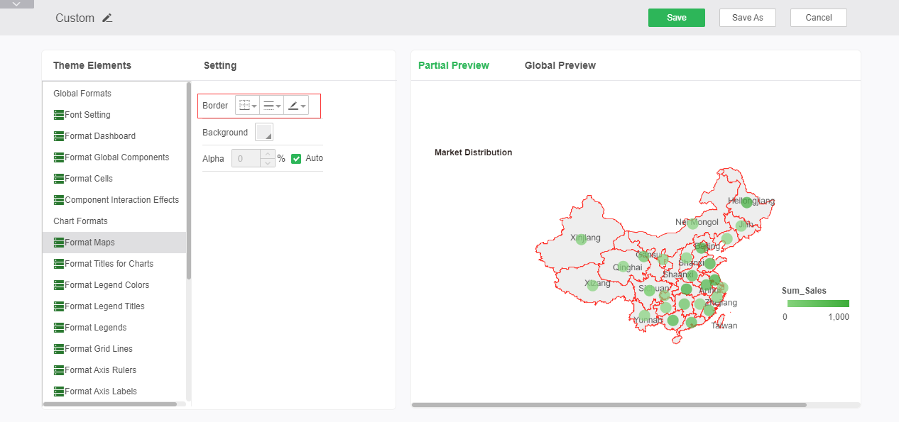
Border: You can set the style of the map border line and the color of the border line. Just set the bottom border display.
➢For example: Set the map border line to red solid line, you can see the editing effect in the preview area, as shown in the figure:
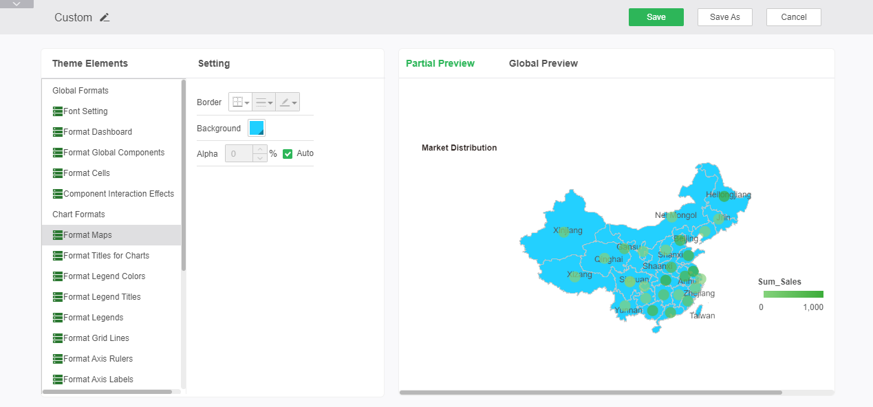
Background: The background color of the map can be set.
➢For example: set the background color of the map to blue, you can see the editing effect in the preview, as shown in the figure:
Alpha: You can set the alpha of the map background.
oFormat Titles for Charts
Format Titles for Charts sets the font style, alignment, rotation, and background color of the chart title. After the setting is completed, you can perform global preview and partial preview in the right preview area.
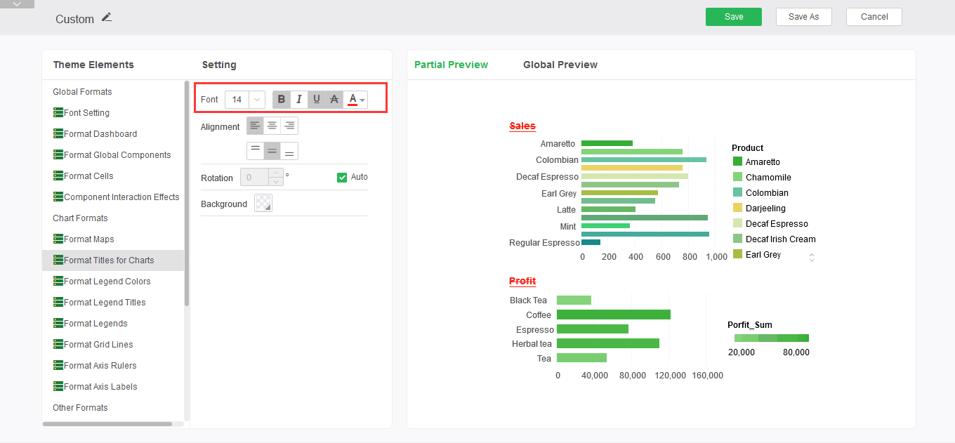
Font Style: Set chart title font size, bold, italic, underline, strikethrough, and font color.
➢For example: set the font style to bold, add underline and strikethrough, the font color is red, you can see the editing effect in the preview area, as shown:
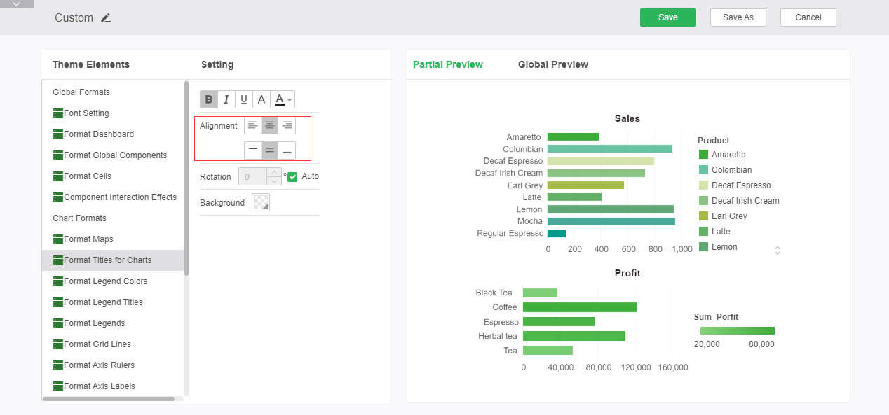
Alignment: Sets the alignment of the chart title.
➢For example: Set the alignment of the icon caption to be horizontally centered and centered on the top and bottom. You can see the editing effect in the preview area as shown in the figure:
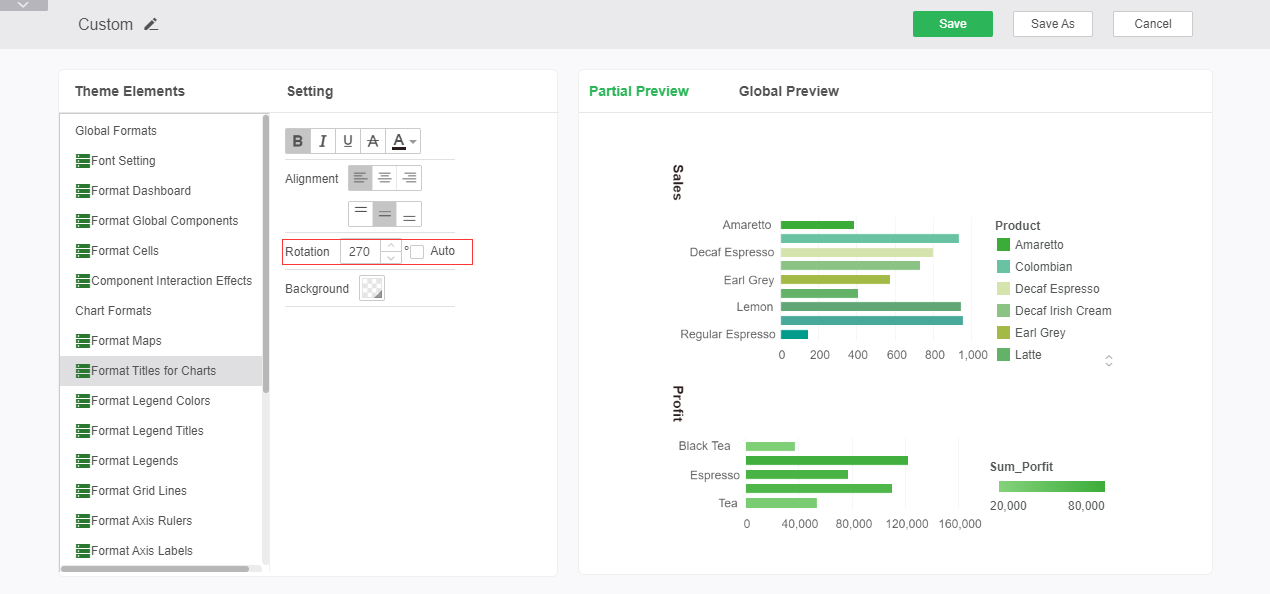
Rotate: Set whether the icon title rotates and rotates.
➢For example: set the rotation to 270 degrees, as shown:
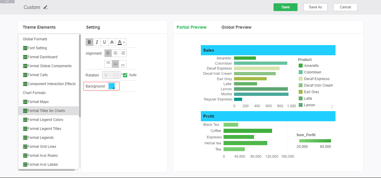
Background: Sets the background of the chart title font.
➢For example: set the background color to blue, you can see the editing effect in the preview area, as shown in the figure:
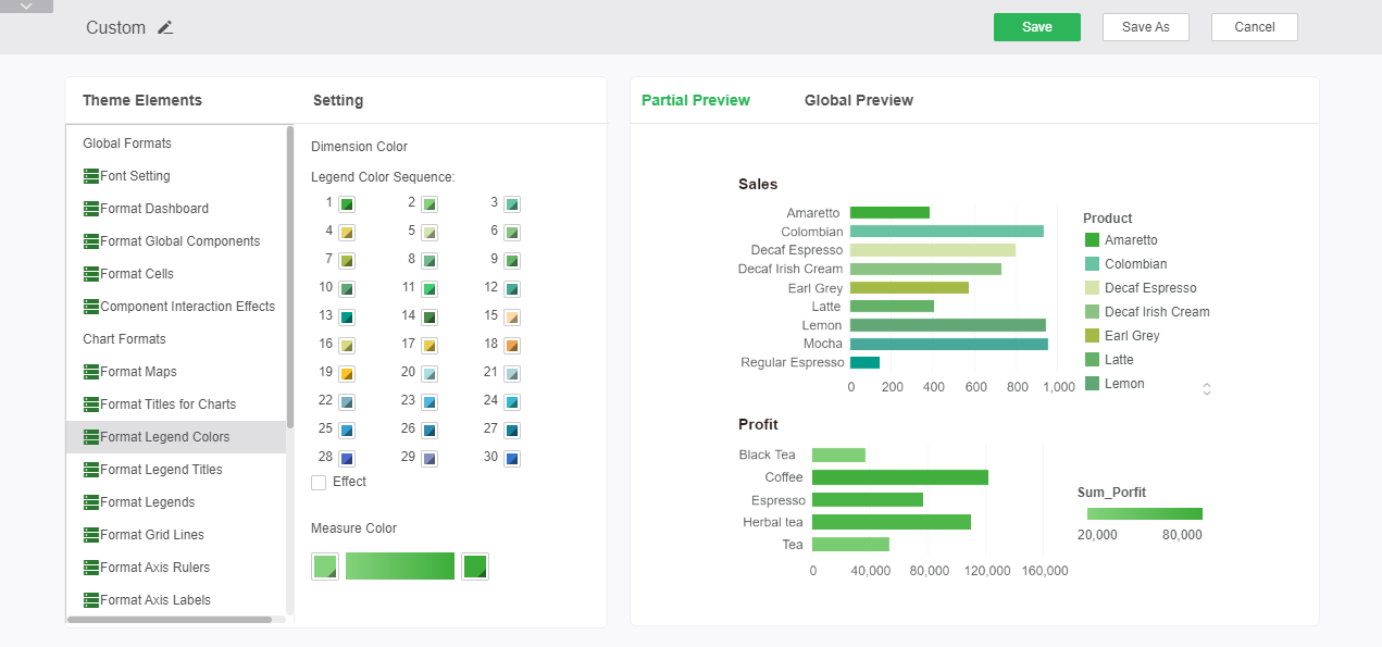
oFormat Legend Colors
Sets the default color for chart legends, including dimension colors and measure colors. After the setting is complete, the preview area on the right side can be partially previewed and globally previewed.
Dimension Color: The legend displays the following 30 colors in order. After checking the effect, the color will have a three-dimensional effect.
Measure Color: Sets the start and end color of the gradient of the measure legend.
➢For example: Set the color of the legend from 1 to 30. Set the start color and end color of the measure gradient. You can see the editing effect in the preview, as shown in the figure:
oFormat Legend Titles
The legend title format is used to set the font style, alignment, and background of the legend title. After the setting is completed, you can perform global preview and partial preview in the preview area on the right.
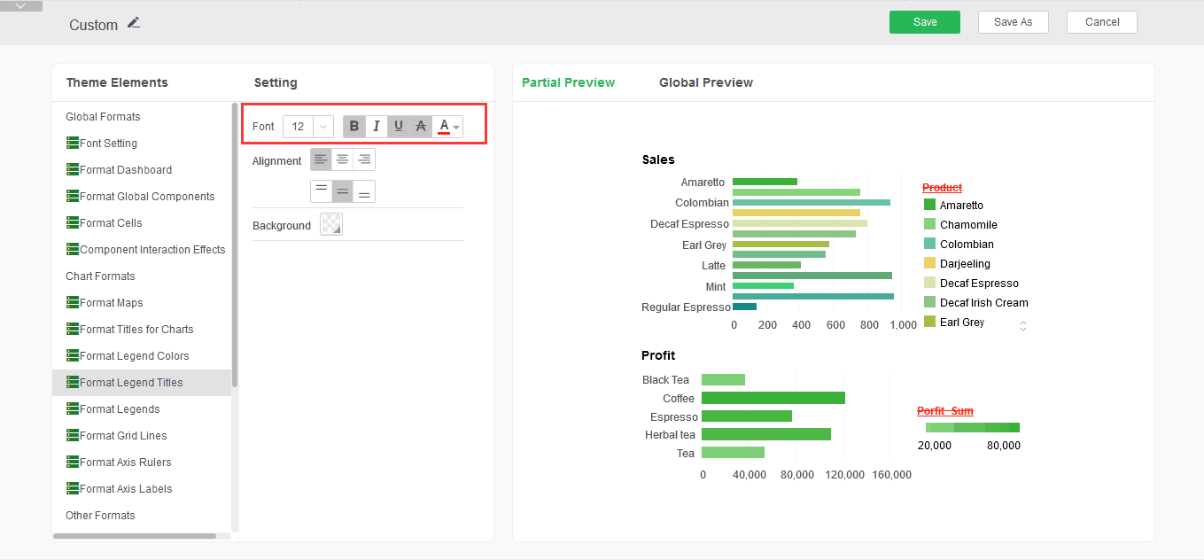
Font Style: Sets the legend title size, bold, italic, underline, strikethrough, and font color.
➢For example: set the font style to bold, add underline and strikethrough, the font color is red, you can see the editing effect in the preview area, as shown:
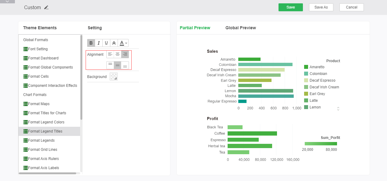
Alignment: Sets the alignment of the legend title.
➢For example: Set the alignment of the title of the legend as right-aligned and center-aligned. You can see the editing effect in the preview area, as shown in the figure:
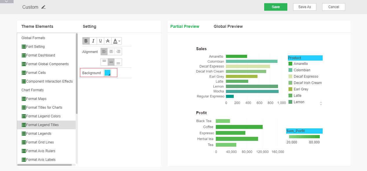
Background: Sets the background color of the legend title.
➢For example: set the background color to blue, you can see the editing effect in the preview area, as shown in the figure:
oFormat Legends
The legend format is used to set the font style and alignment of the legend. After the setting is completed, you can perform global preview and partial preview in the preview area on the right.
Font Style: Sets the size, bold, italic, underline, strikethrough, and font color of the legend.
➢For example: set the font style to bold, add underline and strikethrough, the font color is red, you can see the editing effect in the preview area, as shown:
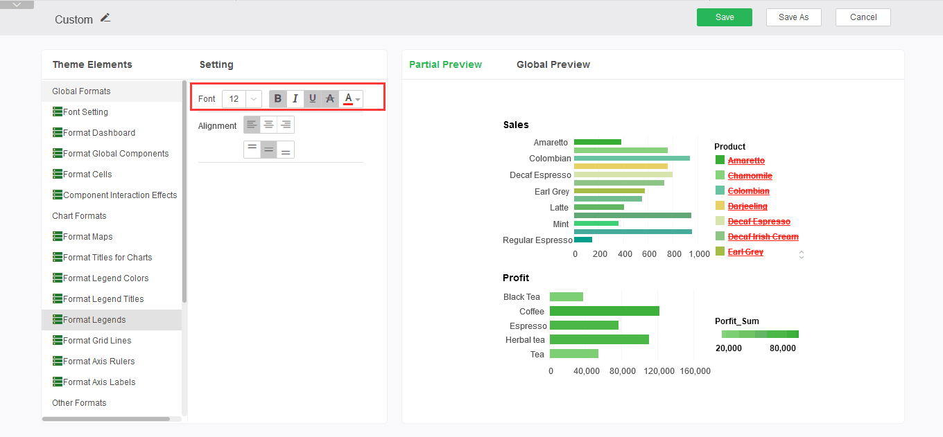
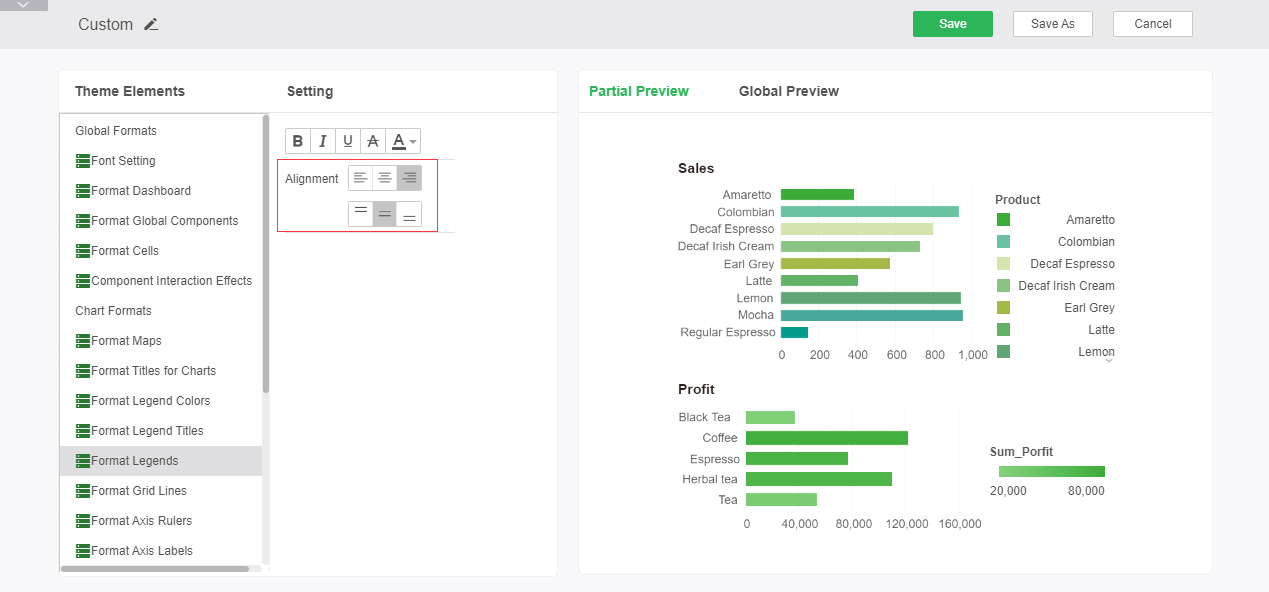
Alignment: Sets the alignment of the legend.
➢For example: to set the alignment of the legend as right-aligned and center-aligned, you can see the editing effect in the preview area, as shown in the figure:
oFormat Gird Lines
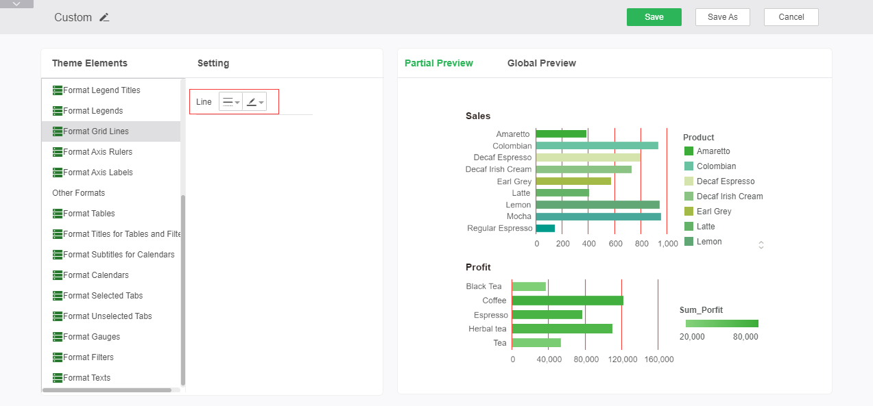
Grid Line Format Set the grid line style and color of the graph. After the setting is complete, you can perform partial preview and global preview in the right preview area.
Line: Sets the style of the grid lines and the color of the lines.
➢For example: Set the color of the grid line to red, and the style of the line to solid. You can see the editing effect in the preview area, as shown in the figure:
oFormat Axis Rulers
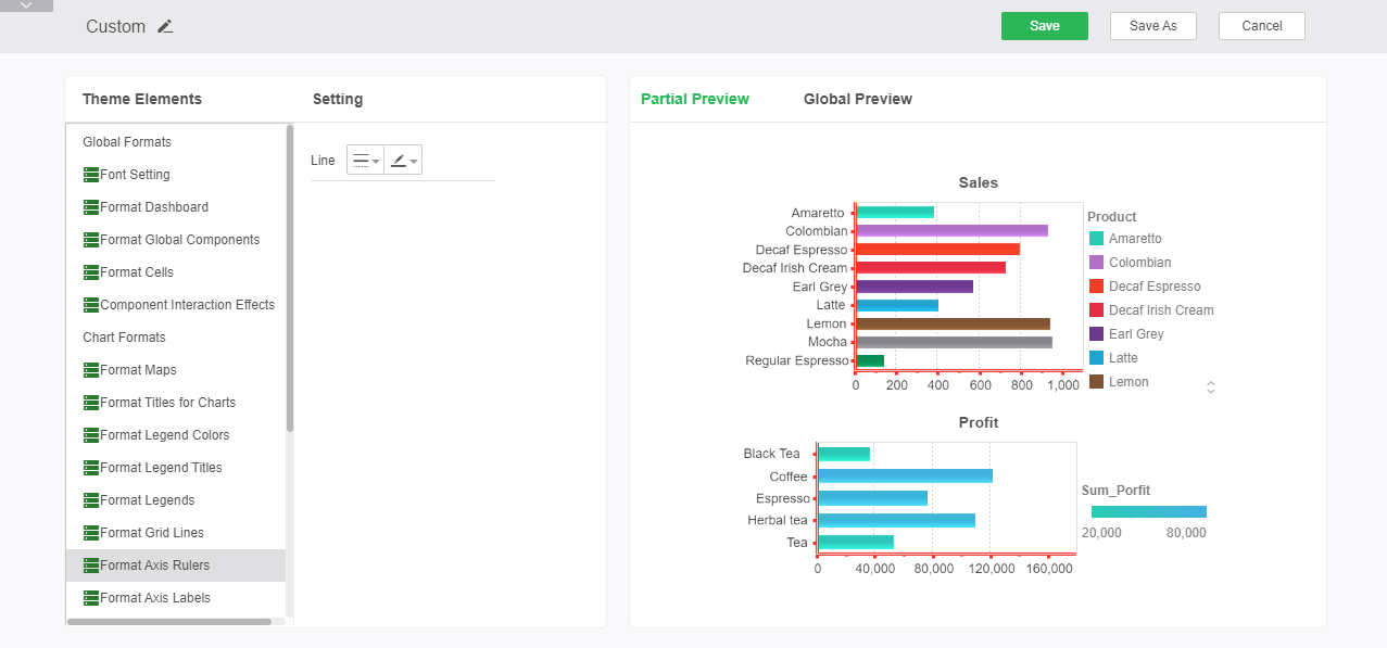
The axis format sets the axis style and color of the chart. After the axis format is set, the preview area on the right cannot be partially previewed and viewed globally. Since many system themes do not show the axis by default, only ice crystal blue and ice crystal silver can see the setting effect in the preview area in real time.
Line: Sets the style of the chart axis and the color of the line.
➢For example: Set the color of the axis to red, and the style of the line to thicken the solid line. You can see the editing effect in the preview area, as shown in the figure:
oFormat Axis Labels
The grid label format sets the font style, rotation, and background of the grid labels. After the setting is complete, you can perform partial preview and global preview in the right preview area.
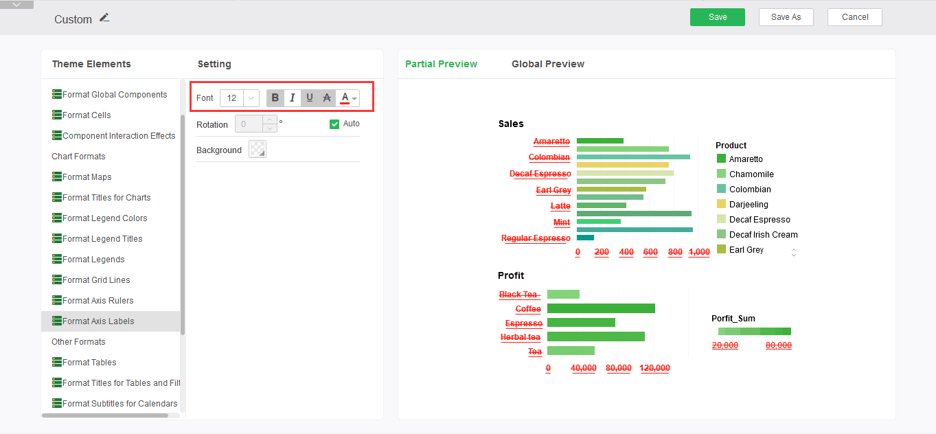
Font style: Set size, bold, italic, underline, strikethrough, and font color for axis labels.
➢For example: set the font style to bold, add underline and strikethrough, the font color is red, you can see the editing effect in the preview area, as shown:
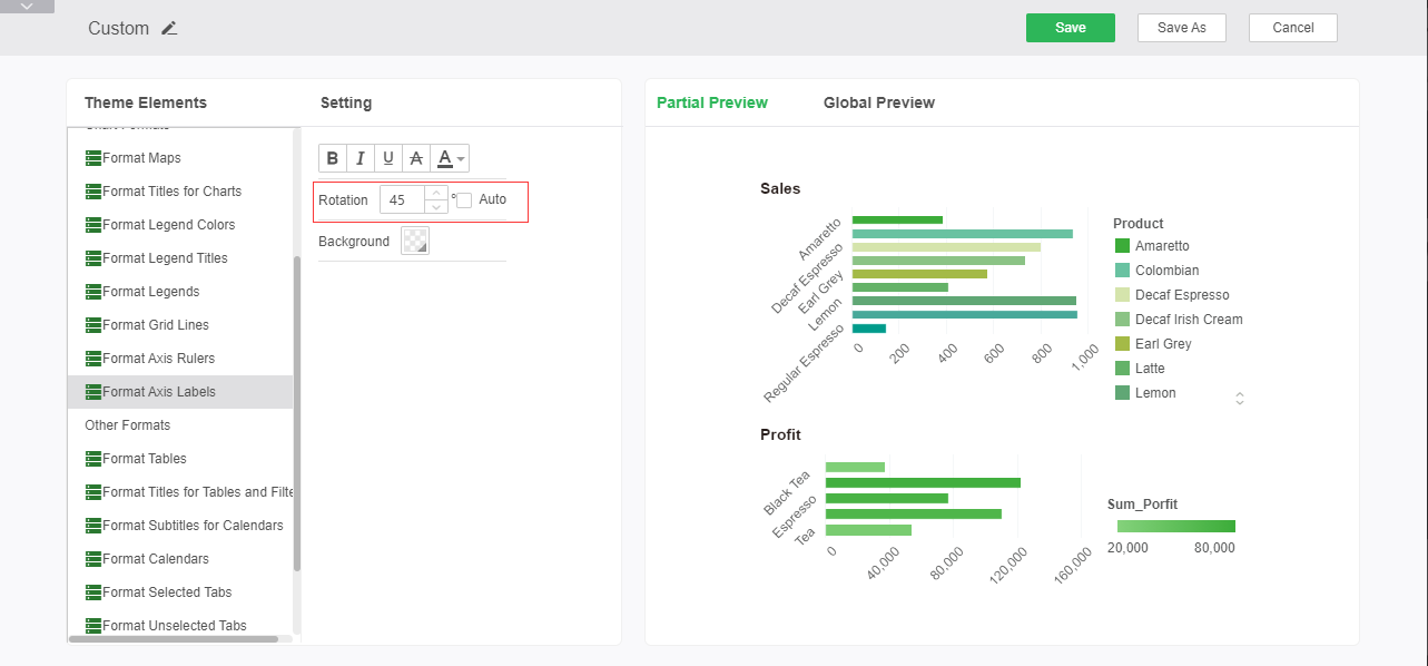
Rotation: Sets the rotation angle of the axis label.
➢For example: Set the axis label to rotate at 45°. You can see the editing effect in the preview, as shown in the figure:
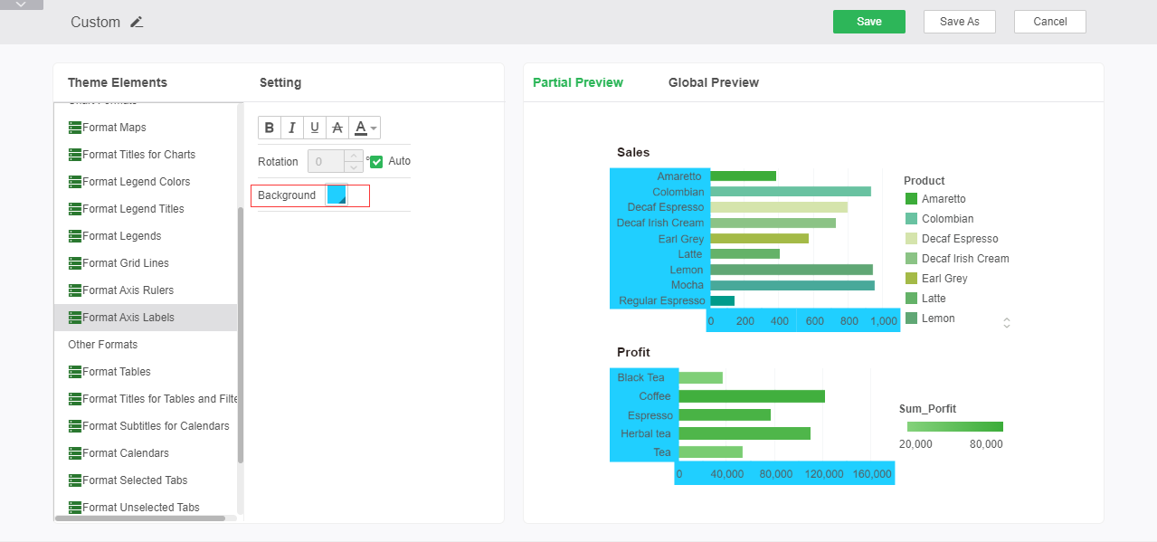
Background: Sets the background color of the legend title.
➢For example: Set the background to blue. You can see the editing effect in the preview, as shown in the figure:
•Other Formats
oFormat Tables
Allows the user to edit the style of the table used by the current theme, and can perform corresponding operations on the style of the table, including new, edit, and delete. Users can create or edit existing custom table styles. You can also delete custom table styles.
In the theme element of the custom theme page, select: Other Formats - Tablestyle, then click the New button in the style area, you can pop up a style new window, as shown in the figure:
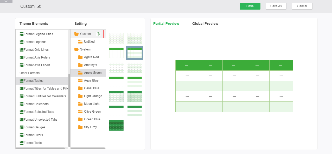
Click the New button to bring up the custom format editor window:
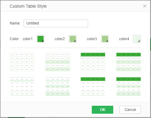
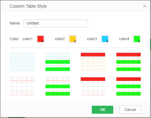
In the new page, you can customize the color of the style. When you edit the color, the thumbnail below will be updated in real time according to the changed color, previewing the effect of the table style, as shown in the figure:
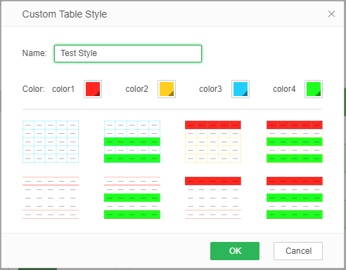
After you have determined the color, after you customize the name of the style, you can save the style by clicking the Save and Save As button, as shown in Figure:
After saving successfully, there will be a new style in the custom folder, as shown in the figure:
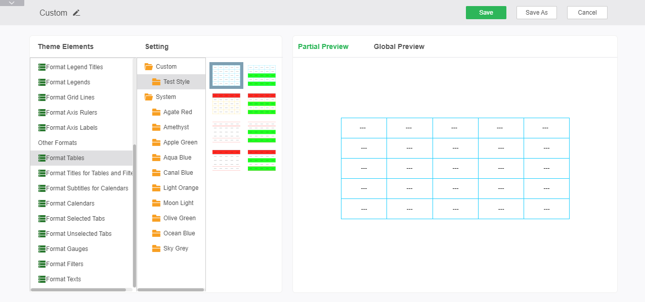
You can select the desired style in the list of table styles to apply to the dashboard theme; you can also select the custom table style in the table's properties window to apply to the selected table.
oFormat Titles for Tables and Filters
The title format can set the title styles of the table class component and the filter class component. Aspects that can be set include font style, alignment, border, background, and alpha.
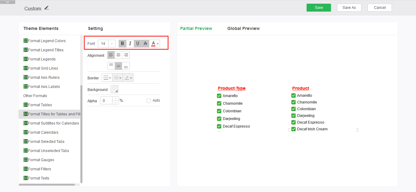
Font Style: Sets the size, bold, italic, underline, strikethrough, and font colors for the heading format of tables and filter components.
➢For example: set the font style to bold, add underline and strikethrough, the font color is red, you can see the editing effect in the preview area, as shown:
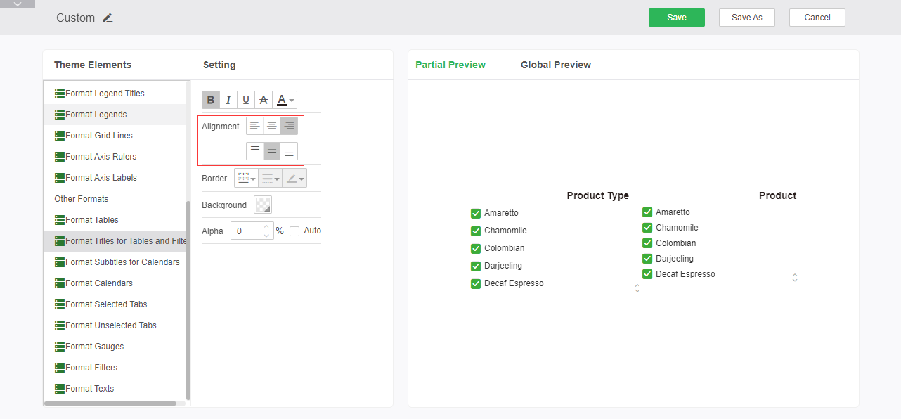
Alignment: Sets the alignment of the table and filter component's headings.
➢For example: Set the alignment of the headings as right-aligned and center-aligned. You can see the editing effect in the preview area, as shown in the figure:
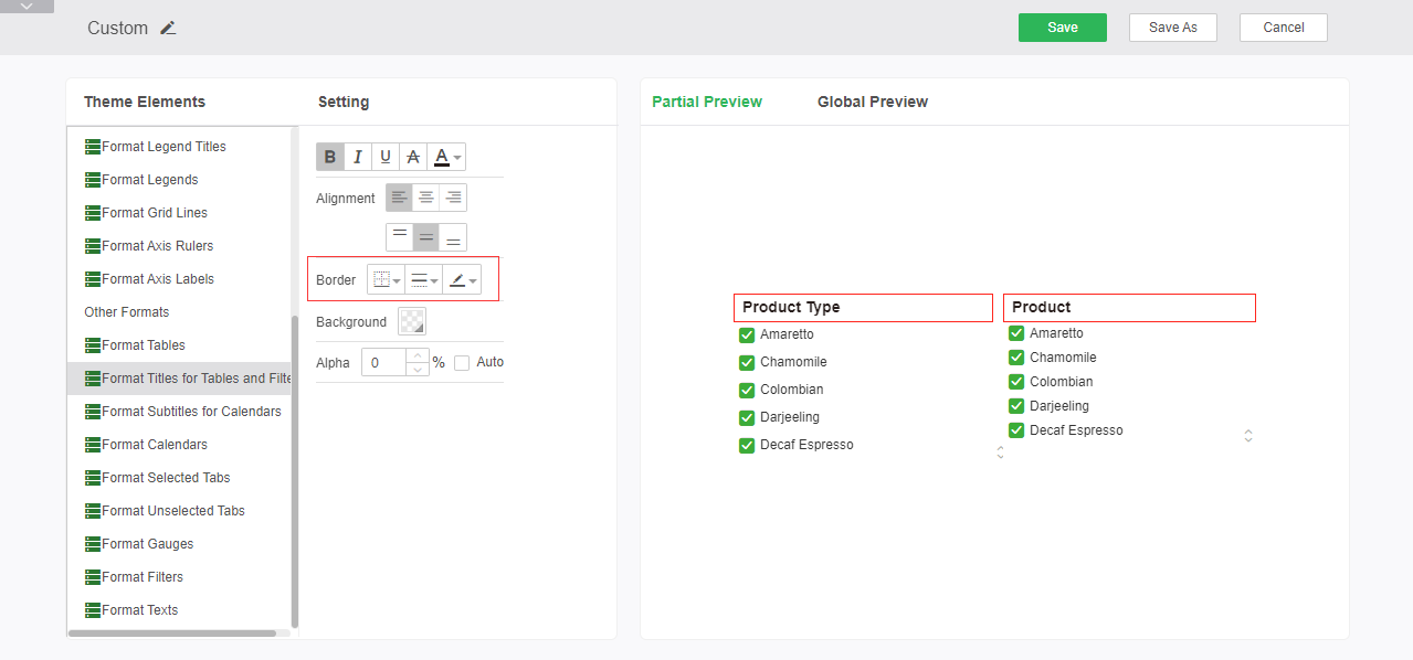
Border: Sets the position of the line, the line style, and the color of the titles of the table and filter components.
➢For example: Set the border line to red solid line, you can see the editing effect in the preview area, as shown in the figure:
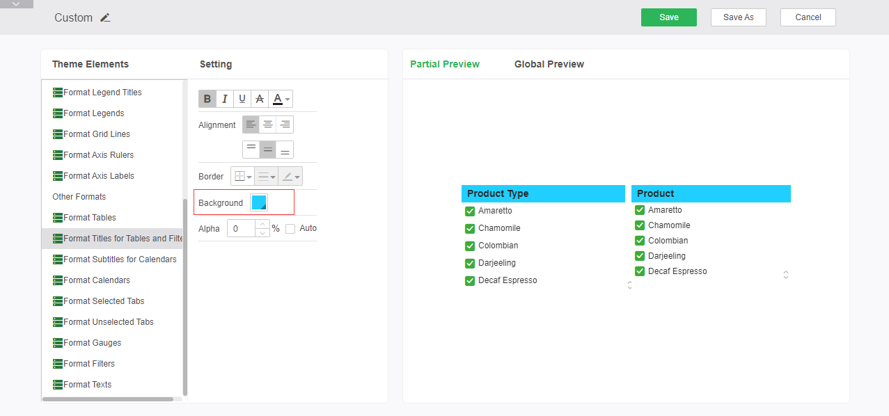
Background: Set the background color of the title bar.
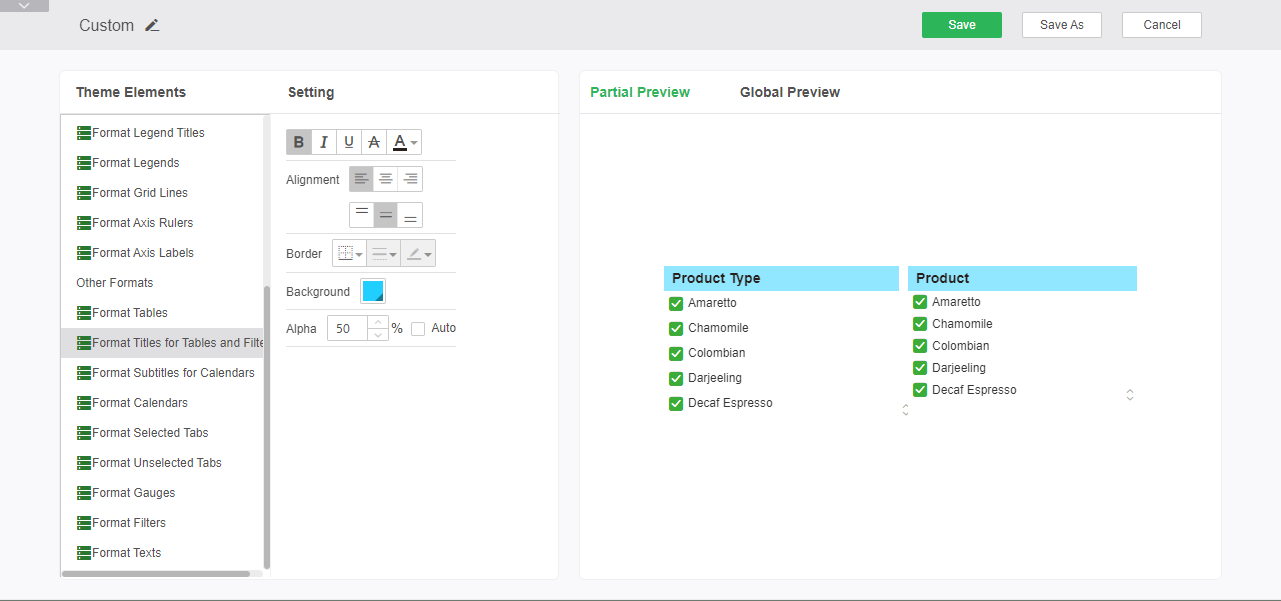
➢For example: Set the title bar to a blue background with the following effect:
Alpha: Sets the alpha property of the title bar.
➢For example: leave the color setting unchanged and configure the transparency to 50%:
oFormat Subtitles for Calendars
The Calendars subtitle format can set the heading style of the date class component, and can set the font style, alignment, background, and alpha.
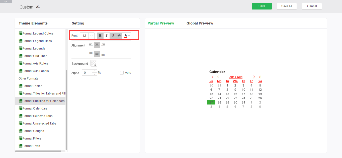
Font style: Set size, bold, italic, underline, strikethrough, and font color for the date component subtitle format.
➢For example: set the font style to bold, add underline and strikethrough, the font color is red, you can see the editing effect in the preview area, as shown:
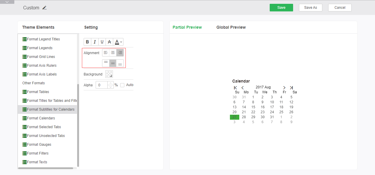
Alignment: Sets the alignment of the heading.
➢For example: Set the alignment of the headings as right-aligned and center-aligned. You can see the editing effect in the preview area, as shown in the figure:
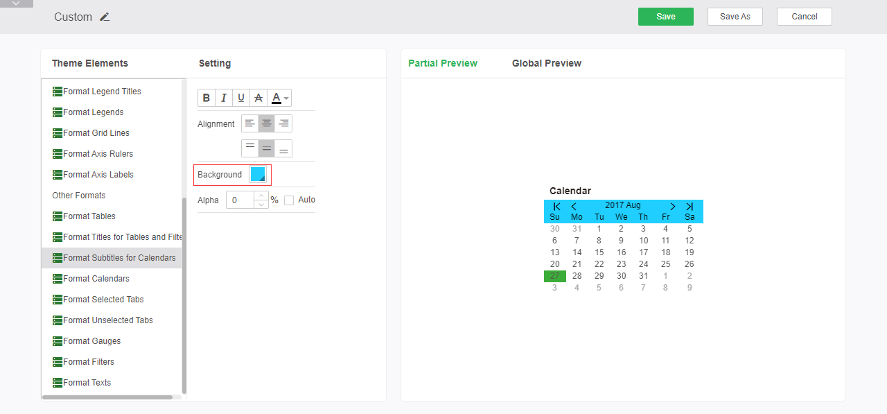
Background: Set the background color of the title bar.
➢For example: Set the background color to blue, the effect is as follows:
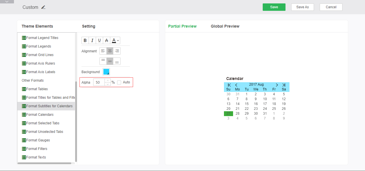
Alpha: Sets the alpha of the title bar.
➢For example: keep the color settings unchanged, set the transparency to 50%, the effect is as follows:
oFormat Calendars
The calendars grid format can set the content area style of the date class component, including font style, alignment, borders, background, and alpha.
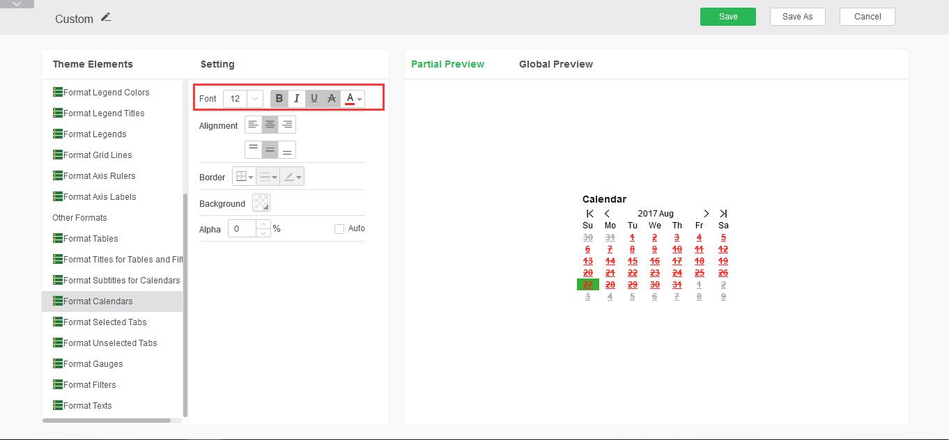
Font Style: Sets the size, bold, italic, underline, strikethrough, and font colors of the date component grid format.
➢For example: set the font style to bold, add underline and strikethrough, the font color is red, you can see the editing effect in the preview area, as shown:
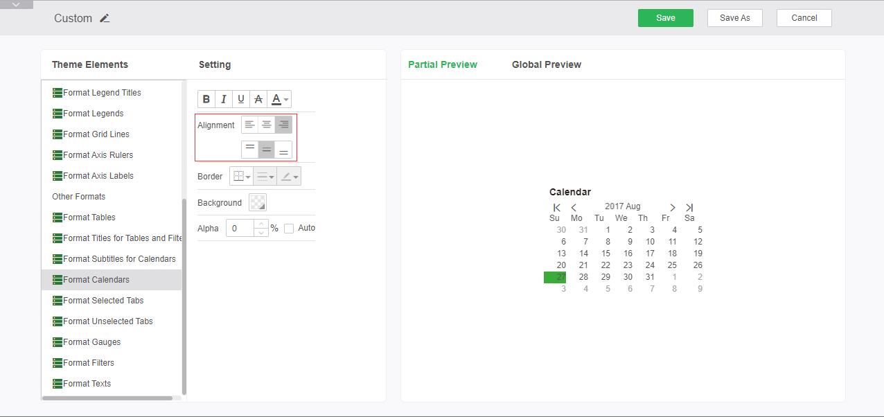
Alignment: Sets the alignment of the contents of the date component grid.
➢For example: to set the alignment as right-aligned and center-aligned, you can see the editing effect in the preview area, as shown in the figure:
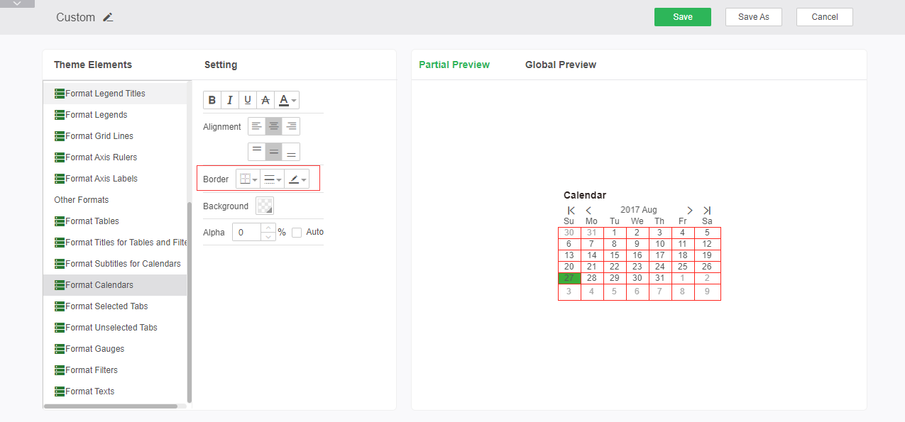
Border: Sets the position, line style, and color of the line in the date component.
➢For example: Set the border line to red solid line, you can see the editing effect in the preview area, as shown in the figure:
Background: Set the background type, color, and other attributes of the date component content area.
➢For example: set the background color to blue, the effect is as follows:
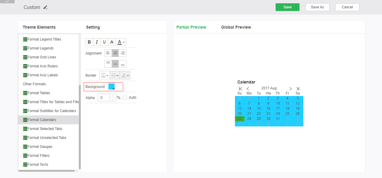
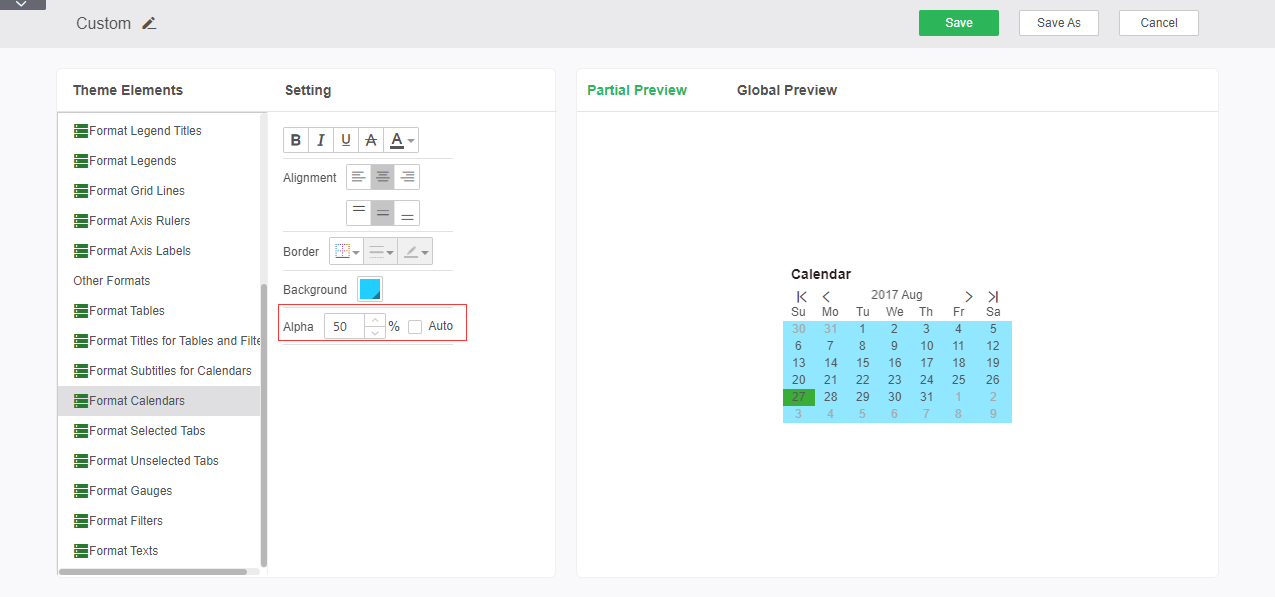
Alpha: Sets the alpha of the calendar content area.
➢For example, if the above setting is kept unchanged, set the transparency to 50%. The effect is shown as:
oFormat Selected Tabs
Tab Selected Format to set the tab style selected in the tab component, including font style, alignment, border, background, and transparency.
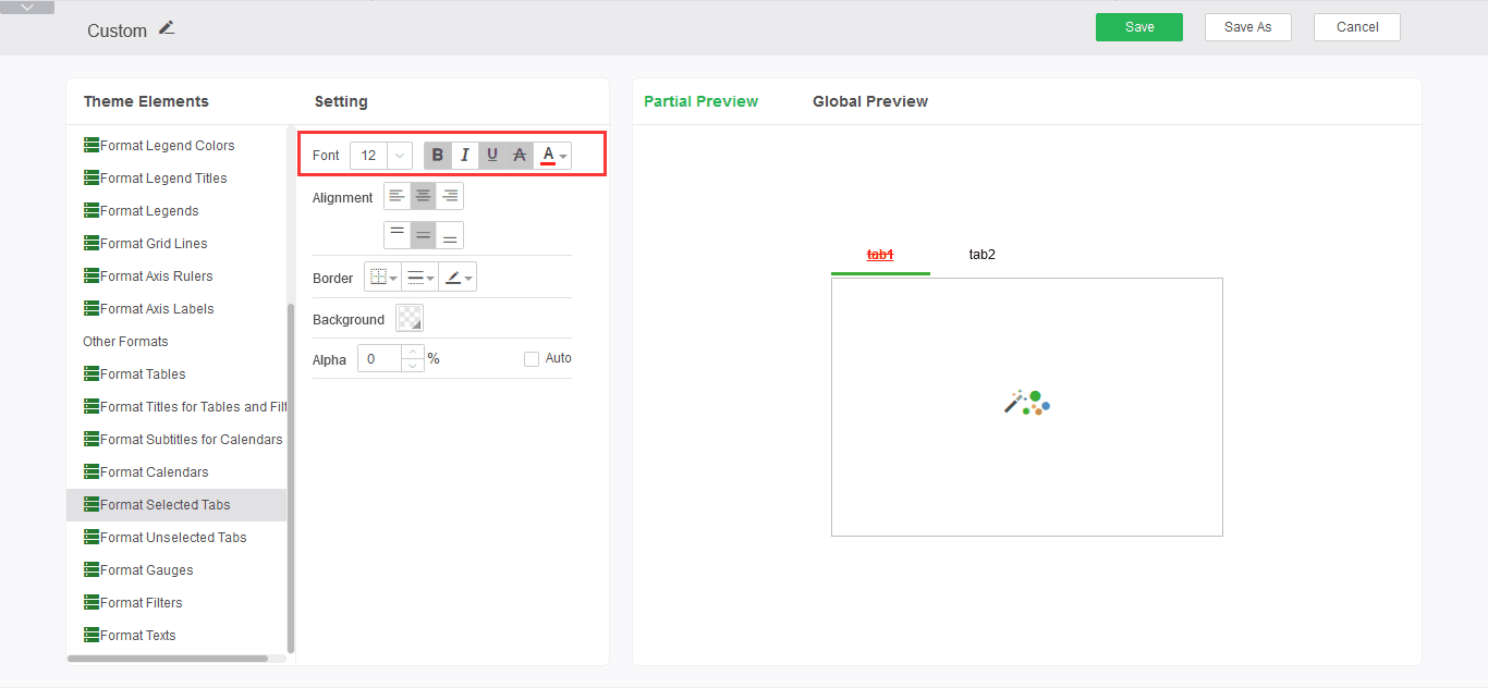
Font style: Settings tab Select the font size, bold, italic, underline, strikethrough, and font color for the tabs.
➢For example: set the font style to bold, add underline and strikethrough, the font color is red, you can see the editing effect in the preview area, as shown:
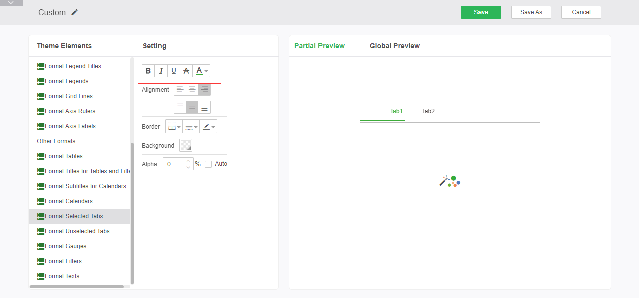
Alignment: Settings tab Select the alignment of the font in the tabs.
➢For example: to set the alignment as right-aligned and center-aligned, you can see the editing effect in the preview area, as shown in the figure:
Borders: Set tabs Select the position of the line, style and color of the border of the tab.
➢For example: Set the border line to red solid line, you can see the editing effect in the preview area, as shown in the figure:
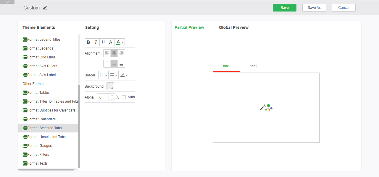
Background: Sets the background color of the tab content area selected on the tab.
➢For example: Set the background to blue, the effect is as follows:
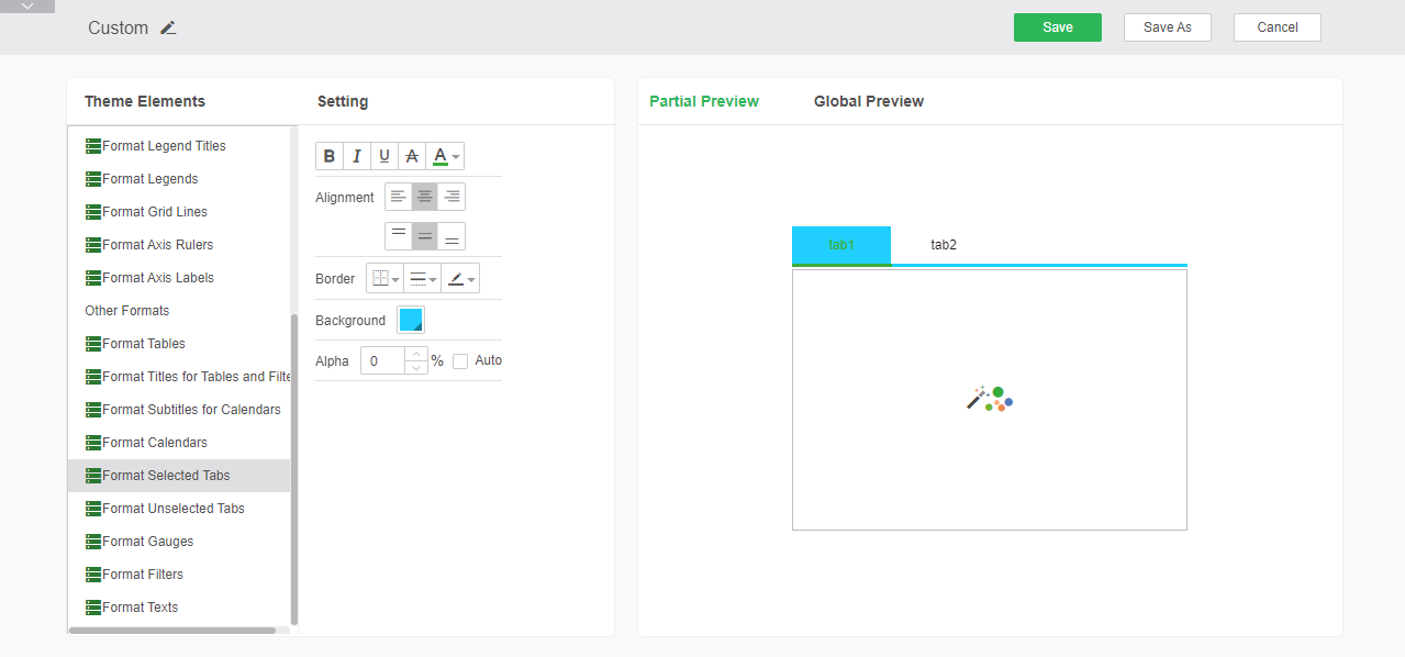
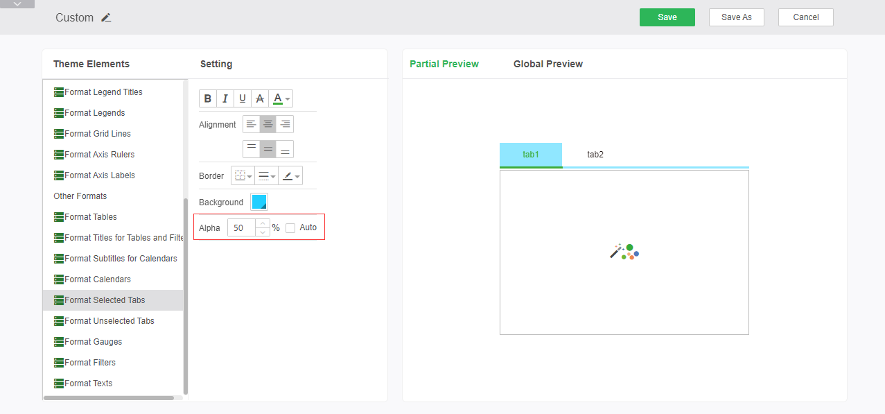
Alpha: Sets the alpha property of the tab area selected on the tab.
➢For example, if the background setting is unchanged, set the transparency to 50%. The effect is as shown in the following figure:
oFormat Unselected Tabs
Tab unselected format you can set tab styles that are not selected in the tab component, including font style, alignment, borders, background, and alpha.
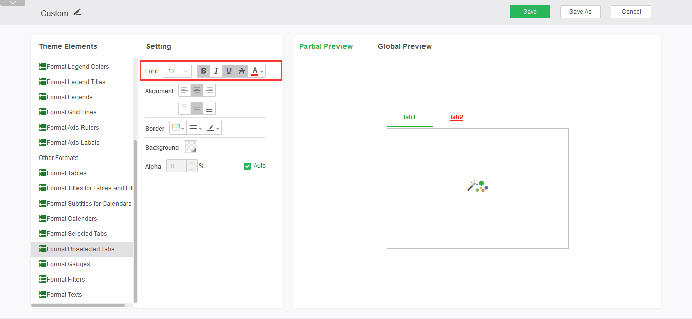
Font Style: Sets the tab size, bold, italic, underline, strikethrough, and font colors for unselected tabs.
➢For example: set the font style to bold, add underline and strikethrough, the font color is red, you can see the editing effect in the preview area, as shown:
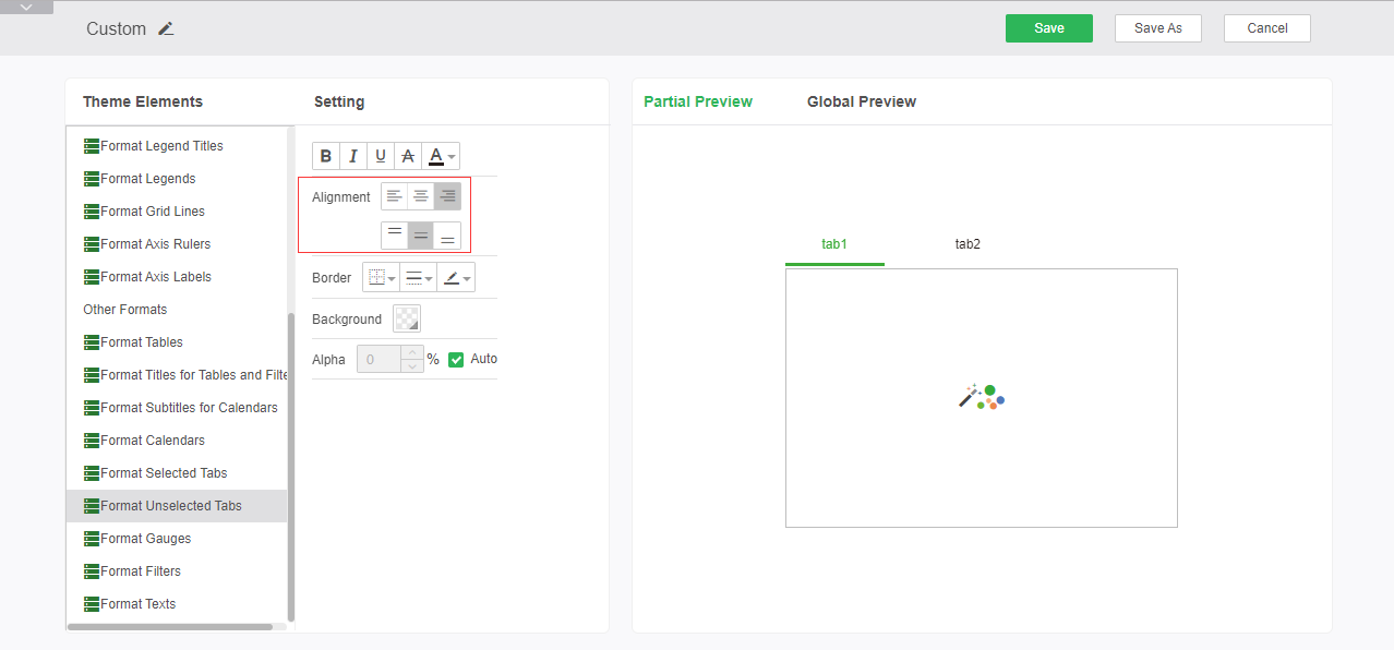
Alignment: Sets the alignment of fonts in tabs that are not selected on the tab.
➢For example: to set the alignment as right-aligned and center-aligned, you can see the editing effect in the preview area, as shown in the figure:
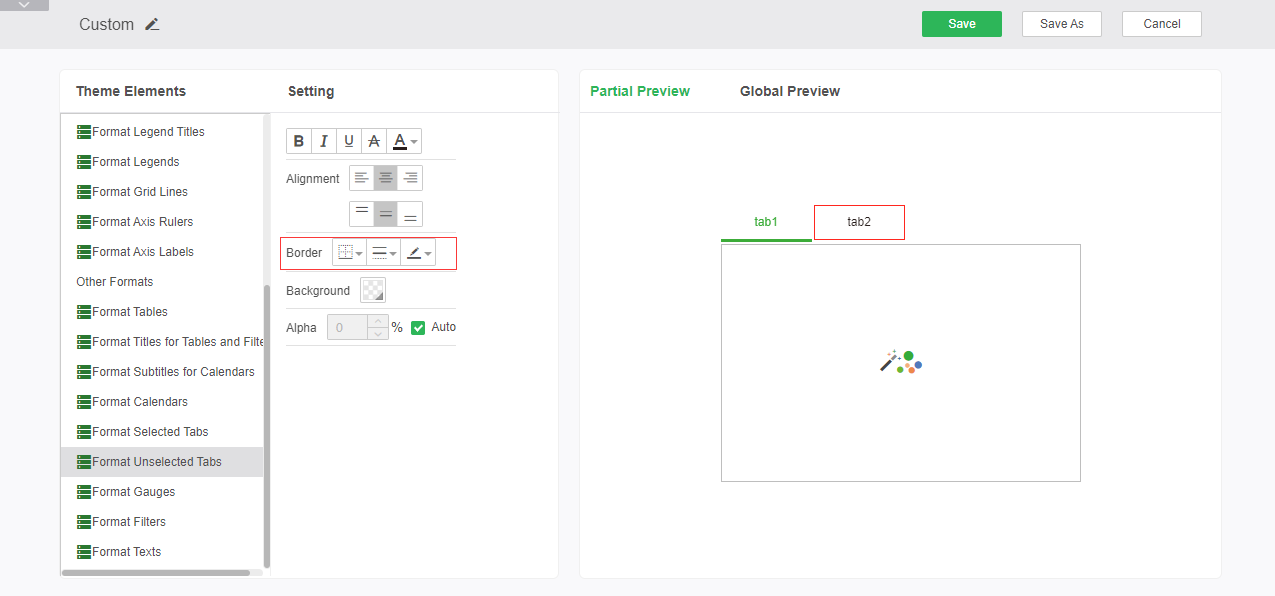
Border: Sets the position of the line, the line style, and the color of the tab's unselected tab border.
➢For example: Set the border line to red solid line, you can see the editing effect in the preview area, as shown in the figure:
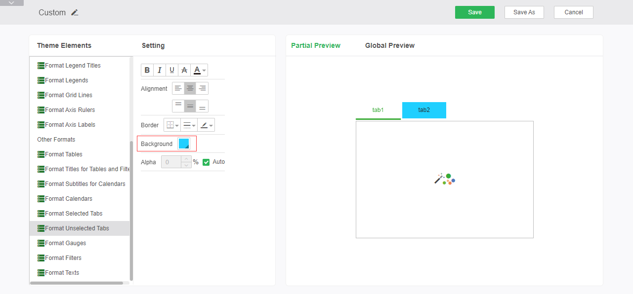
Background: Sets the background color of the unselected tab content area of the tab.
➢For example: Set the background to blue, the effect is as follows:
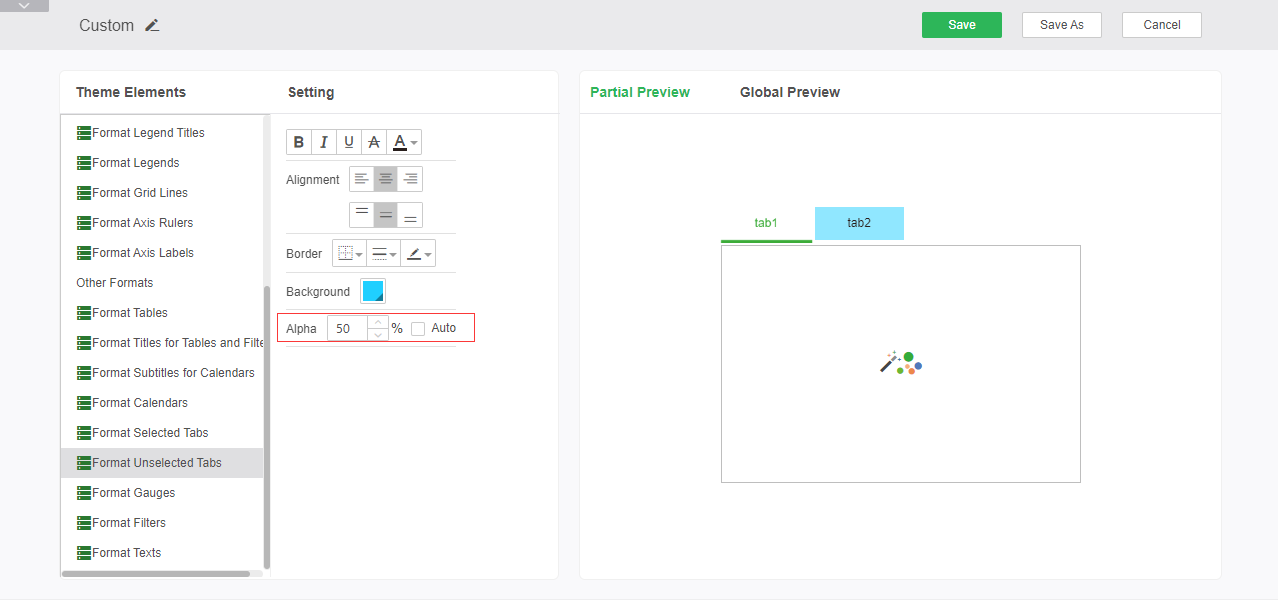
Alpha: Sets the alpha property of the tab's unselected tab area.
➢For example, if the background setting is unchanged, set the transparency to 50%. The effect is as shown in the following figure:
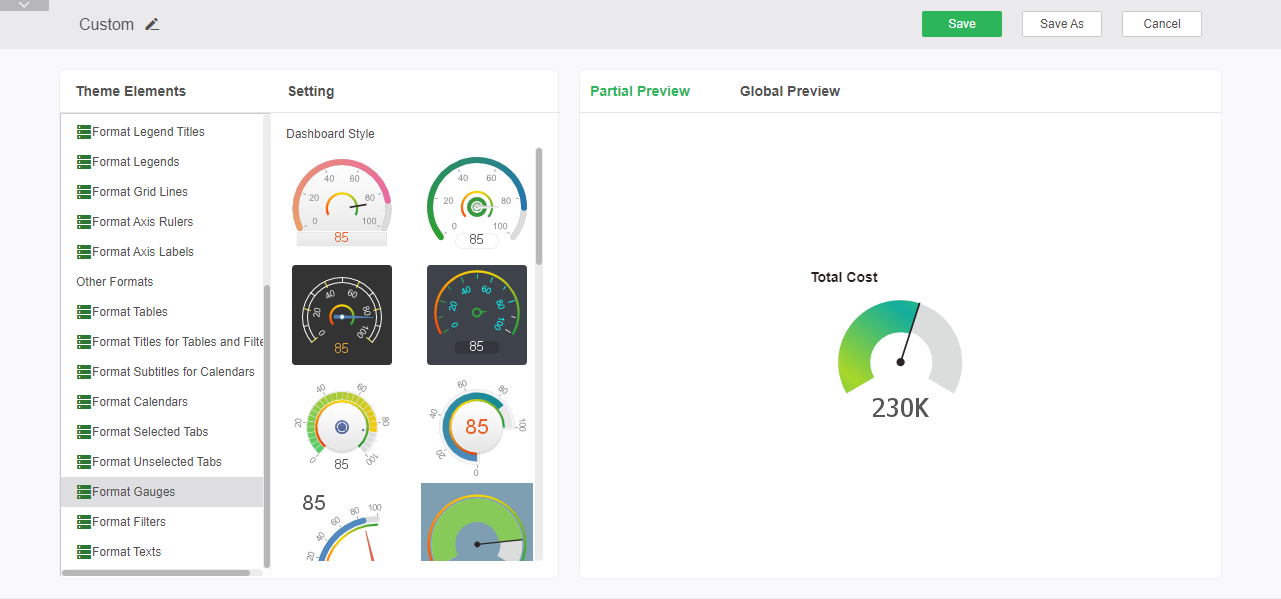
oFormat Gauges
The gauge format sets the default style of the theme dashboard. After the setting is complete, the global preview and partial preview view can be performed in the right preview area.
oFormat Filters
Component grid format (filter component) Sets the font style, alignment, border, background, and transparency of the grid in the filter component. After the setting is complete, it can be viewed in the local preview and global preview on the right side.
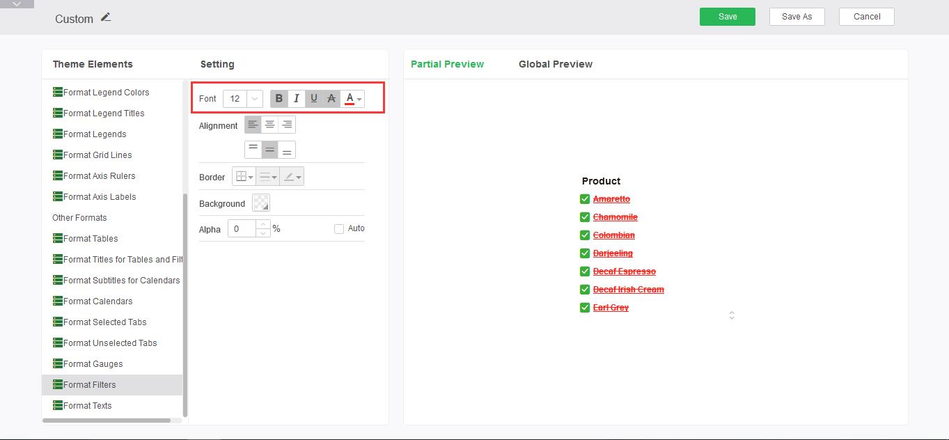
Font Style: Sets size, bold, italic, underline, strikethrough, and font colors in the Filter component grid format.
➢For example: set the font style to bold, add underline and strikethrough, the font color is red, you can see the editing effect in the preview area, as shown:
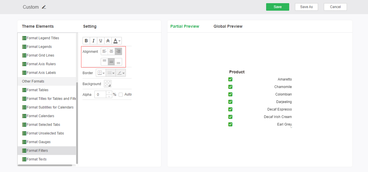
Alignment: Sets the alignment of the font in the filter component grid.
➢For example: to set the alignment as right-aligned and center-aligned, you can see the editing effect in the preview area, as shown in the figure:
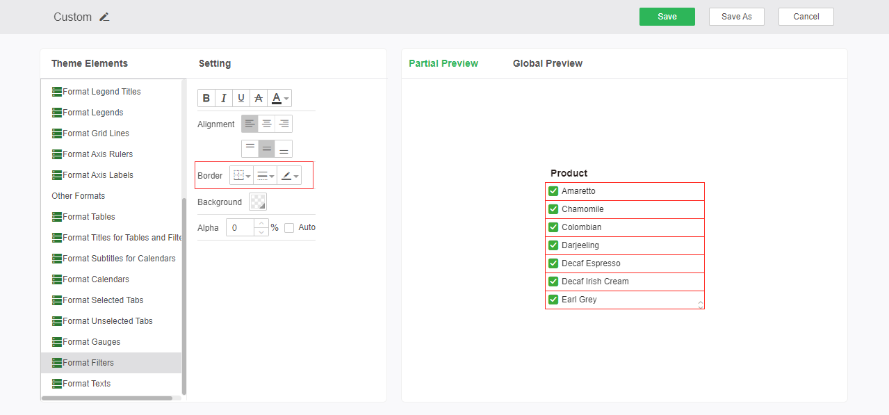
Border: Sets the position, the line style, and the color of the line of the filter component grid border.
➢For example: Set the border line to red solid line, you can see the editing effect in the preview area, as shown in the figure:
Background: Set the background color of the grid area of the filter component.
➢For example: Set the background to blue, the effect is as follows:
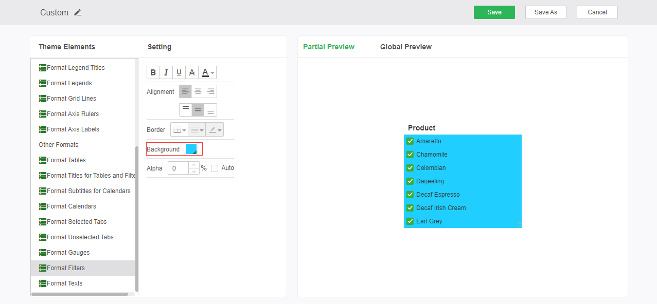
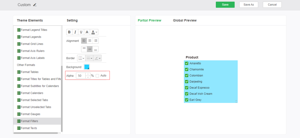
Alpha: Sets the alpha property of the filter component grid area.
➢For example, if the background setting is unchanged, set the transparency to 50%. The effect is as shown in the following figure:
oFormat Texts
Set font style, alignment, border, and background. for text、text parameter and commit After the setting is complete, you can perform global preview and partial preview view in the right preview area.
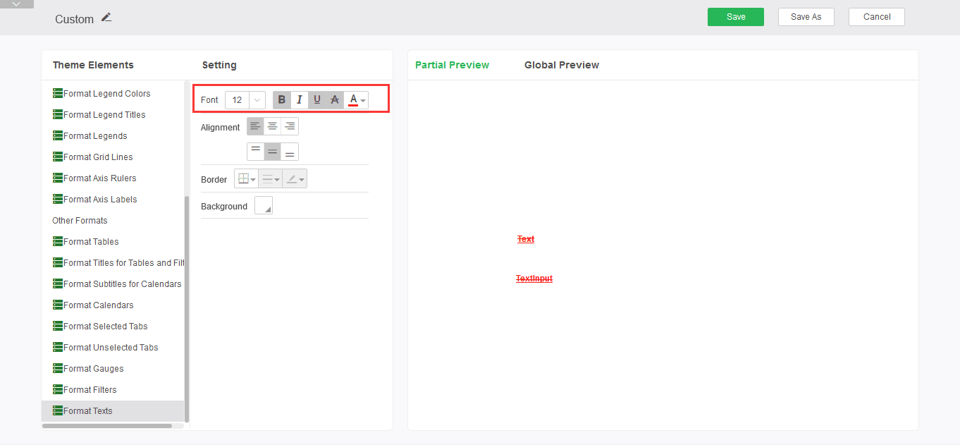
Font Style: Sets size, bold, italic, underline, strikethrough, and font color for text components, text parameters, and submission components.
➢For example: set the font style to bold, add underline and strikethrough, the font color is red, you can see the editing effect in the preview area, as shown:
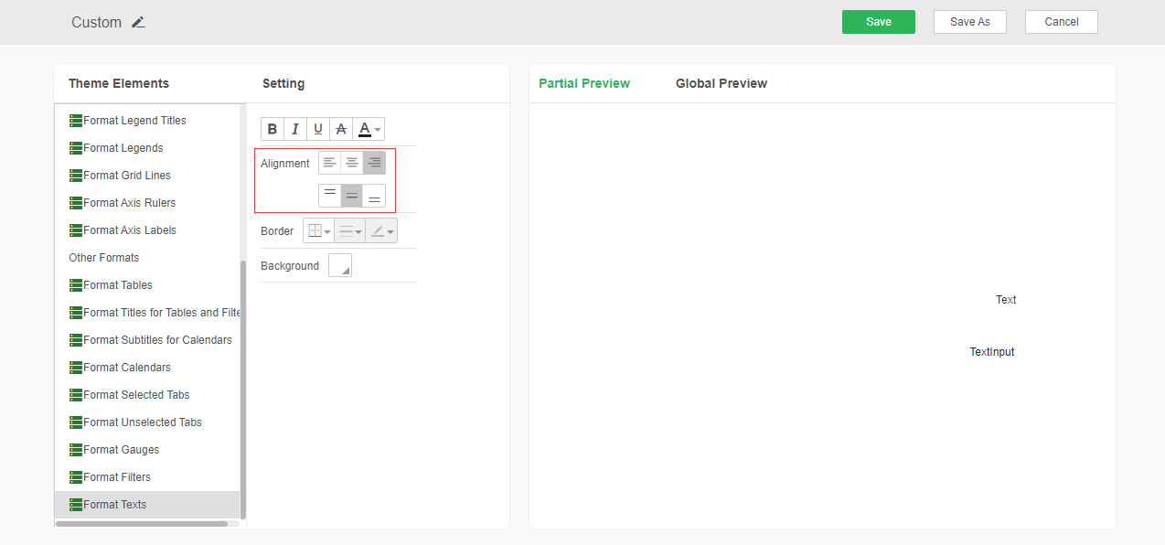
Alignment: Sets the alignment of text component, text parameter component content.
➢For example: Set the text component, text parameter component alignment to right alignment. As shown below:
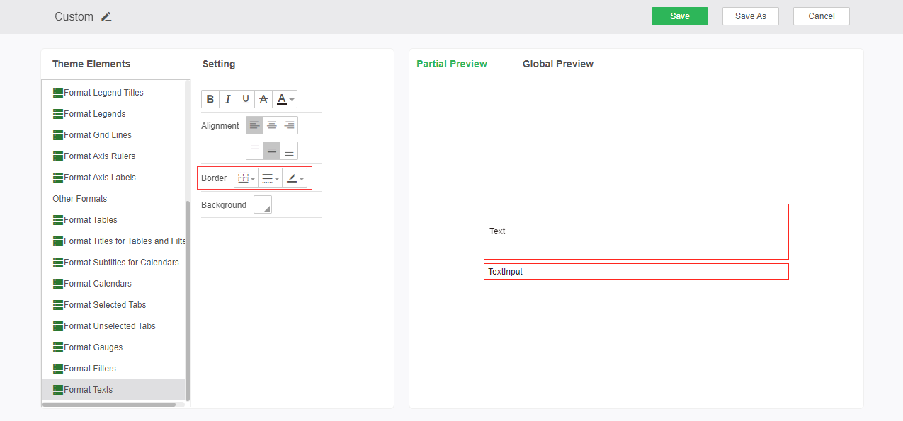
Borders: Sets the position, style, and color of the borders of text and textinput components.
➢For example: Set the text component, text parameter component border line style is thin solid line, color red. As shown below:
Background: Set the text component, text parameter component background color.
➢For example: Set the background color to blue. As shown below:
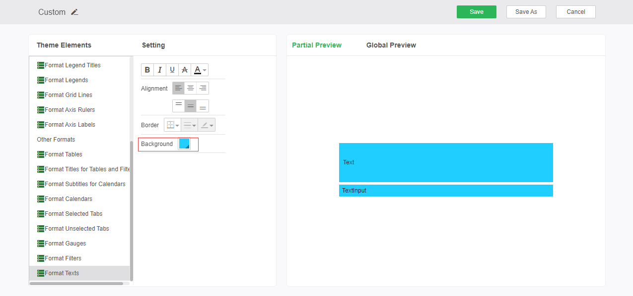
➢Note: The text parameter component background color does not support gradients.
❖Delete custom theme
Select an existing custom theme and click the delete button to delete the selected theme. The delete function is only available when selecting a custom theme. The delete button is not visible when the system theme is selected.
