|
<< Click to Display Table of Contents >> Formatting |
  
|
|
<< Click to Display Table of Contents >> Formatting |
  
|
The items that the format can set are: font, color, alignment, border, transparency, data format. Different areas of the selected component can be set in different formats; the selected area can have different format items.
❖Dashboard Format
The user can set the border and background color for the report by selecting "Dashboard Style" in the More in the toolbar.
❖Cell Format
In Grid Layout, users can format the grid by selecting "Dashboard Style" in the toolbar's More. Settings include borders, colors, and transparency.
❖Component Format
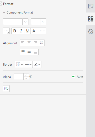
Each component on the dashboard can be formatted individually. Different components have slightly different formatting items. When the component is selected, the user can set the corresponding format for the component in component format in the right panel => General. How to use each format item, refer to the following section.
❖Local format
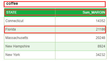
In the concept of the area in the component, the user can format the selected specific area of the component in the right panel=>General. For example, there are a header area, a column header area, and a data area of each column in the table component, and the user can perform format setting for a specific area.

Here's how to use each format item.
❖Multi component formatting
Support multiple components of the same kind to set common property configuration items. include:
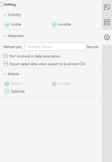
Settings: visibility, advanced, position (width, height), mobile terminal
Format: component style (not included in format brush)
Note: plug in users will open the settings according to their own needs and temporarily do not support the settings of multiple plug-ins.
Usage: when multiple similar components are selected at the same time, the right configuration area needs to be identified dynamically. Only display components, formats (component styles), settings (visibility, advanced, location, mobile end), and these settings are styles with multiple values (as shown in the figure below). By default, all values are empty. If the user has defined it, it will be set according to the newly defined value. If the user has not defined it, it will still use the original value.


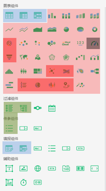
Definition of components of the same kind (as shown in the figure below, components with the same background color belong to the same category)
Class 1: general form, cross table, free form, filling parameters, free form
Category 2: 4 kinds of column chart, 2 kinds of line chart, 2 kinds of area chart, 2 kinds of pie chart, ring chart, 2 kinds of point chart, bubble chart, word cloud, indicator card, 2 kinds of maps, 2 kinds of radar chart, waterfall chart, Pareto chart, histogram, box and whisker chart, rectangular tree chart, heat chart, organization chart, Gantt chart
Class 3: sunrise, funnel, relation, Sankey, time trajectory, 3D Earth, K-line, trajectory
Other unclassified components are grouped in their own right.
