|
<< Click to Display Table of Contents >> Set Filter List Properties |
  
|
|
<< Click to Display Table of Contents >> Set Filter List Properties |
  
|
The common attributes of Filter List are similar to those of the table. For details, see "Set the table". The specific features of Filter List are detailed below.
The Filter List property can be set in the setting page of the right panel. The setting page is as shown below:
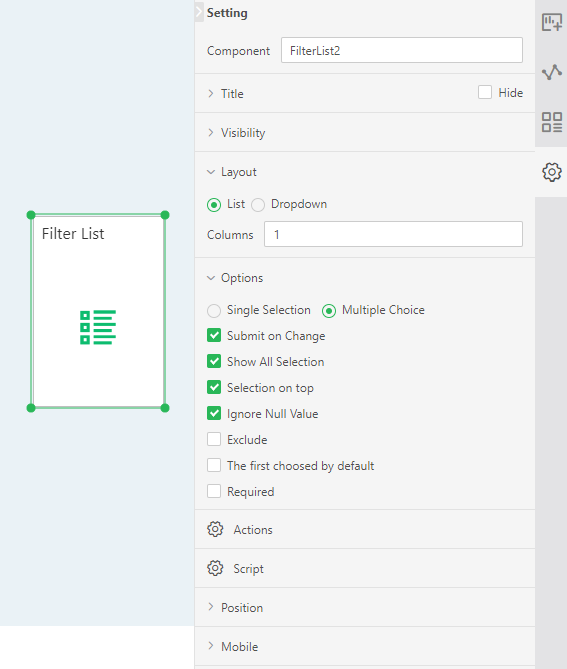
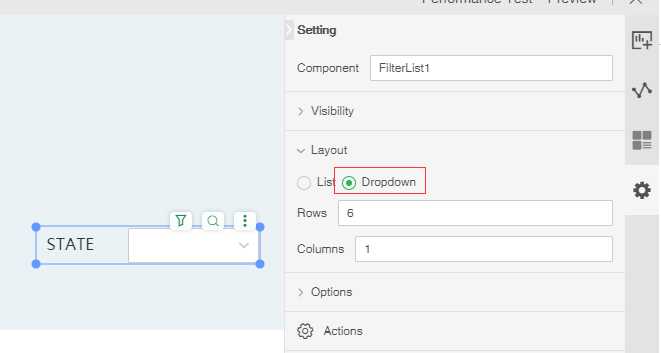
[Layout] provides users with two types of presentation, list and drop-down list. The product is displayed by default in the form of a list. When the drop-down list is selected, the number of rows will be displayed behind it. The default drop-down list is displayed in 6 lines, and the user can set according to the demand. After the Filter List is displayed in the form of a pull list, a show/hide button is generated in the upper right corner, as shown in the figure below.
[Hide Titles/Show Titles] Hides the title of the Filter List. After the Filter Listed title is hidden, the Filter Listed title can be displayed again.
[Selection on top] This option is selected by default. That is, the selected option is automatically placed at the front. When this option is not checked, the selected option position does not change.
[Columns] List The number of columns displayed by the filter component, which is displayed by default in one column, and the user can set it according to requirements.
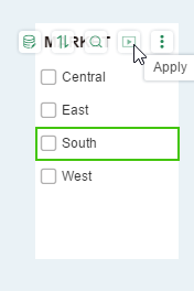
[Submit on Change] This option is selected by default, which means that the filter function is executed immediately after checking. When this option is not checked, an application button will be generated in the Filter List. Clicking this button after selecting the data in the Filter List will execute the filter function.
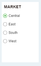
[Radio Select] This option is not checked by default. You can select multiple data to filter at the same time in the Filter List. After this option is checked, only one data can be selected for filtering in the Filter List. The check box on the Filter List becomes a radio button.
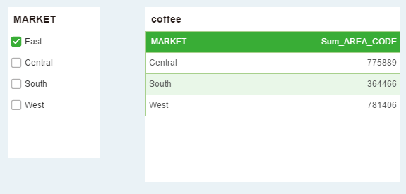
[Exclude] This option is not checked by default. When checked, the selected data is equivalent to the excluded data, and the excluded line is displayed on the selected data.
For example, both the Filter List and the table component are bound to the MARKET column. The data of the MARKET includes East, Central, South, and West. After the exclusion of the Filter List is checked, the East is selected in the Filter List, and the East data in the table is selected. Excluded, other data shows. As shown below:
[Ignore Null Value] Null value is ignored, ie no blank value is displayed.
(Mandatory) The default is not checked. When checked, the component is a required component. When there are multiple parameter components or filter components involved in filtering, only all the required components have selected values to filter out data.
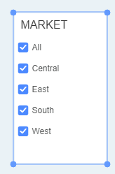
[Show All selection] is checked by default. When the Show all selection is checked, the first line of the component is displayed as Select All. Check "All" on the component and all sub-options will be selected.
[The First Choosed by Default] It is not checked by default. After checking, every time you reopen the report, the first value of the data column bound to the component will be selected by default.