|
<< Click to Display Table of Contents >> Set Calendar Properties |
  
|
|
<< Click to Display Table of Contents >> Set Calendar Properties |
  
|
The common attributes of Calendar are similar to those of the table. For details, see “Set the table”. The following describes in detail the specific properties of Calendar.
❖Layout
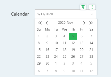
Provide users with two forms of presentation, date and drop-down list, the product default to show in the form of a date. The Calendar is displayed in the form of a pull-down list and a show/hide button is generated in the upper right corner, as shown in the following figure.

When the user selects a date, the Calendar automatically closes the list. And shows the current selected date, as shown below:

❖Defaults
When the data bound by the Calendar contains the default values set, you can directly set the default value in the property and apply it to the component.
The default setting is divided into two parts. The first drop-down list shows the approximate time data and the second drop-down list shows the specific time data. Bind different types of time data, the data display of the two drop-down lists is not the same.
Binding field |
Previous drop-down list |
After a drop-down list |
|---|---|---|
Year-Quarterly |
general |
This quarter, Last quarter,Maximum |
this year |
Q1 to Q4 |
|
last year |
Q1 to Q4 |
|
Year-Month |
general |
This month, Last month,Maximum |
this year |
January to December |
|
last year |
January to December |
|
Year-Week |
general |
This week, Last week,Maximum |
this year |
Weeks 1 to 54 and the last week |
|
last year |
Weeks 1 to 54 and the last week |
|
this month |
Weeks 1 to 6 and the last week |
|
last year |
Weeks 1 to 6 and the last week |
|
Day |
general |
Today, Yesterday,the day before yesterday, Maximum |
this year |
the 1st day,the last day |
|
last year |
the 1st day,the last day |
|
this quarter |
the 1st day,the last day |
|
last quarter |
the 1st day,the last day |
|
Date/Time Stamp |
general |
Today, Yesterday,the day before yesterday, Maximum |
this year |
the 1st day,the last day |
|
last year |
the 1st day,the last day |
|
this quarter |
the 1st day,the last day |
|
last quarter |
the 1st day,the last day |
Comparison mode and range mode are displayed as the left default and the right default, and the display is the same as the default option of the individual mode. as the picture shows.

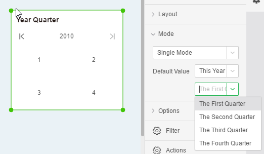
In stand-alone mode, bind the field “Quarter of Years” and set the default value in Properties - Advanced. As shown in the figure, the default value is selected on a quarterly basis.

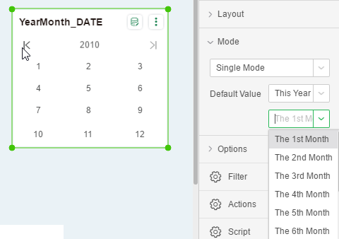
In range mode, the binding field “Year and Month” sets the default value. As shown in the figure, the default value is selected in months.

❖Required
The default is not checked. When checked, the component is a required component. When there are multiple parameter components or filter components involved in filtering, only all the required components have selected values to filter out data.