|
<< Click to Display Table of Contents >> Set the ListBox properties |
  
|
|
<< Click to Display Table of Contents >> Set the ListBox properties |
  
|
The common attributes are similar to the table components. For details, see "Set the table". The specifics of the list parameters are described in detail below.
Select the List Parameters component and click Settings on the right panel. Expand the property settings page:
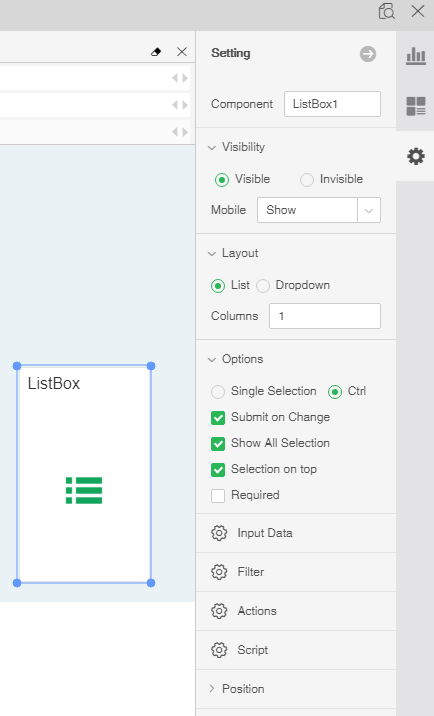
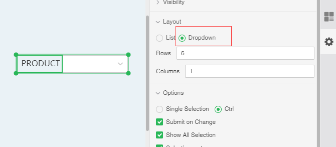
[Layout] provides users with two types of presentation, list and drop-down list. The product is displayed by default in the form of a list. When the drop-down list is selected, the number of rows will be displayed behind it. The default drop-down list is displayed in 6 lines, and the user can set according to the demand. The list parameter is displayed in the form of a pull list and the expand button is generated in the upper right corner, as shown in the figure below.
[Select Value Top] The selected value is automatically displayed in front. The default is to check the status. If unchecked, when the value is selected, the selected value is still in the original position.
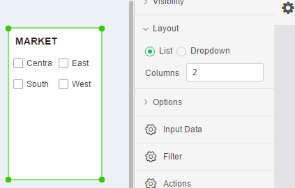
[Column] The default list parameters are displayed in one column and users can set them according to their needs. As shown in the figure below, the list parameters are shown in 2 columns.
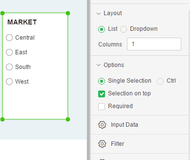
[Single Select] When checking the radio, the component is displayed in the form of a single election. Only one option can be selected in the component, as shown in the following figure:
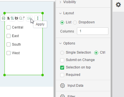
[Submit on Change] This option is selected by default, and the filter function is executed immediately after checking. When this option is not checked, an application button will be generated in the list parameter. Clicking this button after selecting the data in the list parameter will execute the filter function.
[Required] The default is not checked. When checked, the component is a required component. When there are multiple parameter components or filter components involved in filtering, only all the required components have selected values to filter out data.
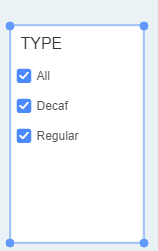
[Show All Selection] is checked by default. When the Show all selection is checked, the first line of the component is displayed as Select All. Check "All" on the component and all sub-options will be selected.
[The First Choosed by Default] It is not checked by default. After checking, every time you reopen the report, the first value of the data column bound to the component will be selected by default.