|
<< Click to Display Table of Contents >> Set ComboBox Properties |
  
|
|
<< Click to Display Table of Contents >> Set ComboBox Properties |
  
|
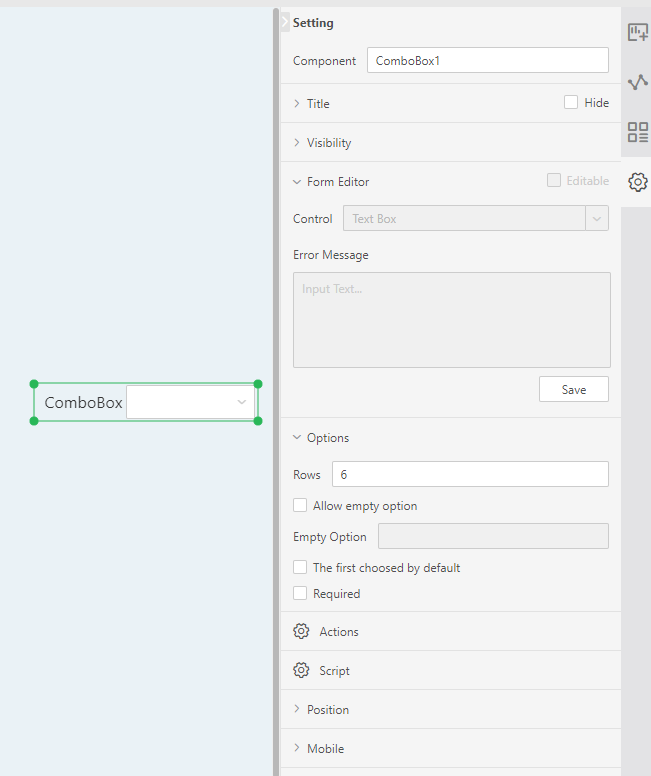
The general properties of the ComboBox are similar to those of the table components. For details, see "Set the table". The specific properties of the pull-down parameters are detailed below.
Right-click on the ComboBox component and select Properties to open the Properties dialog box for the ComboBox component.

[Allow empty options] will show empty options when checked, otherwise empty options will not be displayed.
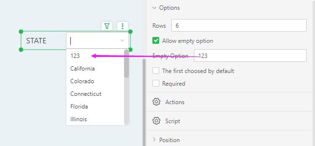
[Empty option] When checking the Allow empty selection, you can edit the name of the empty option. The empty option is displayed as a custom name. As shown in the figure below, the empty options are shown as edited "123":

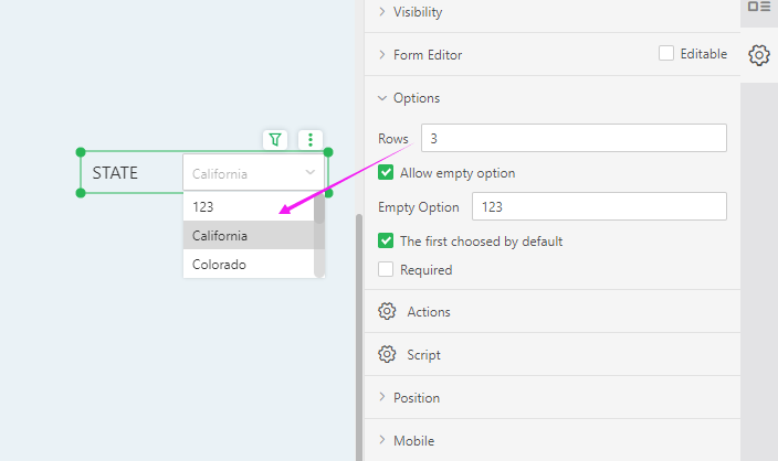
[Line number] The default pull-down parameter is displayed in the "6" line, and the user can set it according to the requirement. For example, the number of display lines for setting the pull-down parameter is "3", as shown in the figure below.

[Required] The default is not checked. When checked, the component is a required component. When there are multiple parameter components or filter components involved in filtering, only all the required components have selected values to filter out data.
[The First Choosed by Default] It is not checked by default. After checking, every time you reopen the report, the first value of the data column bound to the component will be selected by default.